Re: Critique My Frame!
I agree! How did you achieve that insane lighting?
We are a friendly filmmaking community devoted to the art of stop-motion animation using LEGO® and similar construction toys. Here, you can share your work, join our community of other brickfilmers, and participate in periodic animation contests!
A place to discuss, share, and create stop motion films.

Ad
You are not logged in. Please login or register.

I agree! How did you achieve that insane lighting?

That's so cool.
By the way, did you receive my sample line for your Marvel Anthology series? I just want to make sure I got the email address right.

What do you guys and gals think?

For me personally, the rain looks far too thin and narrow to be real. I mean, look to the rain drops on his head, they are huge, but the overlay rain is so narrow. Good for an establishing shot, not so great for a closeup, in my personal humble opinion. ![]()
I agree; It's nowhere near final so please butcher it.

Yep it feels like drops are too small for a close up. Also tuning down opacity a little bit would help.


Unknown,
Yep. You can increase the contrast, or play around with color curves. Either one will do the trick easily.
I tried color curves, and now the frame looks even more fantastic.
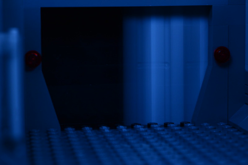
What's up with the blurry door? The blur looks kinda like Sony Vegas automatically inserted his frame to match a certain frame rate. Unless I'm looking at it all wrong. Is that an intentional look?
Nice frame Mosh, just make the drops bigger and that'll be fantastic.
Thanks, Pritchard. I'll have to try messing around with it in post-production. The blur is intentional. I slid the door as I took the frame to try and give it a motion blur effect.
That's an excellent frame, Mosh! Sure, the falling rain does look a little thin, but honestly I probably wouldn't have noticed if that's how it looked in the final film.

https://flic.kr/p/LtAdQ2 Does the lighting look good in this frame?
Last edited by AgentMichaelScarn22 (August 24, 2016 (12:41am))

https://flic.kr/p/LtAdQ2 Does the lighting look good in this frame?
It looks like a normal desk light, rather than an actual scene. The shadows are harsh and long, and look very artificial. What kind of scene is it meant to be? Outside, inside, night, day? Think about where light would really come from in your scene, and how strong it would be.


It almost looks like a sunset, Gillcrafter, with the long shadows all seemingly being cast from one direction.
...Only, it's too bright for a sunset.
Last edited by Dyland (August 24, 2016 (02:25pm))

Yeah so you see my light was obviously coming from the right of the set, which was probably too direct; making long shadows. The setting of my frame is at daytime, so I take it my light should be from above the set, right?

Yessir. If you can get light from multiple sources, that is almost always preferred (So long as the one isn't overpowering). This is a good basic structure for you.
http://www.mediacollege.com/lighting/three-point/
If, however, you're only gonna use one light for an outdoor/daytime shot, then yeah, put the light directly above your figures. If any aspect of your lighting seems odd and stands out to you, then adjust it till everything looks natural.
Another question- Some people are saying to put like a piece of paper or something on the light source.. What's that about?

It softens the light making the highlites not as blown out.
https://flic.kr/p/LvELVV
How does this look? The setting is daylight
Last edited by AgentMichaelScarn22 (August 24, 2016 (09:46pm))
https://flic.kr/p/LvELVV
How does this look? The setting is daylight
Better, but those shadows are still very dark, and the lamp being at 90 degrees to the camera is also a bit off-putting. What you really need is more lights to help balance it out a bit. IIWAM's three-point lighting tutorial was a great suggestion, so try getting your hands on three lamps and setting them up like that.
Posts [ 461 to 480 of 597 ]