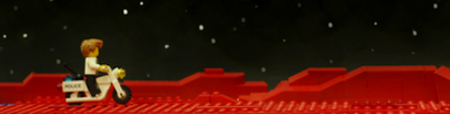
Re: Critique My Frame!
That lighting is real pretty, and I like the way you've framed between the two figures on the sides.
We are a friendly filmmaking community devoted to the art of stop-motion animation using LEGO® and similar construction toys. Here, you can share your work, join our community of other brickfilmers, and participate in periodic animation contests!
A place to discuss, share, and create stop motion films.

Ad
You are not logged in. Please login or register.

That lighting is real pretty, and I like the way you've framed between the two figures on the sides.


Infinity, that frame looks excellent. The lighting is very cinematic. I can't really tell what is going on exactly, but I'm sure it will make sense in context.
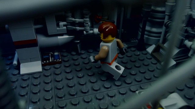
Here is a frame from my upcoming production The Third Arrival. This shot is supposed to be from a security camera.
What do you all think?
Last edited by 1999mrlegoman (December 28, 2016 (10:51am))

1999mrlegoman that shot is really cool, i love the way you did the walls.
This is a test frame from a star wars film I'm making. I wonder How im going to animate this shot!

Please Critique.
Last edited by BlackSmithFilms (December 18, 2016 (01:05am))
@1999mrlegoman I really like the set design. The high angle is good for suggesting that the shot is from a security cam. Might want to mess with it in post to really sell the effect. Maybe a time stamp in the corner and a monochrome or green night-vision filter. Flicker and/or film grain could also help.
@Rafael man that's gorgeous dude! Absolutely nothing I can critique ![]()
Good luck animating characters on that cramped, roofed set though ![]()
Last edited by Brickcrazy (December 17, 2016 (03:56pm))

The on-set lighting looks great, rafael! It might be cool to get some more colours in there, maybe some red or blue rim light on the stormtrooper. As for animating the shot, maybe take the ceiling off while you animate then add it back in during post. Just be conscious of the floor reflections.


Wow, that looks absolutely amazing!

1999mrlegoman: That frame looks really nice the set looks awesome! I would agree with Bricrazy though about messing with it in post, cause right now it doesn't look that much like a security camera but with some post stuff it would really look like one!
rafael9522: That frame looks totally awesome! I love the set/lighting. I agree with NXT though a backlight would really look nice.
Here is a frame for my rebbrick entry, I think I'm going to animate it tomorrow. But was wondering if you guys see any thing I should change?
Thanks a bunch
OsomStudios

Looks great Osomstudios! I'm really liking the lighting and the only source of light is coming from the doors and windows. Very nice touch ![]() .
.
I'm working on another project while I work on Marvel Anthology. It's a little more top secret, well other than the frames below, but I was wondering which one I should go with and if so what can I do to make it even better. Thanks ![]() .
.


Looks like Operation 66. Am I right?

@Infinity Prime Studios: The top frame looks as if there is fog in the background, maybe you could add some in the foreground as well?
@osomstudios: Looks great!
Last edited by bataton (December 22, 2016 (11:50am))


Here is a frame for my rebbrick entry, I think I'm going to animate it tomorrow. But was wondering if you guys see any thing I should change?
These are nice pictures, though I'd like to warn you that the Rebrick competition disallows the use of text. You might want to take out those posters if it's not too late.

Hey guys, heres a project I'm currently working on. Any thoughts or ideas on how or what I could work on in the future?
This scene is done, but any kind of critique or feedback is more than welcome.
Thanks.


Divine, I really like the set and the lighting in that shot. However, the foreground is a little bit bare the way it is framed. My eyes go to the man's face, then down his torso, and then the whole bottom of the frame is just gray studs. If you are going to crop the frame, I would suggest doing so from the bottom primarily and that should clean it up nicely.

@Geouung,
Thanks for the feedback! I definitely will crop it in post i hadnt reallt picked it up originally but i had plans to go in more much closer shots once the establishing shot was taken i just realized the effect it had on you and i hadnt picked it up so thank you.

It seems to have a lot of headroom. Is there a reason for that?
Also, is this shot supposed to feel like these people are being spied on, because the long lens and the slight pillar in the left side of the frame makes it feel that way (so if that's the goal, congratulations! ![]() ).
).
Maybe a rimlight or some fill light on the foreground characters might help them stand out.
Other than that, it's pretty much fine, depending on what the frame is supposed to be. Only you know what you're intending for the frame. ![]()
Posts [ 501 to 520 of 597 ]