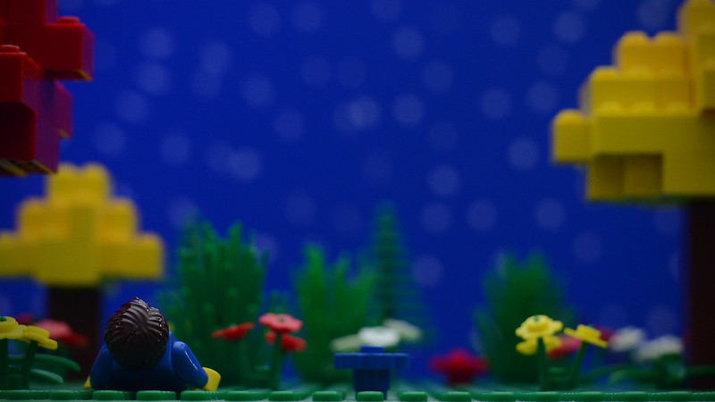
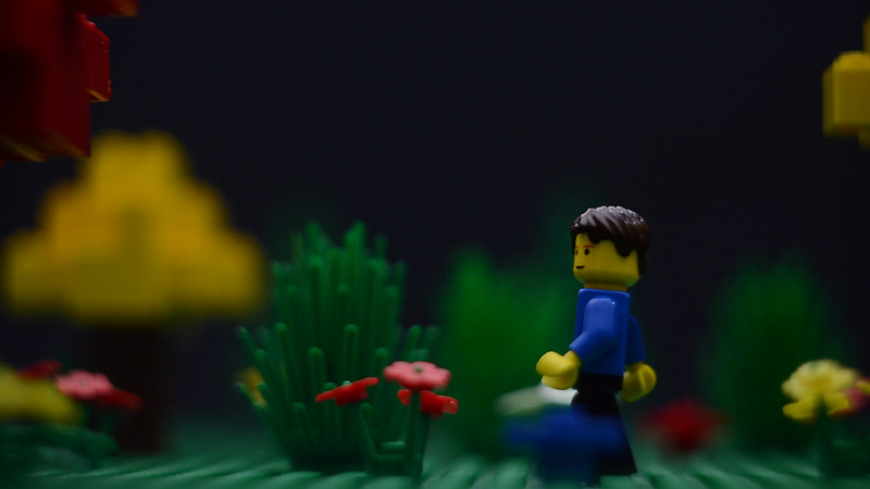
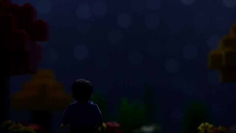
Topic: Critique My Frame!

This thread is a spiritual successor to the "Frame from your upcoming film" thread and is designed to focus on the productive and helpful critiquing of a work-in-progress shot or frame from your upcoming brickfilms. Post here if you want people to critique the cinematography, lighting, blocking and set design of a work in progress shot! Keep Smeagol's guide to commenting on a film in mind when writing critiques.

Guidelines:

  • Only post a frame that is a work in progress.

  • If you want to show off a finished frame, post it in soon-to-be-made "Show off a Frame!" thread.

  • Allow at least three comments between new frame posts.

  • If you are posting a frame, be sure to give feedback on the previous frame!

Let's get started!

Re: Critique My Frame!

I guess this is the appropriate place to put this. I put the others on the Sets & Props Critique Thread. If I'm in the wrong place, please tell me. mini/smile

https://farm9.staticflickr.com/8591/15776855824_591ee23de1_c.jpgStarry Night Background Test by rioforce, on Flickr

A test background for a starry night. I think that the poster board is a bit too blue, unfortunately. What do you think?

I'm going to be taking all suggestions into consideration, because I accidentally ruined my stars on the poster board, so I now have to redo it... mini/confused

YouTubeWebsite
https://bricksafe.com/files/rioforce/internet-images/RioforceBiMSig.png
"Whatever you do, do all to the glory of God." - 1 Corinthians 10:31b

Re: Critique My Frame!

I agree with you that it's too blue. It's also extremely bright to be night time. I'd tone both of those down. Also your set lighting doesn't match that of the background.

"every day I feel more pleased that sigging isn't a thing anymore" - Squash
YOUTUBE | Will voice act, ping me in the discord.
03:52    Smeagol    I should send girls turds in a box
01:28    Smeagol    That signature leaves me wondering if I should be sending more girls more turds in boxes than I presently am

Re: Critique My Frame!

I would do some color correction maybe. Or if possible get a black poster board.

Re: Critique My Frame!

I don't think the poster board needs to be black, since you're going for a sort of cartoony feel; dark blue would probably be better, something in the navy range. It's a really convincing background, though, does a good job conveying the feeling of being outside.

Re: Critique My Frame!

A blue sky with white dots feels really wrong.  The night sky is usually dark blue or black, never that shade.  And a day sky never has white dots in it.

Re: Critique My Frame!

Thanks for the comments. I was going for a navy color. It wasn't meant to be that bright. I thought that the color of the posterboard would be darker in-camera, but it turned out that it wasn't.


https://farm8.staticflickr.com/7368/15781124284_3ba44ef4b8_c.jpgThe Dark and Starless Night (Background test) by rioforce, on Flickr

Here's my new background. I took a black posterboard and painted it dark blue. I haven't added stars just yet, because I'd like to know what you guys think of the color.

YouTubeWebsite
https://bricksafe.com/files/rioforce/internet-images/RioforceBiMSig.png
"Whatever you do, do all to the glory of God." - 1 Corinthians 10:31b

Re: Critique My Frame!

The posterboard is much better, though I still think your foreground is extremely bright for night time.

"every day I feel more pleased that sigging isn't a thing anymore" - Squash
YOUTUBE | Will voice act, ping me in the discord.
03:52    Smeagol    I should send girls turds in a box
01:28    Smeagol    That signature leaves me wondering if I should be sending more girls more turds in boxes than I presently am

Re: Critique My Frame!

Looks much better. I think adding stars again will definitely make it even better. I'd suggest trying to increase your depth-of-field a little. I realise this is to create the illusion of a very large and deep set but I would prefer less blur on the background.

Re: Critique My Frame!

rioforce wrote:

Thanks for the comments. I was going for a navy color. It wasn't meant to be that bright. I thought that the color of the posterboard would be darker in-camera, but it turned out that it wasn't.


https://farm8.staticflickr.com/7368/15781124284_3ba44ef4b8_c.jpgThe Dark and Starless Night (Background test) by rioforce, on Flickr

Here's my new background. I took a black posterboard and painted it dark blue. I haven't added stars just yet, because I'd like to know what you guys think of the color.

Looks really good, I think the colour looks really good. But I agree That it looks a bit bright for a night forest set, also it might help to use some blue gels. Oh and that framing looks really cool.

Hope that helps
OsomStudios

Last edited by osomstudios (January 30, 2015 (10:40am))

This world is a dark place. One day I will see my Savior face to face.
My Youtube

Re: Critique My Frame!

Nighttime is dark. Very dark. This shot doesn't look like it's at night at all. It's a nice shot, but if you want it to look like night you need to actually lower the amount of light being cast onto the set. Tinting it blue isn't going to cut it. I shouldn't be able to see all those trees and bushes easily. In fact, most of the shot should be silhouettes. Obviously you need to be able to see the character, so splash some light onto him. But everything else needs to be difficult to see.

Re: Critique My Frame!

I'm just a little uneasy looking at the upside-down flowers.  I'm from the "studs on flowers up" school.

https://vimeo.com/channels/holdingourown      http://holding-our-own.tumblr.com

"None practice tolerance less frequently than those who most loudly preach it."

Re: Critique My Frame!

You don't necessarily need to make the lights dimmer, you could also turn the exposure down.

I've done some experiments in the real world and night lighting is actually almost the same as day lighting.  The only major difference being that it's just very, very dim.

Though, obviously, you'd want to make it just slightly brighter than actual night, if you don't then you can't very well see anything.

I've found that muting the colour to some degree also helps.  Usually when there is less light colours are harder to distinguish, and they all blur into something similar, yet not entirely undefined.  I'd say around about half saturation.

Re: Critique My Frame!

Lighting at night is absolutely not the same as lighting during the day. The easiest way to tell when a scene was shot during the day and then processed to look light night? Look at the shadows. Shadows are very soft or even nonexistent at night. Unless the sky is overcast, shadows during the day are sharp.

Also, night is not blue. Night is black and gray. Unless there is a source of light, everything is going to be BLACK. Obviously that won't do in film, but you shouldn't make everything just slightly darker so you can see the character. You should use light to highlight the points of interest, and then allow everything else to bleed away into blackness.

Re: Critique My Frame!

One thing to try Rio is to have also a white key light to emulate the moon's reflection of the sun. Some nights the moon can be pretty bright. Most people choose blue as a "night color" is because when cameras were set to auto white balance, they would most often go for something "cooler".

Last edited by Gentry Studios (January 30, 2015 (12:30pm))

Twitter | Instagram | YouTube Channel | Tumblr | My Weekly Film Podcast!
"For I am NOT ashamed of the Gospel of Christ" - Romans 1:16

Re: Critique My Frame!

Squid wrote:

I've done some experiments in the real world and night lighting is actually almost the same as day lighting.  The only major difference being that it's just very, very dim.

Shadows are dimmer, the light mainly comes from directly overhead and is much more diffused, the light is a colder colour (As Nathan says, it's not blue exactly, more that it's less Orange so don't use an orange light to light the scene).

You don't want to just turn down the exposure, it'll mess with the quality. Really you want to put your lights far away, as far away as you possibly can with your set up. Then check how it looks and adjust by moving them closer if it's too dark to see anything. The moment you can see your character easily you've probably gone slightly too far.

"every day I feel more pleased that sigging isn't a thing anymore" - Squash
YOUTUBE | Will voice act, ping me in the discord.
03:52    Smeagol    I should send girls turds in a box
01:28    Smeagol    That signature leaves me wondering if I should be sending more girls more turds in boxes than I presently am

Re: Critique My Frame!

Nathan Wells wrote:

Lighting at night is absolutely not the same as lighting during the day.

I didn't say they were the same, I said that they were almost the same.  It's just that night is much darker, day is much brighter.

On a night lit by a full moon, the angular diameter of the moon is around the same as the angular diameter of the sun, thus the size of the light-source isn't really changed.  However, the light should still probably be ever so slightly defused as during night there is often times a slight low night fog even if it is a clear night, but probably only slightly.

I say this because I once tried taking a long exposure picture of a moonlit night and was surprised to discover that the forest looks almost exactly the same in the picture as it looks during the day.  Of course, during the day you'd only need an exposure a fraction of a second, but at night you need the exposure to be five minutes.
Image
The sky through the leaves even looks sky-blue.  And the shadows are still relatively sharp.  However, diffused slightly because of the night fog, slightly because of the rustling of the trees due to the long exposure, and slightly because of the time it took to take the picture making the light source itself by blurred.

Night is also usually around the same hue as daytime, and is not actually particularly blue, as has been said.

Re: Critique My Frame!

Good points all around. Thanks for the critique. I have painted on the stars and improved the lighting.

https://farm8.staticflickr.com/7296/16403814692_69263c2630_c.jpgWish Upon a Star by rioforce, on Flickr

What do you think?

YouTubeWebsite
https://bricksafe.com/files/rioforce/internet-images/RioforceBiMSig.png
"Whatever you do, do all to the glory of God." - 1 Corinthians 10:31b

Re: Critique My Frame!

i feel like stars need to be a little smaller looking, but that's just me. Also, I don't tend to like them so boke-ish. It's greatly improved though!

Twitter | Instagram | YouTube Channel | Tumblr | My Weekly Film Podcast!
"For I am NOT ashamed of the Gospel of Christ" - Romans 1:16

Re: Critique My Frame!

A huge improvement. It actually looks like night! I would try to shine a diffused beam of light on the front of your minifigure so you can create a highlight around him. This will set him apart from the dark background better. You have a good start with the one shoulder, but I think you can push it further.