

Note: These days, community activity has largely moved to the BiM Discord. Join us!
We are a friendly filmmaking community devoted to the art of stop-motion animation using LEGO® and similar construction toys. Here, you can share your work, join our community of other brickfilmers, and participate in periodic animation contests!
A place to discuss, share, and create stop motion films.
Ad
You are not logged in. Please login or register.


Lovely! Much better! Though I do agree with Rio, the fewer stars in the middle of the frame almost appear to give the background a warping effect.


Brickcrazy, I could go either way.

Cooked Cat, I agree with rioforce. The lighting and the set are fantastic but I feel that you need some kind of connection between the background and the foreground. I'm not sure but maybe adding some building or structures with Lego bricks between those layers can be a solution...


I agree with Rioforce. The greenscreen is done well, I don't see any spills or errors but it is distracting as the sets suddenly stops. Maybe try great your own background, light it the same way, take a photo of it and use that as the background image. Basically a set extension you created. It'll be lit the same way, have the same quality and colour, but will allow for you to animate on the small set without having any large background pieces.

That looks amazing.
yeah, the back ground is just a place holder guys, as it will be IN alantis, not looking at it, so there will be buildings around and everything, and i was thinking of a effect to show a forcefield type window/wall.....

You could use the long tube pieces the create the edge of a glass dome or force field.
I was thinking a kind of heat distortion effect.... and maybe make some color gradient to....

Thanks for the help with my space scene, guys! I think it looks a lot better too.
Yes, much better! The stars look a lot more random now.
Though, is it just me, or are there less stars around the middle of the frame with the ship is located?
You are correct, there are less stars near the center (I'll have to fix that). I think that might have had something to do with the fact that my two sheets of poster board overlap in that area, doubling the thickness and making it harder to punch holes (in other words, pure laziness! ![]() )
)
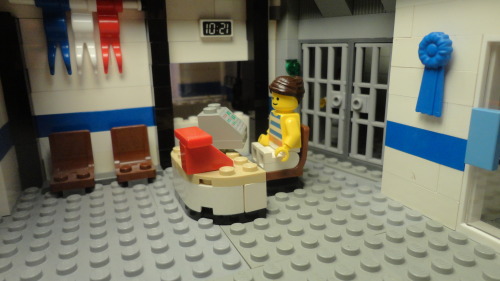
Early image from Holding Our Own Episode 4. It shows newly-wed Brent and Angela in 1992. Check out their hair!:
They didn't have a lot of furniture then.
I am not sure if the modern-art on the wall is a 1992 style. It could just be me, but it seems as if it needs to be something else. The framing of the image isn't very appealing. It looks kind of unbalanced. Though, I guess there's nothing else really wrong with it (actually, nothing is really "wrong", it's just my opinion ![]() ). I like the TV. The phone in the corner looks very 60s, not 90s. 90s would have a phone like this or this, hanging on the wall, probably.
). I like the TV. The phone in the corner looks very 60s, not 90s. 90s would have a phone like this or this, hanging on the wall, probably.
Actually, there is a lot of untold backstory. The telephone is from the 1960s! All the phones in my series, except for those cell hones are from the 60s, and a heck of a lot of them are red! See examples below.
I don't know about the art, either. I don't know what that picture is supposed to be, but the picture that usually hangs there is supposed to be a farm scene.
It may not look too balanced, but the image will pan in toward the left and Brent & Angela will be properly centered. They get a lot more furniture between this flashback and the time the story normally takes place. Here's how the room currently looks like, or part of it:
And now those red telephone examples:
Example 1
Example 2

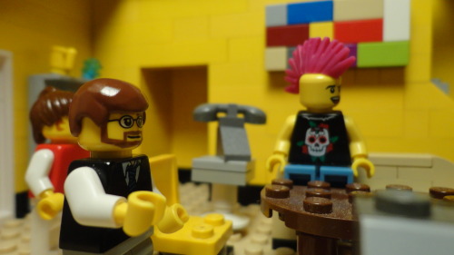
@Cooked Cat - I can't really get over the notion that your frame is slightly off centered and angled, causing the character to be off centered. This is really distracting to me, since it's just enough to notice, but not enough to seem intentional. But maybe it's just my eyes being weird.

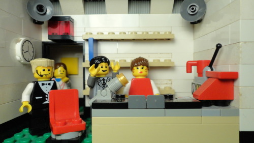
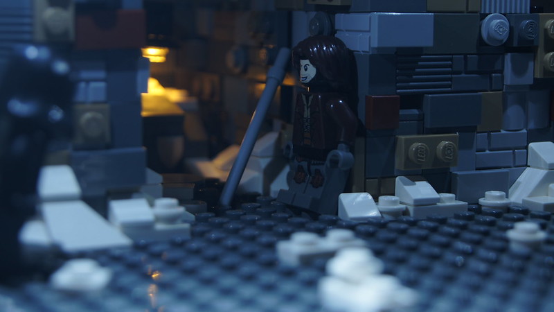 Norway Test Shot 1# by Galactic Bricks, on Flickr
This is not a final frame but just a test shot before I start filming. Is the lighting good? Do the sets work? How do you guys think this shot looks?

The very bottom part of the frame looks a little bright compared to the rest. Try making it a little more even, or perhaps put some emphasis upon the figure.
I really like the orange glow.

I really like that frame Galactic, has a really fresh and appealing feel to it. All the little details really add to the frame, especially the wall and the orange glow, which are both really well done in my opinion.
I do agree with Squid that the lighting could maybe be diffused a bit more over the set, but other than that I'm looking forward to this film!
Posts [ 81 to 100 of 597 ]


