Re: Critique My Frame!

That looks really really cool. I really like the set/lighting. The only critique I might have is that the framing looks just a little low. But over all it looks amazing, your improving a lot. Keep up the good work.

Hope that helps
OsomStudios

This world is a dark place. One day I will see my Savior face to face.
My Youtube

Re: Critique My Frame!

Galactic, the frame looks good! I agree with what was said before about the lighting.

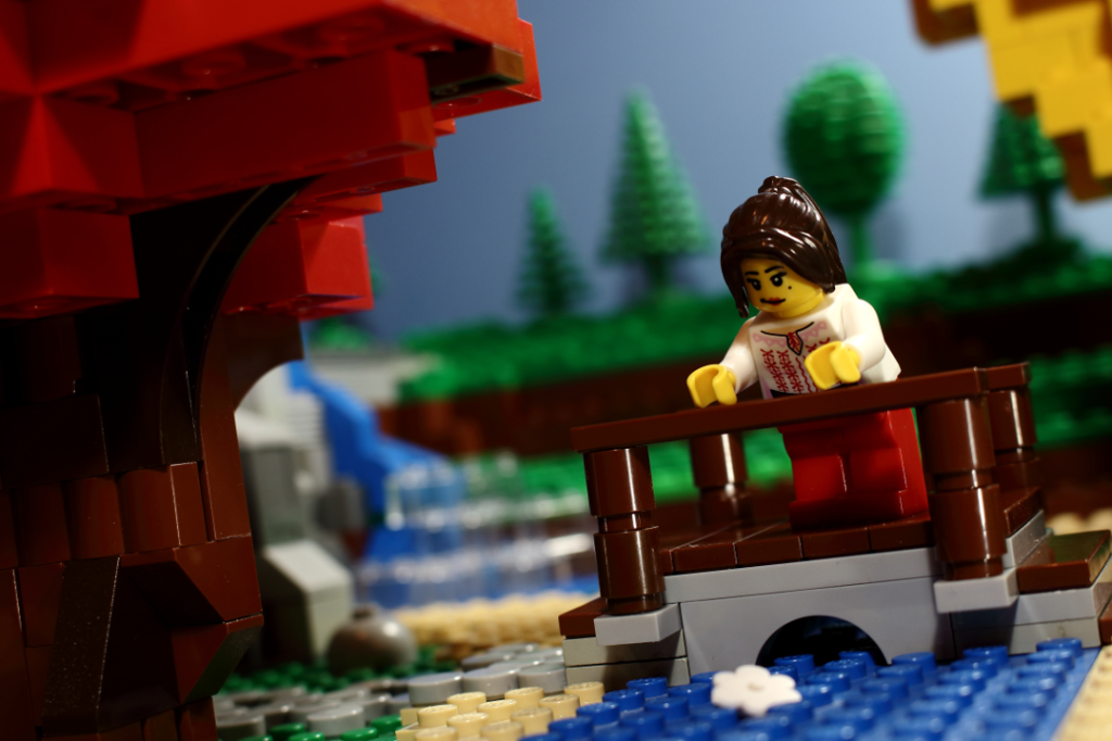
I have a picture that isn't part of an animation, but I don't know where else to post it, so it will go here.
I took the picture from my DSLR, adjusted some color settings and re-sized it. Do you people have any ideas on how I could improve it?
http://i1316.photobucket.com/albums/t619/Unctuously/Bridge%203%20edit%20scaled_zpsq7sxf4zz.png

"...just take stuff apart.  Be heartless, do not develop feelings for these sets..." -Squid
YouTube
My standards: Philippians 4:8

Re: Critique My Frame!

Thanks guys for the compliments and critiques. I will take it all into consideration when I start filming the scene. mini/smile

Rivvm m, I think the frame looks great!!!! My only critique is that the blue backdrop is darker on the left than the right, and thus makes it unevenly lit. You may want to add a lamp to the left Sind to fix that. mini/smile

Re: Critique My Frame!

Nice framing, Rivvm m. The only thing I think you could improve is the lighting on the girl. I believe she should have a harsher sun light on her right side. The background trees look perfect.

I would also like to post a picture for critiquing. I was wondering what I could improve.
Batman

Re: Critique My Frame!

I would try to build the door on the roof out of legos.  I'm pretty sure it's cg, and since it is so close to the figure, it would look better in plastic.  Other than that, I really like it.  I think the lighting is sweet and think that the cg buildings in the background look fine.

Re: Critique My Frame!

I think it would look better if you modified the building in the background on the right. The lights in the windows show that it's a copy-paste.

Re: Critique My Frame!

I think the perspective on that rooftop access point might be a bit off.
Perhaps building it out of Lego would help. Or looking at photos of rooftop buildings for reference

"Tell stories that matter to you, not stories that'll sell." - Stephen Tobolowsky

YouTube/Twitter/SG

Re: Critique My Frame!

@Rivvm m I agree about the sky being too dark. It needs to be a more even color. Also, the frame is rotated strangely. Maybe if your rotated it it would look more balanced. mini/wink

@LMDigitalMovies There's nothing more that can be said than what has already been said. The lighting looks great, but the CGI elements look kind of out of place.

YouTubeWebsite
https://bricksafe.com/files/rioforce/internet-images/RioforceBiMSig.png
"Whatever you do, do all to the glory of God." - 1 Corinthians 10:31b

Re: Critique My Frame!

Thanks for the comments. I would just like to say that the rooftop is completely real. That door and the room on the roof is built out of LEGO.

Here's an updated shot:
Batman2

Re: Critique My Frame!

It looks nice, I especially like the lighting on his face, but you might want to add some multi-colored lights if you have access to them, because with the background you're using it seems like there should be some yellows and greens. Don't point the lights directly AT him, just point it to the side so the LEGO reflects the color of the light.

uh oh!

Re: Critique My Frame!

@LMD, it looks nice. I like the buildings in the background being different from each other. Currently, the height of the buildings in the background makes the building Batman is standing on look short. I don't know if you want that or not, just pointing that out.

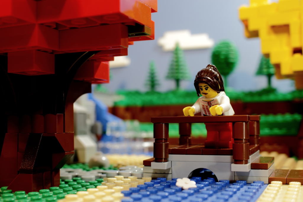
I retook the shot of the bridge. What do you think now?
http://i1316.photobucket.com/albums/t619/Unctuously/Bridge%204%20edit%20scaled_zpsp46xwia8.png

"...just take stuff apart.  Be heartless, do not develop feelings for these sets..." -Squid
YouTube
My standards: Philippians 4:8

Re: Critique My Frame!

That's way better!

"Bless you for making this." -Sloth 2016 * on "Chicken Shaped Lighthouse Attacks Police"
http://bricksafe.com/files/harborlightpro/400x100%20BRICKSINMOTON%20PIC%202.jpg
Ephesians 4:29 -"Let no corrupt word proceed out of your mouth, but what is good for necessary edification, that it may impart grace to the hearers."

Re: Critique My Frame!

Much, much better. I really like the brick built clouds you added to the background as well. mini/smile

Re: Critique My Frame!

The lighting is great. I like the clouds too. I see that you rotated it a bit. That's one pretty frame.

YouTubeWebsite
https://bricksafe.com/files/rioforce/internet-images/RioforceBiMSig.png
"Whatever you do, do all to the glory of God." - 1 Corinthians 10:31b

Re: Critique My Frame!

Gorgeous! Can't think of any way to make it better! Love the clouds!

YouTube  |  Flickr  |  Twitter

Re: Critique My Frame!

Something doesn't look quite right with that bridge. It looks like it's sitting on top of the stream. The arch brick in the center makes me think that the water should flow out of that area only.

I would make the bridge larger (e.g. use a larger arch piece over the water) or make the stream narrower.

Re: Critique My Frame!

https://fbcdn-sphotos-a-a.akamaihd.net/hphotos-ak-xpf1/t31.0-8/1495413_601680126599026_7339269697022174657_o.jpg

actually, after posting this in the "Show of frame"ness thread, I am willing to change the colouring, so guess it can go here, I am shooting for morning. (after lighting evening... mini/confused)

Re: Critique My Frame!

You say that is supposed to be early morning? Hmm. It looks to much like sunset. Early morning is bluer and has less contrast in the shadows. They seem to be diffused more with a better fill light. Though, is your frame sepia tone, or is it just the lighting? Because everything looks a bit too brown/yellow.

YouTubeWebsite
https://bricksafe.com/files/rioforce/internet-images/RioforceBiMSig.png
"Whatever you do, do all to the glory of God." - 1 Corinthians 10:31b

Re: Critique My Frame!

I agree with Rioforce, it looks much to brown for the early morning. Adding blue would help but a white-yellow light would also help. The framing is nice and the set looks good.

Re: Critique My Frame!

Adding to Rioforce's Statement: Morning seems to usually be more yellow, less red/orange.

Twitter | Instagram | YouTube Channel | Tumblr | My Weekly Film Podcast!
"For I am NOT ashamed of the Gospel of Christ" - Romans 1:16