Re: Critique My Frame!

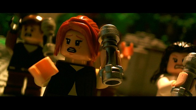
William That looks cool I like the custom minifigure! Although I think it would improve the shot a lot if you moved the camera so the guy in focus was on the left side and the girl stayed in the right corner like you have it just so you don't have very much empty space in the side of the frame for our eyes to wander to.

Hope that helps
OsomStudios

This world is a dark place. One day I will see my Savior face to face.
My Youtube

Re: Critique My Frame!

@Osomstudios You are right, but this is how they are positioned in the actual video, and I always try to follow my musical videos, frame by frame, to the originals.

Last edited by William Osborne (December 3, 2015 (12:41pm))

Re: Critique My Frame!

What exactly did you want critique on then?

YouTubeWebsite
https://bricksafe.com/files/rioforce/internet-images/RioforceBiMSig.png
"Whatever you do, do all to the glory of God." - 1 Corinthians 10:31b

Re: Critique My Frame!

Well, the overall quality of the frame.

Re: Critique My Frame!

-.- That's what they have been doing.

Divine wrote:

There is a few issues I will mention, one your main character is still blurred and not very sharp, your first character in the shot should either be more in the frame or cut out of the frame all together. ... I would recommend you check out the rule of thirds.

osomstudios wrote:

Although I think it would improve the shot a lot if you moved the camera so the guy in focus was on the left side and the girl stayed in the right corner like you have it just so you don't have very much empty space in the side of the frame for our eyes to wander to.

Yet, it more or less seems like you're just making excuses on why it isn't good, not looking to improve.

William Osborne wrote:

I know the frame is slightly out of focus, the fact is that my webcam,

William Osborne wrote:

but this is how they are positioned in the actual video, and I always try to follow my musical videos, frame by frame, to the originals.

If you do change it, you should post it here, but there's not much more to critique beyond what has already been said.

YouTubeWebsite
https://bricksafe.com/files/rioforce/internet-images/RioforceBiMSig.png
"Whatever you do, do all to the glory of God." - 1 Corinthians 10:31b

Re: Critique My Frame!

Well, Rio, I know that. You're the one still going on about it mini/lol But seriously though, you all have given me good advice. As Divine mentioned it, I will try to make sure for future reference that I remember to cut out people out of focus, like the woman in this shot. I could of done with just showing him.

Last edited by William Osborne (December 4, 2015 (08:13am))

Re: Critique My Frame!

https://farm1.staticflickr.com/644/23225849723_1dc3bc5d56_z.jpg

I haven't made anything Star Wars in a while, so might as well tap into the craze.
I love the way the background turned out, but I feel the framing is a bit off, and the green may be turned up a bit too much.

Is there anything else I may have missed?

Re: Critique My Frame!

I think it looks fantastic.

"I wear black even when I'm not animating. I'm like a walking funeral parlor."
-PushOverProductions

Re: Critique My Frame!

Very nice framing.

https://vimeo.com/channels/holdingourown      http://holding-our-own.tumblr.com

"None practice tolerance less frequently than those who most loudly preach it."

Re: Critique My Frame!

Thanks guys!
I'm pretty fond of the shot, especially the focus. (Which is really hard to get just right with a webcam)
So I'm glad ya'll approve.

And I'll do all I can to follow your wonderful suggestions and tips. mini/tongue

Re: Critique My Frame!

This is a frame from an upcoming brickfilm short I'm working on. I decided to go in a different direction with this brickfilm and make something original. So far I like the shot, I don't have a lot of lights to work with since I forgot to bring some back from my dorm. I just finished the script and I have started shooting. I would love some feedback on the shots so far.

https://pbs.twimg.com/media/CW4y9nYUEAAUZQ9.jpg:large
https://pbs.twimg.com/media/CW40UtuVAAANzFG.jpg:large

Last edited by Infinity Prime Studios (December 22, 2015 (10:52pm))

Re: Critique My Frame!

I really like the look of it!  It has a very strong space vibe.  I really like the minimalist landscape and the very plain looking spaceman with the high contrast lighting.

On the actual moon one can't actually see the stars during the day because the glare from the surface makes the sky look black, but having the star background there looks really nice (and it might not even be our moon).

Re: Critique My Frame!

It's all nice, except that I think that there are many here in BiM who "make something original".

https://vimeo.com/channels/holdingourown      http://holding-our-own.tumblr.com

"None practice tolerance less frequently than those who most loudly preach it."

Re: Critique My Frame!

Thank you! I was really worried about the background and how much light I was exposing. These were really helpful and it might be taking place on another moon...who knows...

Yeah I meant for me making something original (my bad). I've been doing and planning some stuff with copyright characters (like Star Wars) so I wanted to step away from all that and make up something.

Last edited by Infinity Prime Studios (December 23, 2015 (08:50am))

Re: Critique My Frame!

Finished making this futuristic interrogation/torture chamber set a little while ago. I pretty much made the chair and then designed a room around it... mini/wink

Not 100% sure of the underset lighting. Suggestions and comments welcome.

https://farm2.staticflickr.com/1529/23705300619_c446a070f0_h.jpgInterrogation Room by Brickcrazy, on Flickr

YouTube  |  Flickr  |  Twitter

Re: Critique My Frame!

It has a really strong LEGO Movie vibe (which had some very good lighting), so it looks like you are doing a really good job.

Re: Critique My Frame!

That's some great scenery and lighting you've got there. It complements the chair quite well.
I'm really liking the red light and that whole GLaDOS-like construction. The harsh separation between the lights and shadows looks fantastic, and the yellow pipes bring back fond memories of Sloth's Beyond the Eleventh Dimension.

My only issue is that the left wall is kind plain when compared to the rest of the set, like it needs more detail or color or something.

The camera angle doesn't feel quite right, but that doesn't have anything to do with the set. Myself, I'd keep it to close-ups, or ground-level mid-shots. Something about the framing here feels off. Again, not that it has any bearing on the set itself.

Re: Critique My Frame!

https://scontent-lax3-1.xx.fbcdn.net/hphotos-xap1/t31.0-8/12764826_740138306086540_4021986167685536428_o.jpg

Hey, how do we feel about the lighting, Color grading of this shot?

Re: Critique My Frame!

Good composition.  It looks like there'a a lot of dynamic action going on, even though it looks like it's just a dialogue scene in an office of some type.

I actually do like the coloring.  Everything looks very warm.  My director friend may think the light beam from the window is over-exposing things, but I'm fine with it.

https://vimeo.com/channels/holdingourown      http://holding-our-own.tumblr.com

"None practice tolerance less frequently than those who most loudly preach it."

Re: Critique My Frame!

Looks pretty nice, but it seems to have an oddly green tint to it. Although, that may just be caused by the cyan light hitting a tan wall - like mixing blue and yellow.

http://bricksafe.com/files/Legoguy501/BiM%20Signature.png
2nd place Darkness and Light entry: The Tree
Behind the Scenes