Re: Critique My Frame!

I agree, it is a bit high up. You want your camera to be "part of the action", instead of just observing it. That's pretty much the only thing I can see that needs tweaking. The lighting may be a little too yellow, but it depends on what part of the prison he's in I suppose. mini/wink

YouTubeWebsite
https://bricksafe.com/files/rioforce/internet-images/RioforceBiMSig.png
"Whatever you do, do all to the glory of God." - 1 Corinthians 10:31b

Re: Critique My Frame!

Brickyman, in addition to what the others said, the ISO on your camera seems quite high. Maybe if you used more lighting or used a longer exposure, you could lower your ISO. That is, if you don't want the static. If you want the static, keep it how it is.

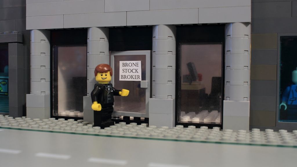
I redid the stock broker building:
http://i1316.photobucket.com/albums/t619/Unctuously/Store%201_zpsgw258ja4.jpg

The name on the sign is not final. I realized that forgot to give my character a name when planning the story...

Last edited by Rivvm m (August 6, 2015 (10:09am))

"...just take stuff apart.  Be heartless, do not develop feelings for these sets..." -Squid
YouTube
My standards: Philippians 4:8

Re: Critique My Frame!

That's much better, Rivvm m!! It looks very smart now. mini/smile

I don't really understand the technical side of cameras, I've never been very good with them. I'd like to though. I use a Quickcam Pro 9000. What should I understand?

Re: Critique My Frame!

Brickyman, I have never used the Quickcam Pro 9000 or any other web cam for pictures, so I am not completely sure how they operate. However, assuming you have complete manual control of the camera, this might help: http://www.cambridgeincolour.com/tutori … posure.htm (I haven't actually read it, but I glanced over it, and it seems to cover the topic fairly well)

"...just take stuff apart.  Be heartless, do not develop feelings for these sets..." -Squid
YouTube
My standards: Philippians 4:8

Re: Critique My Frame!

Might as well resurrect this great thread again.

I'm trying to set up a rather emotional sunset scene for my Vega Zyro film I'm working on. Still very much a WIP, but I could really use some input.

http://bricksafe.com/files/Brickcrazy/Minifigs/Vega%20Zyro/2015_09_16_Animation_001_Frame_000014.jpg

YouTube  |  Flickr  |  Twitter

Re: Critique My Frame!

Hey Brickcrazy,

That is an awesome frame you have there, I love the outline of the sunset, and the shadows on the minifig.

The one thing that bothers me the most would be the object to her right, is it a graveyard? and that yellow object you may notice it but everytime I look at the photo the grey & yellow object have my eyes fixed at that when I look at this photo, I feel like its in the way of the minifig. Even tho you have focused on the minifig I can't help but feel its still a distraction and is taking a toll on this great frame. Maybe something smaller to her right?

Otherwise I love the shot, the tower lighting up from the suns gaze, the nice purple sunset, it does feel like you really do capture the moment of emotion in this scene.

Sincerely,
Divine.

RELEASED! Check out my channel to watch it!
Check out my Youtube Channel New Vid every week: https://www.youtube.com/channel/UCy5NKN … 7cRn8gsNaw

Re: Critique My Frame!

The sunset looks very well done, and I like the forced perspective. On the other hand, it's not really clear to me what's going on; I'm guessing she's in a graveyard, because of the flowers and the tombstone shape on the right. The flowers stick out a lot, and not in a good way; I think it's the black/white contrast. I might also argue that the helmet (?) does the same thing. The only other thing is the ground; it may just be me, but I feel like there's a lot of ground in brickfilms. Generally it takes up a good portion of the frame, and is not very interesting to look at. I took the liberty of cropping the image a bit to demonstrate what it might look like without the ground:

https://dl.dropboxusercontent.com/s/1710c3k2h5lwuod/croppedshot.png?dl=0

P.S. Divine kinda beat me to the punch on some of these points.

Last edited by Littlebrick (September 16, 2015 (10:01pm))

"[It] was the theme song for the movie 2010 first contact." ~ A YouTuber on Also Sprach Zarathustra
CGI LEGO! Updated occasionally...

Re: Critique My Frame!

other then what the others have said....
is there a way to make this hills darker? given that it kinda looks like the light/sun is above, not behind them....

Re: Critique My Frame!

Brickcrazy let me in on some need-to-know info about the frame that he forgot to mention here. The gravestone and helmet are essential to the frame, which is why they cannot be silhouetted like Vega is. It's meant not to be the absolute focus of attention, but you are supposed to be drawn to look at it (as she walks down the hill).

Personally, I like the frame. I think that maybe there could me a bit of different bounce lighting on the helmet, like, instead of using a whole lamp to light it, just set up a piece of white cardboard or foil right beside it to bounce some of that pretty pink light on the helm.

YouTubeWebsite
https://bricksafe.com/files/rioforce/internet-images/RioforceBiMSig.png
"Whatever you do, do all to the glory of God." - 1 Corinthians 10:31b

Re: Critique My Frame!

rioforce wrote:

The gravestone and helmet are essential to the frame, which is why they cannot be silhouetted like Vega is. It's meant not to be the absolute focus of attention, but you are supposed to be drawn to look at it (as she walks down the hill).

Okay, that's good to know. As the shot is right now, they feel like a distraction. This is just a personal opinion, I am by no means an expert cinematographer, but I feel like keeping the shot simple and eliminating all the non-essential things in a shot is the way to go. Right now the elements in the shot are Vega, the gravestone, the helmet, the flowers, the hills and buildings in the distance. Six elements (seven if you feel like the sunset is one). What absolutely needs to be there? Figure out what you're trying to say with the shot, keep it simple, and minimize or eliminate the distractions.

"[It] was the theme song for the movie 2010 first contact." ~ A YouTuber on Also Sprach Zarathustra
CGI LEGO! Updated occasionally...

Re: Critique My Frame!

I think the problem with the helmet and the flowers is that the light on them is very blue, while the sunlight, which I'm guessing is supposed to be the only source of light in the scene, is pink. This makes the helmet and flowers seem out of place since the light on them does not feel natural. Lighting them with pink light like the rest of the scene would make the whole thing feel more coherent and natural.

Re: Critique My Frame!

Brickcrazy wrote:

Might as well resurrect this great thread again.

I'm trying to set up a rather emotional sunset scene for my Vega Zyro film I'm working on. Still very much a WIP, but I could really use some input.

http://bricksafe.com/files/Brickcrazy/Minifigs/Vega%20Zyro/2015_09_16_Animation_001_Frame_000014.jpg

Looks really really cool! The only other thing that looks sort of a little odd is that the sun is not really round. But thats really minor, over all a really sick frame!

This world is a dark place. One day I will see my Savior face to face.
My Youtube

Re: Critique My Frame!

Thanks for all the input guys!

I was going to reply to most of the comments personally, but rioforce beat me to it. As he already pointed out, the helmet and tombstone are actually a very important part of the shot. In fact, as I worked on it more, I realized that they really needed to be the main focus in this shot rather than Vega. Two more days of fiddling around and this is what I now have:

http://bricksafe.com/files/Brickcrazy/Minifigs/Vega%20Zyro/Sorrow'sDescent1.jpg

YouTube  |  Flickr  |  Twitter

Re: Critique My Frame!

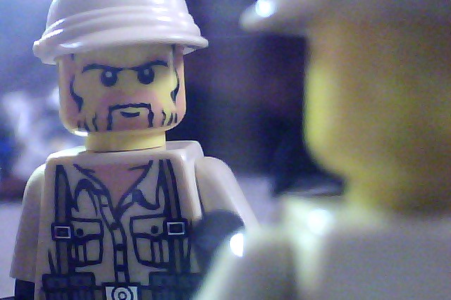
Test frame from a (hopefully) upcoming film/trailer.
https://farm1.staticflickr.com/653/22726614433_f7b40ef078_z.jpg

Now available to score films. https://soundcloud.com/guy-commanderson

"Contrary to the old saying, the trick is not to expect but accept the unexpec..." ~ Rick Rascal

Re: Critique My Frame!

Thats a nice picture If I Were A Minifig,

Noticing the frame, the characters face is rather blurred and not sharp, but its not that bad in my opinion.
I'm assuming your using a webcam and that you have used digital zoom for the photo.

I love the way you've set up this shot, i'm currently studying photography and film and this is what we call a dirty shot. I like it a lot man, good job mini/smile

Sincerely,
Divine.

RELEASED! Check out my channel to watch it!
Check out my Youtube Channel New Vid every week: https://www.youtube.com/channel/UCy5NKN … 7cRn8gsNaw

Re: Critique My Frame!

Thanks for the input! I didn't know that term, "dirty shot."
Unfortunately, the bullrings just from the terrible quality of my webcam. It doesn't have a brand name, and it, sadly, certainly doesn't have zoom of any kind. I should get a new one, butI'm so undedicated as an actual brickfilmer that I don't know that it'd be worth it.

Now available to score films. https://soundcloud.com/guy-commanderson

"Contrary to the old saying, the trick is not to expect but accept the unexpec..." ~ Rick Rascal

Re: Critique My Frame!

Here's a frame from my next brickfilm, Lego Shakin Stevens - Merry Christmas Everyone.
https://scontent-lhr3-1.xx.fbcdn.net/hphotos-xfp1/v/t1.0-9/12345458_718457811589458_6497997976105588751_n.png?oh=dffe884677c15969ca977555f376e0d6&oe=57222F8D

Re: Critique My Frame!

If I were A minifig,

No worries bro mini/smile Yeah I know what you mean when you say you don't get enough motivation, it happens to me a lot. For me its lack of story and outline of the actual set. However you should consider collaborating would make life soo much easier and more fun, and its a great motivation tool to help you animate more often!

William Osborne,
The pic doesn't look all so bad, however I do question what is going on in this scene, I assume they may be in some kind of boat or canoe? There is a few issues I will mention, one your main character is still blurred and not very sharp, your first character in the shot should either be more in the frame or cut out of the frame all together. Of course if this isn't going in the main film thats a different story. I would recommend you check out the rule of thirds. Don't worry I even make this mistake, But I notice it better in other people.

Otherwise I do like the decal shirt of the guy.

Sincerely,
Divine.

RELEASED! Check out my channel to watch it!
Check out my Youtube Channel New Vid every week: https://www.youtube.com/channel/UCy5NKN … 7cRn8gsNaw

Re: Critique My Frame!

Divine
They're on a horse slay. I know the frame is slightly out of focus, the fact is that my webcam, like If I Were A Minifig's, isn't a hugely expensive one. It came with my film-making software and isn't fantastic. However, this is my final film using this camera, because I'm getting the C920 which will make a world of difference.

Re: Critique My Frame!

William Osborne wrote:

They're on a horse slay.

Ah, nice to see somebody taking a literal interpretation of the lyrics in their video for once. Too many abstract versions of this song!

"every day I feel more pleased that sigging isn't a thing anymore" - Squash
YOUTUBE | Will voice act, ping me in the discord.
03:52    Smeagol    I should send girls turds in a box
01:28    Smeagol    That signature leaves me wondering if I should be sending more girls more turds in boxes than I presently am