Re: Critique My Frame!

osomstudios wrote:

The first one looks like your white balance might be of. As for the second shot it looks really nice. The harsher lighting is usually accomplished by upping the contrast in post/using un defused lights. You usually want to keep your contrast a bit lower while filming though.

I disagree. Harsh lighting does not mean boosting the contrast in post. Movies shot on film had lower contrast, yet were still able to achieve harsh lighting. Yes, taking the paper off the lamps to make them not-diffused does help, but the thing that really makes lighting harsh is the in-camera contrast. The difference between white and black, and light and dark. Using only one lamp and avoiding any fill-lights or fill-material helps create that harsh effect.

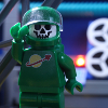
As for that night-time frame, it looks fine, a bit too dark IMO. I don't think it needs to be bluer. Night does not automatically mean blue light. It's only our eyes that makes night look blue. Since moonlight is white, I usually like to light my scenes with more white light at night, with only a slight blue.

However, I do think that some distant light source would be good to have. It looks like he is in a dark alley, or on the street in a city. If so, I would put a light in the distance, not necessarily pointing towards the character. Think of this light as maybe a street-light or a parked car.

YouTubeWebsite
https://bricksafe.com/files/rioforce/internet-images/RioforceBiMSig.png
"Whatever you do, do all to the glory of God." - 1 Corinthians 10:31b

Re: Critique My Frame!

If you look at most things about getting a filmic look they will say to set your contrast almost all the way down [with a DSLR, you don't want to set it all the way down on a webcam] because film has a very washed out look [I believe but I might be wrong]. As for using only one lamp I completely agree. Thanks for mentioning that.

This world is a dark place. One day I will see my Savior face to face.
My Youtube

Re: Critique My Frame!

Thank you everyone from your immense feedback!  It is greatly appreciated!  Now, I simply need to apply these practices tomorrow when I have the time.  I'm super excited!

YouTube | I'm making music now. Have a listen. | Website

Currently on hiatus from making my own brickfilms. In the process of learning music production techniques.
Need a voice actor? Hit me up.

Re: Critique My Frame!

Hey all,

There haven't been a whole lot of posts here lately, so I figured I'd throw this frame out there and hear someone else's two cents on it. Basically, I'm interested on what you think of the angle and lighting. Thanks in advance! mini/wink

http://bricksafe.com/files/Brickcrazy/Minifigs/Vega%20Zyro/Vega1.jpg

YouTube  |  Flickr  |  Twitter

Re: Critique My Frame!

Brickcrazy wrote:

Basically, I'm interested on what you think of the angle and lighting. Thanks in advance! mini/wink

Personally, I'd prefer a bit more of a tilt on that dutch angle, and, if you pulled the camera a bit closer, it might give the shot a little more emotion/intensity. I like it when directors, especially Brickfilmers, try to push their camera angles to the fullest for the greatest dramatic effect. Though, neither of these issues are a big problem. The angle of the tilt should match the emotion of the scene, and, if you pull in too close, the shot could add a bit too much suspense in a "looking over the shoulder" shot - especially if it doesn't match the mood and pace of the rest of the scene.

Other than that, your framing is truly inspired. The metallic door, electronic button, and oxygen tank all deserve attention within the shot (I assume) and nothing seems to be left out. It's interesting enough of a shot to grab my attention. I look forward to seeing a shot like this within the final film, Brickcrazy! Keep up the good work! The lighting and focus are great, especially for an enclosed metallic space as the shot appears to replicate.

https://i.imgur.com/Z8VtGae.png

Re: Critique My Frame!

Somehow, I feel like the slant should be a left slant rather than a right slant.  Of course, this depends upon the context.  Right now it looks like space lady just heard a creepy loud thud when she is supposed to be alone on a spaceship, in which case it does very well for dramatic effect.  It also depends upon what there previous shot was.

I usually go alternate betwixt left slants and right slants, always trying very hard to never have two of the same slant in a row.  But if the previous shot was not slanted, then that wouldn't really be relevant.

Re: Critique My Frame!

its less a frame and more a bunch of them, what are you peoples thoughts on these?
https://www.youtube.com/watch?v=oNaMgLv0cMA

Re: Critique My Frame!

Alright, several months ago I began a quick 30 second short based on "The Hobbit." It was a Lego (somewhat comical) version of Bard killing Smaug. I tell people I am still making it, but I haven't touched it till today. Yeah..... I originally stopped because my laptop couldn't take the heavy effects. However, I would like opinions on the frame from a shot that was rendered out.

https://lh3.googleusercontent.com/kFx153t0MwKD0XlC3HtprV31rkIddgXDOU_QjSIMXg=w1081-h608-no


This may get finished, but probably not for a while. mini/smile

Re: Critique My Frame!

This shot is amazing.

https://c1.staticflickr.com/1/341/32154997096_f26d8af45e_o.jpg

Re: Critique My Frame!

Great composition, and really nice colour harmony throughout.

Re: Critique My Frame!

I love the shot, it looks great, but there are two issues that stick out.
First, the fact that the background is just one tower used over and over, and second, that there's no base, only a black floor/abyss-thing.

But you mention the laptop not being able to handle it, so fixing those issues seems out of the question right now.

Now, as has been said, the color scheme and composition look great.
And you may not notice the flaws if it's quick and in motion.

Re: Critique My Frame!

Pritchard Studios wrote:

And you may not notice the flaws if it's quick and in motion.

Each shot is like 2 seconds. Most of them you can't even see the water, which is badly colored. I never noticed it looked so black. As for the towers being repeated, I was hoping the short would be so quick that the average person not thinking about how it was made wouldn't notice it (I was not going to spend much time on this project).

Thanks for your opinion!

Re: Critique My Frame!

That looks pretty cool "Mosh". Heres a lighting test I did for my darkness and light entry 
http://i.imgur.com/qNcRMhh.jpg?1
I would love to know your guy's thoughts,critics on this. Note this does not have the final framing or bacround.

Thanks a ton guys
OsomStudios

Last edited by osomstudios (July 8, 2015 (11:45am))

This world is a dark place. One day I will see my Savior face to face.
My Youtube

Re: Critique My Frame!

You need to upload your image. Right now it is just stored on your computer's desktop. Imgur is a easy, free image hosting site and it doesn't even require a login.

Re: Critique My Frame!

Thanks a ton, I used that and it looks like its working. I should also mention that my onset lighting is hugely inspired by your frames you have ben posting.

This world is a dark place. One day I will see my Savior face to face.
My Youtube

Re: Critique My Frame!

@Osomstudios, I like the greenish light coming from the lampposts. Very cool.

Last edited by Willow Tree (July 9, 2015 (02:44pm))

Re: Critique My Frame!

I really like the lamp posts.

Re: Critique My Frame!

Lighting looks good, Osom! The framing is pretty good too, though the camera seems ever so slightly crooked (compare the tan top of the building to the edge of the frame).

Re: Critique My Frame!

Thanks guys! I'l definitely try to straighten it out.

This world is a dark place. One day I will see my Savior face to face.
My Youtube

Re: Critique My Frame!

It's a cool frame, Osom. As with all things in this thread, it depends on context we're missing from a still image, but I do feel like it would be nice to have more detail in the shadows if there are details to be seen, there. I think it's best to expose so that everything is visible (albeit dimly lit) in the shadows when possible, unless you have a very specific reason to shroud something in a shot or scene in total darkness.

http://i.imgur.com/wcmcdmf.png