Re: Critique My Frame!

Is that your final lighting? I feel like the set is lit too much for a dark scene. Darkening in post doesn't look good most of the time because it's unrealistic. Maybe you should move your green screen back, and light it separately. Moving it back would also help it not to cause so much reflection on the floor, which should make your chroma keying easier.

YouTubeWebsite
https://bricksafe.com/files/rioforce/internet-images/RioforceBiMSig.png
"Whatever you do, do all to the glory of God." - 1 Corinthians 10:31b

Re: Critique My Frame!

I dont think it's my final lighting, as I need to change the colour of the green screen I think. thank you for your feed back. I cant really move it back to much further as I would then be out of room, I'll try though. thanks guys!

Re: Critique My Frame!

I do prefer the lighter lighting.

Aka Fox
Youtube: My channel   Twitter: @animationantics
Best brick films: My selection

Re: Critique My Frame!

Here is a frame that I took last night. I was mainly focusing on lighting, set building, and blocking. I have no plans on using it for anything in particular (the set was built for an animation test) but I kinda liked how it turned out, so I thought I might as well post it here. mini/smile

http://bricksafe.com/files/Brickcrazy/Stop%20Motion%20Animation/Test50000.jpeg

YouTube  |  Flickr  |  Twitter

Re: Critique My Frame!

Kind of reminds me of my set with the trees and the cutout hills mini/tongue

I think the lighting is kind of harsh to me, but then again, all of the colors look kind of sharp (especially the red). I do like the brick wall though, it has a nice variation in it.

YouTubeWebsite
https://bricksafe.com/files/rioforce/internet-images/RioforceBiMSig.png
"Whatever you do, do all to the glory of God." - 1 Corinthians 10:31b

Re: Critique My Frame!

rioforce wrote:

Kind of reminds me of my set with the trees and the cutout hills mini/tongue

I was thinking the exact same thing. I also agree with Rioforce on the colours and the harsh lighting. I think maybe try position the lamps to get some small shadows on the lady to really convey the outdoor sun.

Re: Critique My Frame!

I agree with Rio, it's a bit bright and strong, but it's something that I could get used to in a longer film.
It could also work well in a film where everything is awesome, but one thing's not quite right and you can't quite put your finger on it. And that one thing is some evil presence/overlord thingie that must be defeated. It's interesting to note the near lack of shadows and the fairly even lighting for things being so bright, it gives it an unrealistic feel.
(But not in a bad way, in a fairy-tale kind of way.)

As for blocking, I'd put her slightly more toward the center of the frame. My eye seems to be drawn more the the white flowers in the back, rather than the figure in the front, and that slight position change should help.

The set is great. I love the blocky trees, and there's a nice sense of less is more in the simple designs and bright colors.

Re: Critique My Frame!

rioforce wrote:

Kind of reminds me of my set with the trees and the cutout hills mini/tongue

There is a simple reason for that: I blatantly copied you! mini/lol

The way I see it, if someone does something that works really well, emulate it. I hope you don't mind the fact that I did so. Consider it a compliment! mini/wink To give myself some form of justification, I used round trunks as opposed to square ones... mini/tongue

Prichard Studios wrote:

It's interesting to note the near lack of shadows and the fairly even lighting for things being so bright, it gives it an unrealistic feel. (But not in a bad way, in a fairy-tale kind of way.)

I was kinda going for a bright cartoony/fairy-tail look, so I guess that worked. As to the blocking, blame rioforce and his lesson on the rule of thirds...

I'll mess with the setup a little more later. Thanks for the input all!

YouTube  |  Flickr  |  Twitter

Re: Critique My Frame!

Brickcrazy wrote:

blame rioforce and his lesson on the rule of thirds...


Blame rio, haha! mini/lol  mini/tongue

"Bless you for making this." -Sloth 2016 * on "Chicken Shaped Lighthouse Attacks Police"
http://bricksafe.com/files/harborlightpro/400x100%20BRICKSINMOTON%20PIC%202.jpg
Ephesians 4:29 -"Let no corrupt word proceed out of your mouth, but what is good for necessary edification, that it may impart grace to the hearers."

Re: Critique My Frame!

See, though, your frame doesn't actually follow the Rule of Thirds. For it to work, the character's CENTER should be bisected by the first vertical line, not be entirely positioned in the left third of the frame.

Take for example this picture of a puppy:

http://static1.squarespace.com/static/52923541e4b03e7a07297095/t/52cb9ec2e4b01b31ddfb3686/1389076163468/rule-of-thirds-grid.jpg

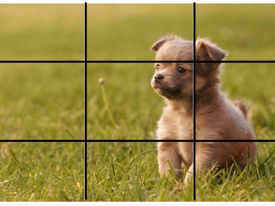
The puppy isn't in the right third of the frame, it's located in the dividing line between the middle third and right third. This generally is more pleasing to the eye. Now, if you wanted to achieve a feeling of unease, breaking the Rule of Thirds is a great way to do this.

If you want your frame to be more pleasing and put the viewer at ease, I'd move your character just one stud over to the right.

Also, keep in mind all creative/artistic "rules" can be broken, but only should be broken once you have a purpose for breaking them, and you actually understand why it was "rule" in the first place.

Re: Critique My Frame!

Nathan Wells,

Oh, OK. I see now. Like I said, I'll play around with it some more.

YouTube  |  Flickr  |  Twitter

Re: Critique My Frame!

What Nathan just clarified (that the rule of thirds is about centering elements along the 1/3 lines, not lumping things into the 9 parts of the grid) is something I didn't understand for many years. It makes a huge difference in composing shots!

http://i.imgur.com/wcmcdmf.png

Re: Critique My Frame!

I think if you moved your character one space forward and one space to the left it would be counted as using the rule of thirds.

"Bless you for making this." -Sloth 2016 * on "Chicken Shaped Lighthouse Attacks Police"
http://bricksafe.com/files/harborlightpro/400x100%20BRICKSINMOTON%20PIC%202.jpg
Ephesians 4:29 -"Let no corrupt word proceed out of your mouth, but what is good for necessary edification, that it may impart grace to the hearers."

Re: Critique My Frame!

Lighting and blocking wise, is this an improvement???

http://bricksafe.com/files/Brickcrazy/Stop%20Motion%20Animation/Test80000.jpeg

YouTube  |  Flickr  |  Twitter

Re: Critique My Frame!

Brickcrazy wrote:
rioforce wrote:

Kind of reminds me of my set with the trees and the cutout hills mini/tongue

There is a simple reason for that: I blatantly copied you! mini/lol

The way I see it, if someone does something that works really well, emulate it. I hope you don't mind the fact that I did so. Consider it a compliment! mini/wink To give myself some form of justification, I used round trunks as opposed to square ones... mini/tongue

Haha, no worries. mini/wink

...blame rioforce and his lesson on the rule of thirds...

Yea, go ahead and blame the teacher... I tried to teach you, but all you ever did was chew gum and daydream in class... mini/lol

---

The lighting does look better, though, the framing is still not perfect. You can't always just move a character a LEGO stud to get it on a third. Moving the camera may help.

Here's a quick example of better framing (done by cropping, but it's better to do it in-camera).

http://i.imgur.com/eEMFdyS.jpg

YouTubeWebsite
https://bricksafe.com/files/rioforce/internet-images/RioforceBiMSig.png
"Whatever you do, do all to the glory of God." - 1 Corinthians 10:31b

Re: Critique My Frame!

It doesn't have to be exactly on a third line, let's not get carried away with the strictness of the rules here. I think the character is in a good position, but it would help the framing even more (as an additional rule of thumb for using the Rule of Thirds) if you put a tree on the third line opposing the character. Also the flowers in the foreground should be moved, varied in their placement a little bit.

"I wear black even when I'm not animating. I'm like a walking funeral parlor."
-PushOverProductions

Re: Critique My Frame!

Legocloniac477 wrote:

It doesn't have to be exactly on a third line, let's not get carried away with the strictness of the rules here. I think the character is in a good position, but it would help the framing even more (as an additional rule of thumb for using the Rule of Thirds) if you put a tree on the third line opposing the character. Also the flowers in the foreground should be moved, varied in their placement a little bit.

I disagree. Not that the rules should not be broken at any time, but to make a visually appealing image, following the rule of thirds is a must. There are times to not follow the rule of thirds, but this is not one of those times.

Putting a tree on the other side to "balance" it is not necessary, though. In my personal opinion, it looks better without something "balancing" it or crowding it. For example:

https://upload.wikimedia.org/wikipedia/commons/c/ce/Rivertree_thirds_md.gif
(There's nothing offsetting that tree in the picture)

I don't know why you would want to move the flowers. Pretend this was real life and the only thing you could move was the character and camera. You can't go around adding trees and moving flowers to get the perfect shot. Of course, these are just my personal opinions.

YouTubeWebsite
https://bricksafe.com/files/rioforce/internet-images/RioforceBiMSig.png
"Whatever you do, do all to the glory of God." - 1 Corinthians 10:31b

Re: Critique My Frame!

Yep, Rio highlights it perfectly. However, I'd like to point out that I wouldn't frame a shot this particular way, because the feet of the figure almost touch the frame. I'd rather cut off the feet, or back the camera up so more ground is shown. This is me being very picky, though.

Re: Critique My Frame!

Brickcrazy wrote:

Lighting and blocking wise, is this an improvement???

http://bricksafe.com/files/Brickcrazy/Stop%20Motion%20Animation/Test80000.jpeg

While it doesn't follow the thirds rule entirely, I think this is the best composition of this character in the shot so far. I don't think the Rule of Thirds is something that needs to be strictly followed for every shot; if this shot were composed adhering to the thirds, I think there would be a whole lot of unnecessary negative space on the right side of the frame. As it is there, there's a nice balance to the shot.

Re: Critique My Frame!

Well, based on everyone's suggestions, here is one last attempt. I feel like I'm trying to chase perfection here, which is rather silly, considering how I'm not planning to use this shot for anything. Nevertheless, I've learned a few things from this discussion, and that's what really matters. Thanks all! mini/smile

http://bricksafe.com/files/Brickcrazy/Stop%20Motion%20Animation/Hair20000.jpeg

YouTube  |  Flickr  |  Twitter