

Note: These days, community activity has largely moved to the BiM Discord. Join us!
We are a friendly filmmaking community devoted to the art of stop-motion animation using LEGO® and similar construction toys. Here, you can share your work, join our community of other brickfilmers, and participate in periodic animation contests!
A place to discuss, share, and create stop motion films.
Ad
You are not logged in. Please login or register.


Putting a tree on the other side to "balance" it is not necessary, though. In my personal opinion, it looks better without something "balancing" it or crowding it.
The way it was framed looked empty. There was too much space between the character and tree on the edge of the frame. I think the way it has been changed looks much better because it isn't just empty space. My eyes aren't bored looking at it.
I don't know why you would want to move the flowers. Pretend this was real life and the only thing you could move was the character and camera. You can't go around adding trees and moving flowers to get the perfect shot. Of course, these are just my personal opinions.
Okay let's pretend this is real life, no two flower plants would ever be perfectly in line with each other. But then let's come back to the true reality of this: the artist has ultimate control over the scene. This isn't real life. If it makes it look better, do it. I think it looked odd the way it was. He changed it, and hey! It looks better!

Wow Brickcrazy, the framing in that last picture looks significantly better.


Only thing I have to add to this discussion is that it's hard to critique framing for one shot on its own like this. You've switched from a wide-ish / mid type shot to a mid-closeup. It's a more dynamic shot (though I would tilt the camera down such that her eyes are on the top one-third line if we're trying to be textbook here) but perhaps in the context of the story and other shots around it, the wider framing would have made more sense, I don't know.
For instance, I could post this still from my new film here and folks might say "there's not enough room in front of the way the figure is facing!" or that he's awkwardly shrunk down in the corner of the frame. That's all deliberate and flows with the shots around it, so trying to arrive at perfect textbook framing for a still in isolation isn't always constructive.
It *is* however, very worthwhile to understand what the conventions and "rules" are so that you can use them most of the time, and only break them if you have a purpose behind it. Heck, even my sample image follows the rule of thirds pretty closely.


rioforce wrote:I don't know why you would want to move the flowers. Pretend this was real life and the only thing you could move was the character and camera. You can't go around adding trees and moving flowers to get the perfect shot. Of course, these are just my personal opinions.
Okay let's pretend this is real life, no two flower plants would ever be perfectly in line with each other. But then let's come back to the true reality of this: the artist has ultimate control over the scene. This isn't real life. If it makes it look better, do it. I think it looked odd the way it was. He changed it, and hey! It looks better!
Truth. Honestly on of the reasons I like stop motion is you CAN control everything in the frame, go watch Hitchcock's The Trouble With Harry, every set in that film was built on a sound stage and it looks great, every thing placed in the frame was deliberate. I can't afford to build a bunch of sets on a sound stage and live action with the limited control I have over it is just not as appealing. Watch Hitchcock, watch Kubrick and see how directors who are very dilibret in everything you see in frame affects storytelling.

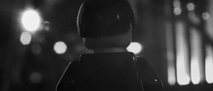
So, I guess I should post this here: 
with my new 7D mark ii.![]()

I like it a lot.
The only thing I really think might be changed before filming is to tilt the camera ever so slightly more, that or level it.
ok, I'll bear that in mind thank you. yeah, its been ages since I have had time to animate, its awesome to get back into it.
Awesome frame. I can't wait to see this animated.
The only thing I really think might be changed before filming is to tilt the camera ever so slightly more, that or level it.
Personally, I like the frame at it's current tilt. The scene doesn't call for a dutch angle, nor does it call for a straight line. Since the shot is from behind a wall, it makes it look like it is a hidden camera, meaning, it is probably a handheld camera, meaning that the lines are not all straight. Of course, this is just an initial observation.

I didn't notice the hand until the second time I looked at the frame, that's really nice. Personally I think it should be straightened out, but I also really like straight lines and right angles, so I'm biased.
thank you guys, I didnt notice the slight tilt actually, but will be adding in some killer Dutch angles in the next scene. what do you think of the color grading?
The blacks feel a bit close to being crushed, you might want to lighten them just a little bit; that's something I've noticed with a lot of your work.
Last edited by backyardlegos (March 25, 2015 (01:07pm))
guess im just a fan of the darkness. ![]()
this better?:

I prefer the old.
This new one looks artificially brightened, and the old one's darkness gave it a nice mysterious air.
I also love darker frames, but have been blamed for going too dark on more than one occasion, so take my opinion with a grain of salt.
P. S. Did you know that Facebook likes to mess with brightness and contrast? And heavily compresses anything uploaded?
Meaning what we see here isn't quite what it truly looks like.
I like the brighter one. I like how the blacks are not so black. It gives it a look as if there is a small bit of light coming in from some other place (like a window behind the camera). I like the lower contrast look too.
I like the newer version as well, it feels more natural. The thing about grading though, is that as long as everyone can see what's happening in the shot, it's really all a matter of personal preference and the style of film.

The last one has the perfect lighting. The shadows and colors are very realistic and he kitchen set is pretty cool. Good shot!

That's a really nice shot.
Personally, I prefer the older one. To me it feels a lot like a cold, gloomy day, with weak sunlight struggling to filter through the heavy clouds, and has a washed-out grey feeling that goes really well with the ghostly hand. It helps make the atmosphere seem more dark and uninviting. Of course, it really depends on what effect you're going for, if you want to make it feel more naturalistic or less foreboding I'd go with the second.
Also, blacks getting crushed is, apparently, a fairly common feature of old film cameras, so if a shot is being colour-graded to give it a filmic look, this sort of an effect with often be applied. At least, that's what I've heard, I haven't really done much colour grading myself so I wouldn't know for sure.

I am currently on the 4th scene of my current project. (It has nothing to do with the Easter competition, really) This is a dolly like shot with a frame like this at the end of the camera movement. How does it look?

If you want the person on the horse to look powerful and in charge, you should lower the camera so it is looking UP at the person.
Posts [ 221 to 240 of 597 ]


