Re: Critique My Frame!

Besides what was already mentioned (the sky, the tree, the background), I would recommend making the camera angle lower. A high camera angle makes things look like they are being recorded on a security camera, instead of the audience feeling like they are in the film, feeling the emotions of the characters.

As for the hills that Harborlight mentioned, I think something like this is what he is referring to:

http://www.bricksinmotion.com/forums/po … 8/#p340738

I look forward to seeing your updated version of the frame. mini/smile

YouTubeWebsite
https://bricksafe.com/files/rioforce/internet-images/RioforceBiMSig.png
"Whatever you do, do all to the glory of God." - 1 Corinthians 10:31b

Re: Critique My Frame!

I thought you were doing the mafia story.  Try not to spread out too thin!

https://vimeo.com/channels/holdingourown      http://holding-our-own.tumblr.com

"None practice tolerance less frequently than those who most loudly preach it."

Re: Critique My Frame!

@Troodon,
Thanks for your feedback. I think you are deffs right in regards to the ground being too flat. I'll add some flowers and rough it out a bit with some stones/logs etc.
I gotta say you are definitely right about the palm tree being out of place mini/lol I don't know what I was thinking.

@Rioforce,
I have taken your advice in regards to the camera angle being lower, it was just the way I had to rig setup I am excited to see what it will look like when I next take the frame! Thanks for the hill suggestion I did see that before and thought it was truly a brilliant idea I'll see what I can come up with.

I look forward to seeing your updated version of the frame.

I as well mini/smile Hopefully it'll be an improvement.

@HoldingOurOwn, Hey bud. I still am doing it, but I have put it aside now for this project. I do agree 100% with you in regards to not spreading into several projects, but while I was resting this idea came into my mind and I just had to use it! Also from time to time I really like to switch into different ages, medieval has been one on my mind for quite a while! But the mafia story will arise again mini/smile

Thanks for your feedback guys!

Sincerely,
Divine.

RELEASED! Check out my channel to watch it!
Check out my Youtube Channel New Vid every week: https://www.youtube.com/channel/UCy5NKN … 7cRn8gsNaw

Re: Critique My Frame!

So I've taken your advice from several people.

Al thought its not finished its more of a work in progress. (I actually finished this scene the way the setup was previously. But deffs learned some great things from the great advice given that will be implemented in the future scenes/films.

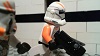
@Harborlight Productions: I have made some attempt to fix up the blue background with adding hills, for the side green baseplate's I really do dislike it, but I have no blue cardboard at the moment to fix that issue, when I do it will be removed. This scene, was more a talk with the king and a knight.

@Troodon, althought it looks terrible I did attempt the ground with adding in texture, I am not currently at my place to have all the parts accessible, of course this would be replaced with brown, to add for logs and stuff. I have so many flowers but again not with me.. Palm tree is out lol. (The big one).

@Rioforce, the camera has been lowered it is so weird for me as I was use to shooting above the characters, but I am excited to try the new setup thanks for the advice! Also I made the hills although their not the best, it is something I'd like to use later on.

http://i61.tinypic.com/s6hzqp.jpg

Sincerely,
Divine.

RELEASED! Check out my channel to watch it!
Check out my Youtube Channel New Vid every week: https://www.youtube.com/channel/UCy5NKN … 7cRn8gsNaw

Re: Critique My Frame!

Those hills are definitely an improvement. If you can I would replace those hills with LEGO hills to give it a more bricky feel. That's only if you have the pieces ofcourse, if you don't it will still be fine.

There are also spaces with no trees at all, so it doesn't feel the most like a forest. If you don't have enough pieces to make it bigger, you could make the shot smaller and bunch the trees up in the front, and the right side of the set.

"Bless you for making this." -Sloth 2016 * on "Chicken Shaped Lighthouse Attacks Police"
http://bricksafe.com/files/harborlightpro/400x100%20BRICKSINMOTON%20PIC%202.jpg
Ephesians 4:29 -"Let no corrupt word proceed out of your mouth, but what is good for necessary edification, that it may impart grace to the hearers."

Re: Critique My Frame!

Hey Harbor,
Glad its an improvement, truthfully I have a lot more trees, I am not sure how I didn't notice that space.. I think its because I thought image would be smaller anyhow I have redone it!

I took two different shots here.

I hope this is much more of an improvement.
http://i57.tinypic.com/5otmo9.jpg
http://i60.tinypic.com/316kkti.jpg

RELEASED! Check out my channel to watch it!
Check out my Youtube Channel New Vid every week: https://www.youtube.com/channel/UCy5NKN … 7cRn8gsNaw

Re: Critique My Frame!

Personally, I think that looks a lot better! mini/yes

YouTube  |  Flickr  |  Twitter

Re: Critique My Frame!

Looking a lot better! One more thing. I would add some more trees closer to the characters to make the forest look more dense. I see two open spaces. I know I'm being a little picky here, I'm just trying to help! mini/tongue

"Bless you for making this." -Sloth 2016 * on "Chicken Shaped Lighthouse Attacks Police"
http://bricksafe.com/files/harborlightpro/400x100%20BRICKSINMOTON%20PIC%202.jpg
Ephesians 4:29 -"Let no corrupt word proceed out of your mouth, but what is good for necessary edification, that it may impart grace to the hearers."

Re: Critique My Frame!

It's looking better!

On the picture in your first post you could bring the camera a bit closer, and even out the spacing of the characters. They are all over here on the right side of the screen, when they could be evened out with one on the right, and one on the left (though, remember the rule of thirds when framing.

The second picture you posted is nice, I like it. Can't think of anything that really needs to be done to it. mini/smile

YouTubeWebsite
https://bricksafe.com/files/rioforce/internet-images/RioforceBiMSig.png
"Whatever you do, do all to the glory of God." - 1 Corinthians 10:31b

Re: Critique My Frame!

Divine, its a huge improvement!
Since I'm guessing this is a "short" forest, there would be some flowers/grass on the ground (due to more sunlight), but other than that it's really good!

Re: Critique My Frame!

Thanks for the great feedback guys its much appreciated, and thank you for the great tips allowing me to improve the frame! I am very happy with the result.

@Harborlight Productions, Ha ha I did think about that myself, I will look at improving that! Its just so hard to animate when you have trees right next to your figure haha!

@rioforce, I agree it could be a lot closer, the rule of thirds always escapes me when animating ha ha. But it really is a strong principle in filming which hopefully I'll make more use of. Thanks I am glad you like it!

@Troodan, thanks man! Yes I will indeed be putting in a lot more flower and grass (I have tons of it, just didn't have it vacant with me at the time).

Sincerely,
Divine.

RELEASED! Check out my channel to watch it!
Check out my Youtube Channel New Vid every week: https://www.youtube.com/channel/UCy5NKN … 7cRn8gsNaw

Re: Critique My Frame!

Here's a frame from Unavailable.

http://i.imgur.com/4245zN4.jpg


I would go deep focus if I could, but alas, webcams don't have adjustable apertures.

Re: Critique My Frame!

Looks very nice. I like the fish-eye effect. It reminds me of those old hidden cameras, if that is what you are going for.

Re: Critique My Frame!

Is this a tracking shot, or a locked down shot? If it's tracking I don't have a problem with the framing, but it it's locked down I think your placement of the light pole could be better. It's a bit distracting that it's not quite in the center, but also not quite in a third of the frame. I'd shift the camera to the left a bit so the pole is in the right of the frame. Also, as the brightest object in the frame, my eyes are drawn to the pole instead of any character.

Re: Critique My Frame!

Hmm, originally this was going to be a locked down shot with a vertical pan at the end, but I could see it looking better as a tracking shot. You're right about the light-pole's location in the frame. I'll see if it looks better if placed in another area on the sidewalk (the character walks up that staircase, I don't want anything obstructing that)

Re: Critique My Frame!

This is nothing special and quite ordinary and for that reason alone I need to put in more effort to make it interesting!

http://imgur.com/LXJ0WcF
(y no image show?)

http://imgur.com/LXJ0WcF

It's a dialogue scene.  Static camera.  Robot off to the left doing background things (though not really in the bground).

More interested in thoughts on camera positioning, lighting and set.  Cheers.

Last edited by togfox (February 25, 2015 (05:30am))

Aka Fox
Youtube: My channel   Twitter: @animationantics
Best brick films: My selection

Re: Critique My Frame!

I think the angle, set and lighting is fine. Try get a bigger depth between the robot and the main character to allow for a more interesting shot. Do this by making the set a little bigger and pulling the main character forward while pushing the background further away.

Re: Critique My Frame!

Not bad, but it looks a little unbalanced. I would rotate the camera left a bit to even out the space on each side of the frame (because the frame looks "heavy" and crowded on the left but empty on the right).

YouTubeWebsite
https://bricksafe.com/files/rioforce/internet-images/RioforceBiMSig.png
"Whatever you do, do all to the glory of God." - 1 Corinthians 10:31b

Re: Critique My Frame!

Divine, everyone says your pic looks divine, but I think it's a bit overexposed, otherwise great!

Indy, I love the fish eye effect plus the B&W and the set (pet store) all in one shot!

Togfox, I am so excited about this picture!  Is that the robot you've chosen?  It is very cool!  (Not that I didn't love the floating one, either!)  A little to the left, is the only suggestion I have.

https://vimeo.com/channels/holdingourown      http://holding-our-own.tumblr.com

"None practice tolerance less frequently than those who most loudly preach it."

Re: Critique My Frame!

HOO, I can assure you they are not calling the pic divine, rather by my name on here which is Divine haha but thanks man! mini/smile

RELEASED! Check out my channel to watch it!
Check out my Youtube Channel New Vid every week: https://www.youtube.com/channel/UCy5NKN … 7cRn8gsNaw