
Re: Critique My Frame!
That's a whole lot nicer!
-Squid | Twitter | Welcome to Darkmoor
We are a friendly filmmaking community devoted to the art of stop-motion animation using LEGO® and similar construction toys. Here, you can share your work, join our community of other brickfilmers, and participate in periodic animation contests!
A place to discuss, share, and create stop motion films.

Ad
You are not logged in. Please login or register.

That's a whole lot nicer!

Night is also usually around the same hue as daytime, and is not actually particularly blue, as has been said.
The color of the light is not significantly different, but in real life the perceived color is because of the Purkinje effect. For someone watching a film, this effect would only come into play if the viewer were in a dark environment, and the duration of the night shots was long enough for the eyes to adjust. It makes sense when you're making a brickfilm that will probably be short and watched in someone's decently lit bedroom to apply the effect to the film itself to emulate how the viewer would expect night to appear.
That's an interesting thing to know. Thanks!

I pretty much agree with consensus on what's been said, but that said, I think you could stand to brighten up the entire shot even though it is night. The important thing is to not have much fill light and rely on highlights from the sides, but you don't have to underexpose just because it's night -- ideally, your brightest areas in a night scene would still be somewhat close to white, for optimal contrast.


That looks way better. [Question: I'm taking a lot of test frames ones that probably won't be in a film can I post them here?]
Thanks
OsomStudios

Thanks for the critiques, guys. You all really helped me with this and I think the new backgrounds are going to look nice in a film. ![]()
I'm going to be working on some other backgrounds too (next up is a cityscape), so I'll post them here.
[Question: I'm taking a lot of test frames ones that probably won't be in a film can I post them here?]
Well, if you can't, then they should go ahead and ban me, because the frames I posted aren't going to be used in a film, they are just tests.

Go for it, Osomstudios! This thread is open to anyone who wants a critique.
This frame is technically from an actual shot from my film, however, the WIP nature of it is the editing that I'm doing to it, and I would appreciate some feedback upon that long before I finalize anything. I hope I am not amiss in posting it here.
First off, here is the edited frame, it is not the final edit probably, and I might change it based off of what people think of it:
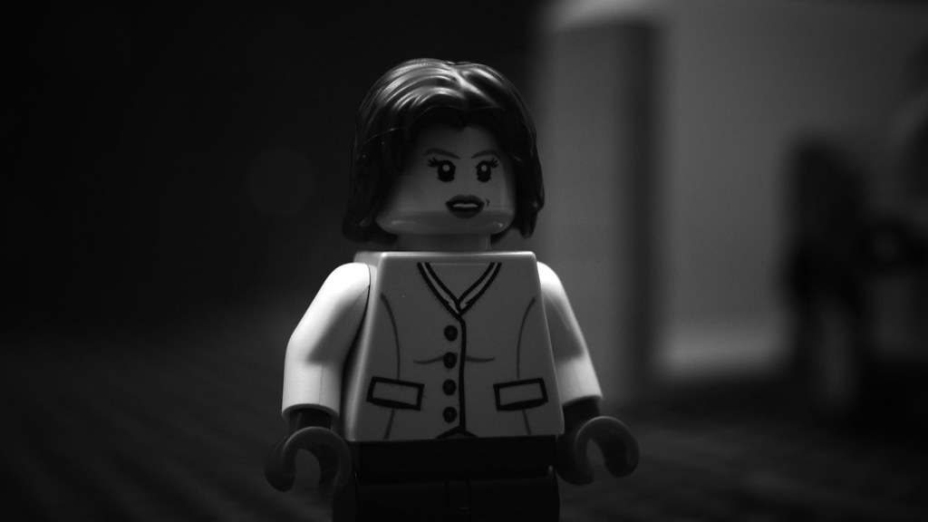
I've tried increasing the contrast and brightening the middle of the frame whilst darkening the edges slightly. I've seen in some old movies and old pictures that there is sometimes a a dark border at the edges of the frame and I wanted to try to emulate that somewhat. However, I'm not going entirely for an old movie look, as I'm using a 16:9 aspect ratio and will make no attempt to add the "old film look" with the black lines and such. But I want to have a kinda happy medium that looks old and looks nice.
Here is the original version of the frame:
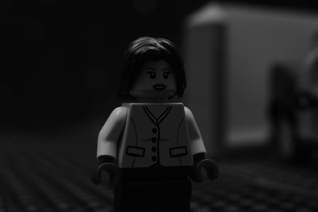
I intentionally filmed it with very soft lighting with very little contrast since I wanted most of the contrast to be added artificially. I've noticed in a lot of old films that the film used sometimes seem to make images have a very strong looking contrast that look to me more like it wasn't because of the original lighting.
For wider shots though I'll have the black edges pushed further to the edges of the frame. And for shots where the subject is to the far left or far right of the frame I'll shift the bright spot to wherever the subject is.
But what I'm wondering is do you guys think the edit should have more or less contrast? or should the edges be darker or lighter?

Very nice rio frame rio. I really like the start effect you created there.

I think the vignetting is good. (That is what you mean when you say "Making the edges darker", right?). I like how the character is brighter and more distinguishable. I can't say that anything needs to be changed, it looks quite nice.
I think your digitally edited frame is a great improvement to the original. I'd see if you could push the contrast even more, though, especially on her face. Right now the brightest thing in the frame is her shoulders and upper arms, and my eyes are drawn to them and away from her face, which generally is something you don't want when framing and lighting a shot when the subject is a person.
Good idea!

One thing to keep in mind for future shots like this, you can add white plates to bounce light back on the minfig, sometimes a few plates is all you need torder get that fill you need, you could also use aluminum foil.

I have my first commissioned job! My dad is giving a presentation at his work and wanted me to animate something for him. I was wondering if anyone has any tips or advice before I start animating.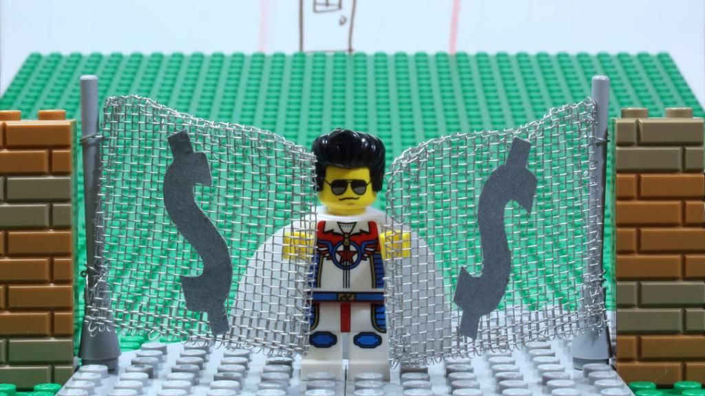
The building/piece of paper in the back ground is a placeholder. Also, I forgot about the 16:9 aspect ratio until after I took the picture, so I will be adjusting for that.
Here is a shot from a short I am working on.

The blue screen is not filled though.

Rivvm m
This seems pretty interesting. It took me a bit to figure out what the setting was, but I've got it now. I'm not quite sure about sloping the grass plate. It seems a tad off, but granted, that could be just me. (no pun intended:P ) Hope this turns out great!
Harbor:
I like it a lot! The closeup gives it an intimate sort of feel. Very cool. In my opinion, keying this in isn't all that necessary, as it looks very good as it is. Of course, the final outcome is up to you. Again, excellent. ![]()
Also Harbor, make sure to wait until the last frame has gained at least three comments before posting your own frame. Just an FYI. ![]()
-Grant
Last edited by GHB (January 31, 2015 (06:20pm))
@Rivvm m Looks cool, but the grass in the background looks strange. If you're trying to give the illusion of depth my using it, ten it didn't work. Also, you can see the edges of it which isn't appealing. May I ask what it is is I can critique it better?
@Harborlight I didn't know that was a bluescreen, I thought it was the sky. As I said in chat, the frame looks awesome and the framing is great (though, you posted a slightly different one in chat I realize).
Rivvm m
This seems pretty interesting. It took me a bit to figure out what the setting was, but I've got it now. I'm not quite sure about sloping the grass plate. It seems a tad off, but granted, that could be just me. (no pun intended:P ) Hope this turns out great!
Harbor:
I like it a lot! The closeup gives it an intimate sort of feel. Very cool. In my opinion, keying this in isn't all that necessary, as it looks very good as it is. Of course, the final outcome is up to you. Again, excellent.

Also Harbor, make sure to wait until the last frame has gained at least three comments before posting your own frame. Just an FYI.
-Grant
Thanks for the feedback! Yes, I will keep that in mind.
@Rivvm m Looks cool, but the grass in the background looks strange. If you're trying to give the illusion of depth my using it, ten it didn't work. Also, you can see the edges of it which isn't appealing. May I ask what it is is I can critique it better?
@Harborlight I didn't know that was a bluescreen, I thought it was the sky. As I said in chat, the frame looks awesome and the framing is great (though, you posted a slightly different one in chat I realize).
Yes the one I posted in chat was when I messed up. This is the final product after about 10 mess ups. ![]()
Here is an updated photo of the same scene.
@GHB & Rioforce, I agree with the green plate not looking the best. I removed the back plate to get rid of the line as well as to hide the edges.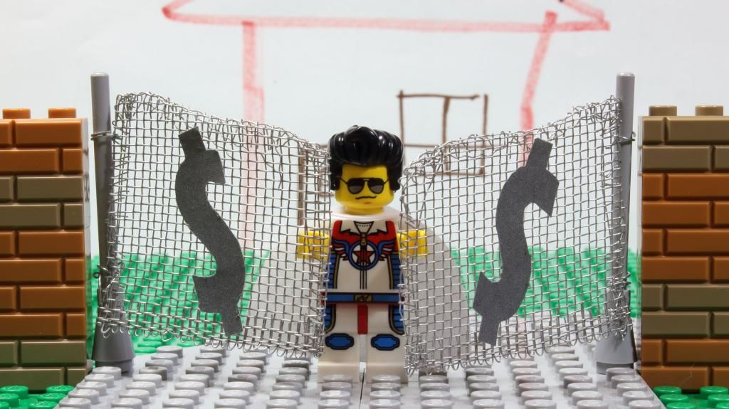
By the way, the set is an imitation of Graceland. (Elvis Presley's home)
Reference picture 1
Reference picture 2
P.S. @GHB I don't see any pun, but that could just be me. ![]()
Posts [ 21 to 40 of 597 ]


