Re: The Movie Poster Thread [Large Images]
Mickey wrote:
I guess I'm just behind the curb these days ![]()
We are a friendly filmmaking community devoted to the art of stop-motion animation using LEGO® and similar construction toys. Here, you can share your work, join our community of other brickfilmers, and participate in periodic animation contests!
A place to discuss, share, and create stop motion films.

You are not logged in. Please login or register.

I guess I'm just behind the curb these days ![]()

Here is a poster I made for my passion of christ video.

Pretty nice Funmi, however the title is a bit too small for a poster, and the cross seems to be green screened a bit weird.
Anyway, seeing Twickabrick's awesome poster made me want to make a rip-off poster for my film in the style of his.

Probably won't be my 'official' poster for the film seeing as it's just like Twickabrick's, I was just testing out my poster making skills.

Thanks, glad to know you're excited.
I just need to voice act and fine tune the script a little more then I'll begin actual production.
I honestly don't know, it won't be that long but it'll stick take a while to make seeing as I'm going to try and do a lot of experimenting with this film.

That poster is ridiculously awesome. ![]() I really like the red lighting. I do see how it looks like Twickabrick's, but if the movie is different in other aspects I think you might be able to use it (if Twickabrick is OK with it, of course). Alternatively, you might want to change the set-up a little, like redistributing the characters, to make it look different if you think it looks too similar. Or maybe just use the bottom half as the entire poster image. One other thing I might add is that I find the top part looks slightly off, as the characters look almost a bit too neatly lined up, but aside from that it's a great job.
I really like the red lighting. I do see how it looks like Twickabrick's, but if the movie is different in other aspects I think you might be able to use it (if Twickabrick is OK with it, of course). Alternatively, you might want to change the set-up a little, like redistributing the characters, to make it look different if you think it looks too similar. Or maybe just use the bottom half as the entire poster image. One other thing I might add is that I find the top part looks slightly off, as the characters look almost a bit too neatly lined up, but aside from that it's a great job.
Thanks, don't worry, the film should be very different from Jurassic Floor, as said it's a sequel to my THAC film that doesn't involve dinosaurs or stupid kids I guess.
Also I'm not exactly sure what you mean when you say they look to neatly lined up.
![]() omg! This poster made me faint. Awesome. Can't wait for the film!
omg! This poster made me faint. Awesome. Can't wait for the film!

Squeeeee!!!! ![]()
Anyway, I echo Spider's question, as I was looking forward to Gray Latitude quite a bit.
I see that you rotated the bottom image, but forgot to flip it, so the 'mirror' effect is a bit off.
(Tall skinny building on the left in the top, and on the right on the bottom.)
But that minor mistake may in intentional, and even if not, it hardly detracts from that amazing poster.
The clarity of the image, the amazing effects, the great color differences, and....and.....and...
Well, I'd better quit before I explode, but I can't wait to see more on this.

That looks really cool. I love the background and the brick-built title. Did you physically build it? or are the letters computer generated? Either way, I want to do that whenever I make a poster for Bogeylanders.
Though, the one thing that could have made this better would be to spend a little bit of time on editing the dust off of the man in black. It shows up rather well on his outfit.


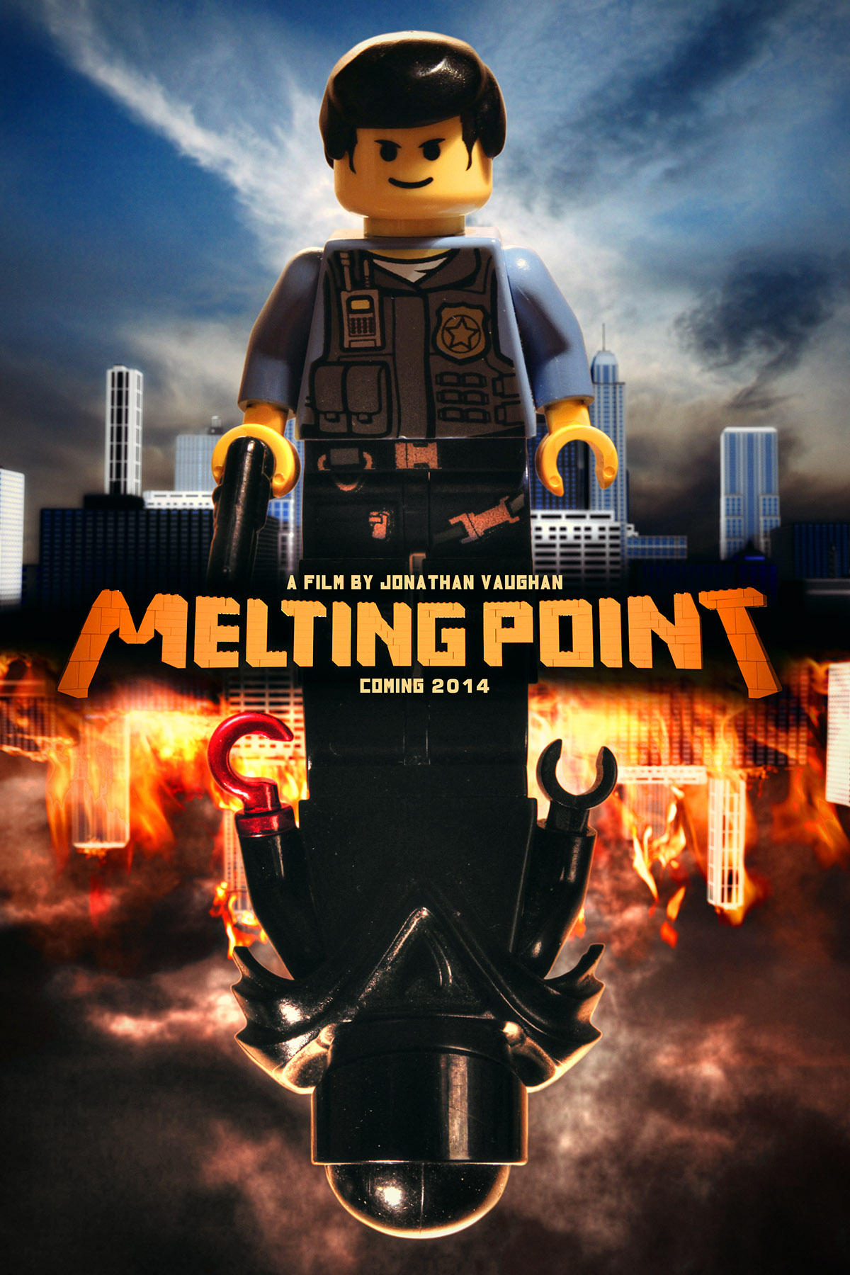
A poster for my new film, made by Anthony White
Watch it here (Directory Link)
Last edited by Saminatorger (May 23, 2013 (06:32am))
@Nick Durron:
![]() Amazing! I can't wait for this.
Amazing! I can't wait for this.

Wow Nick, I love your poster. The logo being brick-built is a great touch!


Thanks guys!
On another note, what ever happened to Gray Latitude? Cancelled or simply further out in the future?
Gray Latitude was cancelled. I've considered releasing what I have completed of it, though.
I see that you rotated the bottom image, but forgot to flip it, so the 'mirror' effect is a bit off.
(Tall skinny building on the left in the top, and on the right on the bottom.)
That was intentional, but if it looks like a mistake maybe that means I should change it...
Did you physically build it? or are the letters computer generated?
They're CGI.

My uncle asked me to do a music video for his band, so I decided to do it. Here's a quick poster I've made for it.

Posts [ 1,041 to 1,060 of 1,267 ]