Re: Header & Logo Redesign
the new logo is cool
We are a friendly filmmaking community devoted to the art of stop-motion animation using LEGO® and similar construction toys. Here, you can share your work, join our community of other brickfilmers, and participate in periodic animation contests!
A place to discuss, share, and create stop motion films.

Ad
You are not logged in. Please login or register.

there appear to be some display issues in Safari and Internet Explorer (specifically, the buttons at top are lighter than the background.)
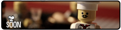
It hasn't gone unnoticed. ![]()


As for me, I like the new logo. I can also understand the problems that could have appeared regarding copyright stuff and such. I think it's simple, but very elegant. Nice work, Sméagol!

I prefer the old logo, but I don't mind the new one. I just think it looks a bit... Agressive.

Looks fine to me.
The logo's nicer now with a bit of colour.
Not crazy about it, but I'll get used to it, but the swoosh thing looks a little strange.

The swoosh could be toned down slightly. Overall I like it though.

I don't really think we need the swoosh for our logo, unless you make it one of those things the director has when he goes ACTION
Sméagol made a mock-up yesterday with a slightly more subtle swoosh.

I like the logo, but the navigation bar is a little bit too light colored

I liked the old logo alot,yet I do understand why you changed it.Staying on good terms with the company that creates our medium is a thing we must do. ![]()
I like the logo posted on the previous page,but maybe make the swoosh a bit subtler.
-JAM.

I actually like this logo better than the old one. This one is simpler, and focuses more on the films aspect of brickfilming than the old one did. I'm glad this new version of the new logo has more color than the version.
Also, I don't see much difference in the header (other than the logo, obviously).

If we're keeping with this new design I'll put in my part...
Likes: The orange text on blue
The 1x6 brick shape
Dislikes: The "play" triangle on the left
The streaks coming from the top of it
I like the play button because it shows that it's about Brickfilming, and the old logo made it seem like the site was just about LEGO. Maybe a fast-forward and rewind would be cool too.
I think we should look at the design from a new perspective.

Okay I've removed the orange for now as it doesn't really match the orange on the rest of the site. (I had only put it in place to see how it would look.) Regarding the shading issue on the buttons, please read the thread before making these kinds of comments because I addressed this issue in the first post. There was no deliberate effort to change the shading, it appears to be a minor compression-related issue but I'll try to fix it.
We'll be continuing to consider changes and improvements to the logo. Personally I think it's hard to top the old logo when it comes to busyness and I don't see how a filmstrip around the edges could surpass three minifigures, a difficult to read font, and a city as being overly busy.


Now the shading issue has transferred to firefox.

Yes, I am still working on this. It's a color profile issue (I had not realized Schlaeps was using color profiles on some of the images) and for whatever reason FireFox isn't recognizing the LCD color profile on the buttons.
Posts [ 41 to 60 of 219 ]