Re: Sets and Props Critique Thread
That's a really nice steampunk thingy.
I once built a really cool set of steampunk characters, but I haven't goten around to making a story for them.
 Bricks in Motion
We are a friendly filmmaking community devoted to the art of stop-motion animation using LEGO® and similar construction toys. Here, you can share your work, join our community of other brickfilmers, and participate in periodic animation contests!
A place to discuss, share, and create stop motion films.
Ad
You are not logged in. Please login or register.
That's a really nice steampunk thingy.
I once built a really cool set of steampunk characters, but I haven't goten around to making a story for them.
backyardlegos, that hover craft looks awesome, make use of it! ![]()
Oh, steampunk, very cool.
Anyway, it looks nice, and the only thing I can suggest is adding a slope brick at the front, (have a 2x2 tile, behind it a 2x2 slope, then the barrels) and maybe putting a 1x8 tile on the studs sticking out at the bottom.
Why? The ship has a nice textured feel all around, but the bottom grey is just normal plain bricks. Hence the tile to give it a bit more style. And the back of the ship is elevated, but the front seems short and too flat, hence the slope. Or even adding a plate under the back two studs of that front part.
Other than those minor details, you did an excellent job on this.
The slope in the front is actually something I considered but decided against. The reason being that the in the steampunk world I imagine this comes from, this technology is not necessarily new. The fellow piloting the skiff is not wealthy, in fact he's a poor merchant. His skiff is only the barest of practical vehicles, so I wanted it to look dangerous to fly and not too sleek. The raised bit in the back is supposed to be the engine, and I like the look of the studs on the sides of the grey part because they look like exhaust ports of some kind.
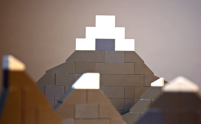 Mountains Test by rioforce, on Flickr
I'd like some critique on the building of these mountains. They are obviously microscale, but I'm trying to make them look large like mountains. I need some tips. Any ideas on how to make them look bigger? Also, please ignore the lighting, because it is really bad currently. It was just a test. ![]()
Thanks!
I'd like some critique on the building of these mountains. They are obviously microscale, but I'm trying to make them look large like mountains. I need some tips. Any ideas on how to make them look bigger? Also, please ignore the lighting, because it is really bad currently. It was just a test.
Thanks!
I actually just made my own snow capped mountains for my brawl entry. Try making the white on the top out of slanted bricks instead, and maybe make them all less...triangular. Try making some of them short and fat, and don't always have the peak in the peak center of the mountain. Also, if possible, make them bigger.
I am looking at your snow-capped mountains, and they are very good! The only thing though (and I guess I should have mentioned this before), is that I have very few white slopes. That is why they are so small. I would have made the tops of the big mountain less blocky, if I had more inverted slopes... I'll look around in some sets and see if I can dig up some white slopes, though. ![]()
EDIT: Here's an updated photo. I found some inverted slopes in a Chima set I had destroyed and have yet to sort.
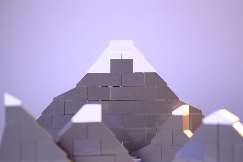 Microscale Mountains by rioforce, on Flickr
(You can critique the lighting now if you wish. ![]() )
)
Last edited by rioforce (August 15, 2014 (12:41pm))
They look pretty nice! As for the lighting, the light from the right side of the frame is too bright and orange, you might want to dim or remove it.
Oh yeah, that looks a lot better, great job!
They look pretty nice! As for the lighting, the light from the right side of the frame is too bright and orange, you might want to dim or remove it.
I agree, also the reflections on farthest mountain seem a bit distracting.
I am looking at your snow-capped mountains, and they are very good! The only thing though (and I guess I should have mentioned this before), is that I have very few white slopes. That is why they are so small. I would have made the tops of the big mountain less blocky, if I had more inverted slopes... I'll look around in some sets and see if I can dig up some white slopes, though.
EDIT: Here's an updated photo. I found some inverted slopes in a Chima set I had destroyed and have yet to sort.
Microscale Mountains by rioforce, on Flickr
(You can critique the lighting now if you wish.
)
I don't know but it might look cool if the mountains were 3D. They look really cool how they are and the lighting looks really nice.
Last edited by osomstudios (August 15, 2014 (02:51pm))
They look good (I really like the lighting, it looks a bit like morning sunshine hitting the side of the mountains). Personally, I'd recommend making them a bit more 3-dimensional, and add a few slopes on the front (perhaps try emulating the shape of this). Or try building some taller mountains and layering those in front of each other, to create a "mountain range" type look, if that makes sense (right now it looks like there's one massive mountain surrounded by several tiny ones, which makes the scale look a bit off). And use cheese slopes. Lots of cheese slopes. Cheese is your best friend.
Last edited by Mr Vertigo (August 15, 2014 (06:09pm))
Thanks for the opinions, everyone!
@Mighty Wanderer The yellow/orange light from the right side was supposed to look like the sun rising. It is acting as sort of a back light to separate each mountain from each mountain behind it. Sort of like a rim light. I may need to tweak it though.
@StefanMuscat I noticed that too. Maybe I need to move the big mountain back a little bit...
@osomstudios Yea, I wish I could make them 3D, but my brick supply is very limited, especially the white bricks. I could possibly pull off the dark gray, but the white is a problem... I actually could have made a photo-realistic CGI that looks like real LEGO bricks and had un-limited bricks, but I felt like I wanted to do everything brick-built for this movie and test out my forced perspective skills. ![]()
@FlyingMinifig I may try to do the mountain range effect. Like I said to osomstudios, I have a very limited supply of bricks, and only one BURP in dark gray, so I think I'll stick to flat mountains... The mountain is supposed to look huge, actually, it goes along with the story, but you are right, some more smaller mountains would fill in the gap. (And I tell the truth, if I had more cheese slopes, I'd use them. I love cheese slopes, but only have a few of them and most are in a dark tan color... ![]() )
)
I think they look great! There are some gaps between the bricks atm, but the placement and angles of the mountains work well, and I like how you've achieved snow on top.
I built a chessboard:
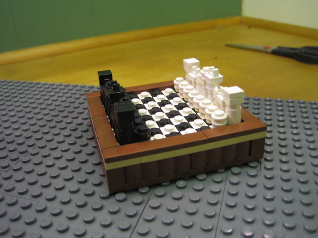
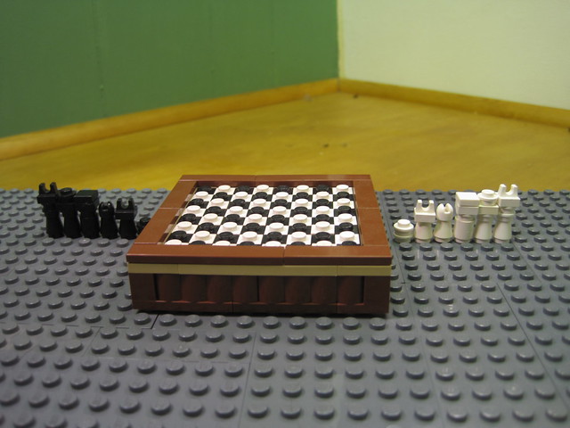
It's the smallest possible accurate scale in LEGO. Even so, I probably wouldn't be able to use it in any brickfilms seeing as it still looks ludicrously huge next to a minifigure. Though it might work for a more stylized/surreal scene, or a medieval castle type setting, where a king might have a big fancy chessboard, or something like that.
Or any public space that has a large oversized chess board (public parks, malls, ect)
http://www.eurobricks.com/forum/index.p … pic=100850
Here's a Porsche. Not much of a set nor a prop but just a MOC that i did.
WoutStopmotion, I must say I'm not much into cars in sets but that is nice! ![]()
Here is a set that I made for a Test/WIP. I am happy with the overall look of it, what do you guys think?

Sincerely,
Divine.
You should edit the wall behind the torch to be lit up. Also, the walls are kind of plain. I suggest adding a few stripes or something, change the colour of the bricks downmost, it'll help. I also don't like how you stashed the fence in there. I'd suggest connecting the posts that it clips on against the wall above. Also, there's bricks sticking out above it and i think it's ugly. Try making them stick out one stud less, and then pick another arch that's at least two studs longer, would make it a lot cleaner.
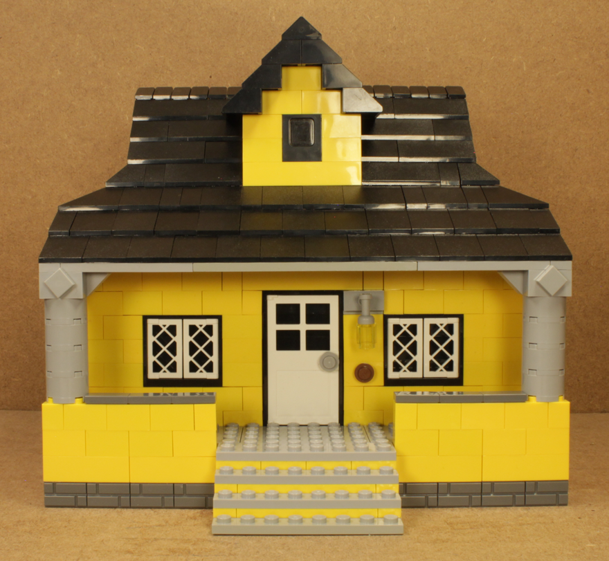
A yellow house that I plan to use for an establishing shot.
Posts [ 3,221 to 3,240 of 3,570 ]