Note: These days, community activity has largely moved to the BiM Discord. Join us!
We are a friendly filmmaking community devoted to the art of stop-motion animation using LEGO® and similar construction toys. Here, you can share your work, join our community of other brickfilmers, and participate in periodic animation contests!
A place to discuss, share, and create stop motion films.
Ad
You are not logged in. Please login or register.


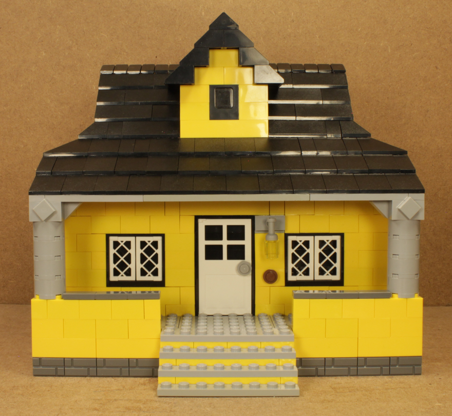
A yellow house that I plan to use for an establishing shot.
Thats sweet. Really like the way the widows and light fit with over all feel of the house
Last edited by osomstudios (October 2, 2014 (09:56pm))

Hey WoutStopmotion,
Thanks for the feedback mate.
I do agree on all your terms, and think there very fair points. I haven't learned how to light up background/minfigs as in putting artificial light but it is something I'm working on doing, this is of course in post production. As I feel it's more convenient on the most part.
I'll also work on adding some stripes or design in future, it's hard as I don't have the right colors to match these dark gray bricks. If I had light gray that would work well and would blend.
The main problem with it sticking out is I don't have two by 1 studs of that color. If I did I would have deffs preferred it myself. I will work on getting some in the future tho.
Thanks again.
Sincerely,
Divine.

My brother did some calligraphy for the sign for Darkmoor imitating the font I plan to use for the credits and such of the film so we can now see how the sign itself is supposed to look properly.
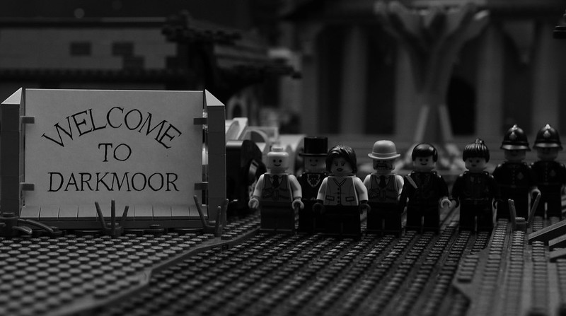
I really like how it's at a slight angle.
I also have a new table setup so I can have the whole set built at once finally. What now remains is arranging my tress and decorations all in a way that looks reasonably nice. After that I should have some pictures of the finished set as a whole.
I still need a good chair to animate, though, and I really need to edit those lines.

The hand-written typography with the textured paper looks fantastic. Really reminds me of old Nikolas Jaeger (Night Owl) brickfilms.

My brother did some calligraphy for the sign for Darkmoor imitating the font I plan to use for the credits and such of the film so we can now see how the sign itself is supposed to look properly.
I really like how it's at a slight angle.
I also have a new table setup so I can have the whole set built at once finally. What now remains is arranging my tress and decorations all in a way that looks reasonably nice. After that I should have some pictures of the finished set as a whole.
I still need a good chair to animate, though, and I really need to edit those lines.
While it's not purist, your sign looks really good! Your brother did an amazing job on that sign. Until I read your post, I thought the sign was printed! I actually think it's better this way... the slight squigglyness (I like to use official, scientific words) gives kind of a spooky, almost subliminal "Something's not right" feeling.
Good point! I did originally want it to be perfect and straight but it really does add to the look.
I typically don't like anything non-LEGO, but I feel like paper and cloth are fitting, since there are some LEGO elements like that in specific sets.

Osomostudios, I like the house, very classic. I would like to see the walls on either side of the steps to be replaced by a wall/gate combo, though.

Nice sign, really like the font. Very nice calligraphy. A few letters do look a bit wobbly, especially the "O"s, but it does enhance the look, I find. (Especially since it looks almost-but-not-quite perfect, which could act as a subtle hint that something is not quite right and that not everything is as it seems.)
I also really like how you integrated the paper sign with the LEGO.
Awesome Frame Squid, I am so excited for this, what kind of genre is this? Also I noticed out the 8 minifigs half of em are smiley face heads ![]()
![]()
Bit still great job, also on the sign as well ![]()
Sincerely,
Divine.

A kitchen wherein a Thanksgiving turkey is about to be cooked.
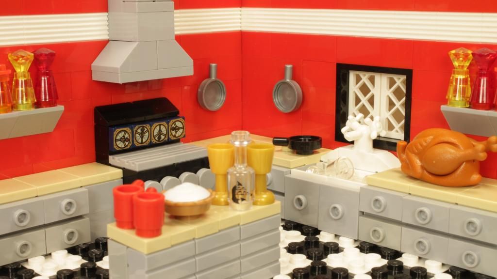

Yeah, that's a really good one. I'd say the same about the drawers though.
I do think that walls are a little bit too vivid, though. It should still be a warm colour, but perhaps something softer like orange brown or beige.
I would say that the wine bottle should be rotated so that the printing is either on the back or the side, whichever shows less. Amazing kitchen! I wish I'd thought of using the back of brick-bricks for drawers myself!
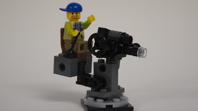 MOC - Film Camera by Galactic Bricks, on Flickr
A little MOC I did that I know you guys will enjoy. ![]()
That's a nice kitchen! It looks really retro with the red coupled with black&white and metal. The camera man set is also beautiful. It would be cool for Lego Group to ralease some smaller sets that are themed like that one! I assume that that base piece is a turntable element?
The camera man set is also beautiful. It would be cool for Lego Group to ralease some smaller sets that are themed like that one! I assume that that base piece is a turntable element?
Thank you. ![]() Yes the camera can turn in a full circle, and the seat with the minifig and the camera itself can lift up and down as well.
Yes the camera can turn in a full circle, and the seat with the minifig and the camera itself can lift up and down as well.
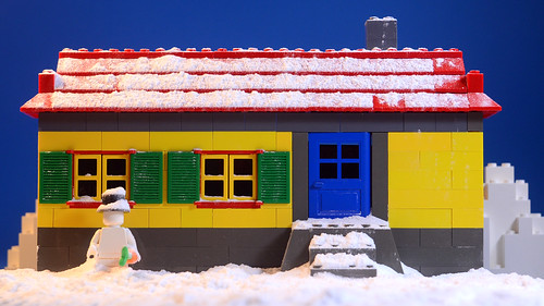 Too Early for Snow by rioforce, on Flickr
A snow test for my upcoming Christmas film.

flour? or bicarb/backing soda?
Posts [ 3,241 to 3,260 of 3,570 ]