
Re: Drawings and other Art
It's good, but it, especially the blue eyes, looks quite like the various apps made by TapBots (Tweetbot, Calcbot).
We are a friendly filmmaking community devoted to the art of stop-motion animation using LEGO® and similar construction toys. Here, you can share your work, join our community of other brickfilmers, and participate in periodic animation contests!
A place to discuss, share, and create stop motion films.

Ad
You are not logged in. Please login or register.

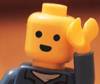
It's good, but it, especially the blue eyes, looks quite like the various apps made by TapBots (Tweetbot, Calcbot).

Aye, I was thinking about that. I adjusted the eyes to be ellipses rather than round rects (as all of tapbots' eyes use round rects for the eyes).
![]()
- EDIT -
And to further differentiate, I'm experimenting with an expression to give the icon some personality.
![]()
Last edited by Siobhan (May 8, 2013 (06:11pm))
Ooh, I very much like the second one!
I've got a question for you guys. I'm buying a Wacom Bamboo tablet and I've read and heard that the nibs break really fast. Can anybody with experience tell me if this is true, or if it isn't that bad (I'll probably use it about 5 hours a week).
Can't speak for Bamboo, but I've gone through three, perhaps four nibs on my Intuos 4 in about that many years.
I can't see 5 hours a week eating too many nibs. I've yet to break/wear one out on the Bamboo (I do have a sheet of drawing paper over top of my tablet for the feel, so maybe it's possible that helps... though I'd expect the opposite). They used to come with replacements out of the box; I'd imagine they still do.

That is actually super cool. The background is gorgeous. I'm not sure what the logo means but it's nice too.
I too am considering a tablet. You can get the Bamboo ones for real cheap on Craigslist; that's what I'm gonna do.

The triangle is Delta from the Greek alphabet which is used to represent "Change in/of." So basically "Change in/of Me."
I used a Bamboo Splash for the flowers (I'm a perfectionist which is bad). (Continuing on Kees' question) I haven't found any problem with the nub on my pen, looks a tad worn in, but other than that no problem.

Sean - What program did you use to make your icons because they look very nice.
1011Ev - That is a really nice looking poster, and I like the message with the delta in it.
I used Photoshop.
Today the graphics tablet I ordered arrived! I since started getting used to it and I like it a lot. Here's my very first try at painting something. I entitle it Desert Rocks (feedback is appreciated. Remember, it's my first try doing digital art)


Seems pretty good, I just think that the rock doesn't look that solid.

So my friend and i are making a game and part of what I'm doing is all the art for the game.
So I present the main character of our game - Gun Face.

Looks pretty good, except for the barrel. For some reason it just doesn't look like a handgun barrel.
I agree with mighty, it looks to flat and not like a barrel. If I were you, you should nearly add a bit of dimension to the gun, to give it that same image as the body

I like that color scheme better. And it looks a lot less like a ripoff of the Tapbots icons.

I think I prefer it to the first. The only thing that bothers me a bit is the convex display. You could probably keep the shading to give the impression of a curved glass cover, but distorting the grid itself doesn't look right to me. I feel like a simple flat pattern would fit the old-school aesthetic a bit better.
Tweaked.
Icon with brighter screen/more contrast, less convex display.

Icon with slight glow on the bezel.

Icon with Michael Bay.

Yes that last one was a joke.]

I like the first one better.
The blue colour looks more friendly and inviting. I also like it better when the eyes are the only source of colour on the screen itself.
I realised I got JJ Abrams and Michael Bay mixed up. Here's a prober Michael bay one.

Posts [ 1,441 to 1,460 of 1,853 ]


