Re: Critique My Frame!
Yea that looks a lot better, It looks a lot more intense, and realistic. But you might want to think some more about were the light is coming from in the scene (like the ceiling light, or outside or something).
My Youtube
We are a friendly filmmaking community devoted to the art of stop-motion animation using LEGO® and similar construction toys. Here, you can share your work, join our community of other brickfilmers, and participate in periodic animation contests!
A place to discuss, share, and create stop motion films.
Ad
You are not logged in. Please login or register.
Yea that looks a lot better, It looks a lot more intense, and realistic. But you might want to think some more about were the light is coming from in the scene (like the ceiling light, or outside or something).
It looks a lot better now, and the 1x2 tile for the phone is a much needed improvement over a walkie talkie!
Here's two shot I did using a set that WAS going to be in Jorge and the unpleasant pants, but I decided not to make that film. Anyway I thought I might as well show it off here since I still think it's pretty cool.
This is what it would have looked like in the film
This is if the opening on the right didn't lead outside
The only problem is that it would be about impossible to actually animate in it since the whole thing was covered up to stop all light from coming in.
Last edited by Sir Snorlax (March 14, 2017 (01:33pm))
I like these frames. Although they are pretty basic they work nicely and it would be nice to see similar frames in your future work. Only critique would be the first image is a bit grainy. What camera did you use to take these photos? If it was a webcam you could probably just tweak your settings. If it was a DSLR or digital point-and-shoot camera then make sure the ISO is set enough so that the image doesn't come out grainy, not too high, but also not too low. It might not even be the shot itself. May just be the way it was uploaded. The colored lighting is also very nice. How exactly did you achieve it?
How does this look? Is it too dark?
I'm trying to get back into the swing of animating, and to do that, I'm trying to improve my set design skills.
Looks fine to me.
I think that looks great. I'm not sure what you're going for, but my only suggestion might be to show less space above minifigure. The room looks like it has a quite high ceiling as you can't see it. Overall, I love the lights and the subtle mixing of colors in the set. Nice set!
if you have 2 more leds, put them behind the colored buttons on the wall. trust me.
I like these frames. Although they are pretty basic they work nicely and it would be nice to see similar frames in your future work. Only critique would be the first image is a bit grainy. What camera did you use to take these photos? If it was a webcam you could probably just tweak your settings. If it was a DSLR or digital point-and-shoot camera then make sure the ISO is set enough so that the image doesn't come out grainy, not too high, but also not too low. It might not even be the shot itself. May just be the way it was uploaded. The colored lighting is also very nice. How exactly did you achieve it?
I'm glad you liked it!
I'm using a logitech c920, and yes grain was a problem that I spent along time trying to get rid of but was not completely successful with. I made the blue light effect by having a a blue base plate on top of the set, then I shined one of my lamps at it from a angle.(so that it wouldn't be really bright) I would love to use it in a film in the future but I'd definitely have to come up with a better setup as the whole set was covered up to keep as much light out as possible. Really what I would need to do if I wanted to film it is just cover up more natural light in my room.(where this was shot)
Maybe it's too dim? Try placing a lamp in front of the set.
Maybe it's because the is a huge black spot right towards the center of the frame, behind the character, that disturbs the eye.
Try moving around the elements of your set, or making it stand out more with the lighting.
Maybe it's too dim? Try placing a lamp in front of the set.
I can't, the light must come from over the window.
It's not too dim. I like the lighting honestly. It's nice and soft and not direct so it doesn't look like a cheesy B-movie. But I do agree with Aiwha that it's a bit dark in the middle. If there's context in shots surrounding the frame it's probably not a problem, but it's confusing on to why there is seemingly an abyss right behind this fellow with a handsome mustache.
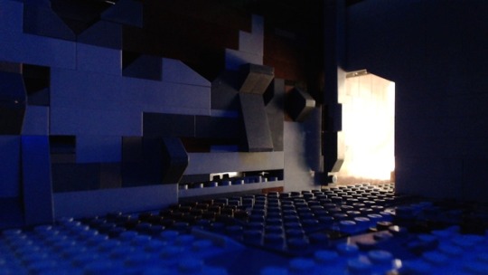
Delta, I love that frame.
The lighting, the high quality and use of focus, and (what appears to be a) really cool set are all top-notch.
My tastes with lighting tend to be high-contrast, pushing the blacks darker than most, and you've nailed that dark look, while still keeping a high range, and good balance, of color and contrast. However, Rio does have a point about the black blob that kinda steals the show.
Were I to offer one critique, it would be to try to light up the guy's face a touch more. That would also draw attention back to him, and consequently away from the black blob. Perhaps by using a white plate or piece of paper as a bounce board/reflector. You don't want to lose the rest of the frame's perfect lighting, so you can't adjust the lamps that much. As it is, attention is not immediately drawn to his face, and that extra bit of light should fix that.
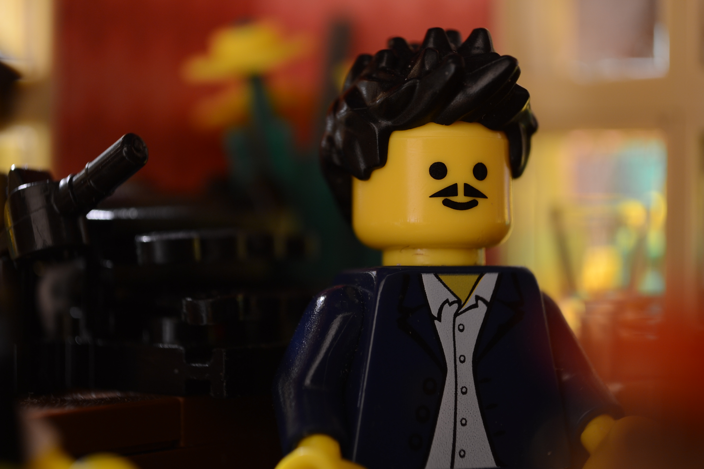
Perhaps it's just the face, but something about that frame reminds me heavily of the Henri and Edmound brickfilms.
And if you haven't seen them, that's quite a complement. (And if you haven't, go watch them now!)
That frame looks really good, is that face animated?
Perhaps you could try repositioning the rim light to separate the character from the rest of the scene.
Regarding the black object, I think that if you move the camera a little to the right so that the character will be in the left corner of the screen will get rid of it (if that's what you want), it will also show the part of the room which the character is facing and the window in the background can provide contrast which will help to further separate the character from the set.
show the part of the room which the character is facing and the window in the background can provide contrast which will help to further separate the character from the set.
I think we're over analyzing it a bit here. What happens in the scene would dictate where the camera position should be, and we don't know what Deltabrick intends here.
So I hadn't been planning on entering the summer contest, but an idea hit me yesterday, and I wanted to check to see if it was viable. If I go through with the plan, I'll need to animate some (or all) of the video on my c920, including some dark scenes.
I threw this together earlier, and was wondering what I should change (lighting, settings, position, etc.).
Lighting is good (although perhaps you could see if you could make the red light more noticeable, but I guess it depends on what you are planning), and although I feel like I'm being picky here, the floor is a bit uneven (but I'm sure that was just down to setting it up quickly ) and I think it would look better if either you raised the bottom layer of L.grey bricks up by 1 using the same colour and removing one of the layers of black bricks (so that you have two layers of L.grey, two layers of black etc.). You could perhaps do a bit of gruelling on the studs that right up against the wall, but other than that, I would say go ahead!
Posts [ 541 to 560 of 597 ]