
Re: Critique My Frame!
Ah, I like it! Love the lighting of it!
We are a friendly filmmaking community devoted to the art of stop-motion animation using LEGO® and similar construction toys. Here, you can share your work, join our community of other brickfilmers, and participate in periodic animation contests!
A place to discuss, share, and create stop motion films.

Ad
You are not logged in. Please login or register.

Ah, I like it! Love the lighting of it!

I like it, especially the lit archive shelves. I'd say shoot from a slightly lower angle, though, so it feels more like the camera is being operated by a minifig sized person, instead of looking down on the characters, the way it is now.

AWESOME! I always loved this scene from episode II. It was actually cut down (or out, iirc), but the scene is pretty intact int he novelization.
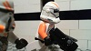
This is a hospital room/ward. Hard to make it interesting but welcome comments

Looks ok, but I have a few things that don't seem right about it:
Is the lady supposed to be in a hospital gown? If so, I don't know if that torso is the best. Maybe it's the belt that makes it not work.
Personally, I would think the hospital would be white, and have brighter lighting. Also, why is the front wall (with the door) transparent? That's not very much privacy... ![]()

@togfox, I agree with Rio in that the walls should be white. I think the hospital equipment looks nice.
I've been gone/busy for a week or two. Finally have time to do stuff. Here is another picture of the knight.
Better? Also, how do you usually get flatly lit skies?
Just as a reminder, this is a panning/rotating shot.
Edit: Oh, I realize that the lighting is kind'a dark, so no need to comment on that specifically.
Last edited by Rivvm m (April 23, 2015 (02:15pm))

i think that is awesome. no need to lighten it as far as i am concerned....... maybe get some more minifigures in the back if you want him to look like he has a army, they dont need to match, just generally be the same colour and holding a weapon.....

@Rivvm m, Great frame! I actually like the look of the light contrast in the sky, but if you do want to to achieve a flatly lit sky, you'll probably need a separate light for just the backdrop.
The angle is much improved from the last frame, Rivvm! To get a flatly lit sky, I usually use a seperate lamp for the background, or use bounce lighting so everything is evenly lit (but that requires a longer exposure and gives a different look to the whole film).
It is a bit dark though, the background actually looks more lit than the foreground, which bothers me a bit. (But it's not too big of a deal if it's late in the day)
just look at how different these are:
your latest one is SOOOOO much better. keep up the good work.

Thanks for the help and compliments. ![]()
I am definitely going to keep the angle of the last picture. As for the lighting, I will probably go with something more like the last one, but I moved my lights and backdrop and don't know exactly where they were. I'll figure it out eventually.
What do you guys think?
I really like the lighting. I am guessing that this is a fast-paced action scene, otherwise I would say that the framing is slightly off. Overall it looks great. ![]()
I like the purple light, it gives a good mood. It feels a bit odd that the background is brighter than the subjects, but it's hard to tell if that's appropriate or not without seeing the whole scene. I also like the wall their fighting against, it's got some nice detail.
thanks, yeah my action scenes are fast paced... just a clip from a flash back.... I tried lighting it like the light was coming from the street below.
EDIT:
how can I improve this?
Last edited by Cooked Cat (April 25, 2015 (05:36pm))
I recommend that you don't make the vast arctic so empty and flat. In real life, there are small hills and dips, things that make terrain interesting. All you have is a lot of flatness.
You could also try adding some digital mist/fog to the frame (especially at the far edge). It blurs out, but if it's cold, it should have a bit of mist or fog. (Besides, things tend to get whiter and less visible on the horizon in real life too).
I also recommend adding a couple clouds. This isn't required, but it might add more interest to the frame, especially since most of it is sky.
Those are my thoughts about it. The frame looks nice, but you did ask for improvement. ![]()

I disagree,
I find that this frame looks fine. In fact there are large plains of snow, the Arctic is not limited to hills and dips. I also don't think mist or fog is necessary for this type of setting and feel. Mist would make it seem almost low toned, and not light. But it depends on what this movie is about of course. Clouds I don't think you need either, as you can see in this picture there are no clouds as well as hills and dips.
This is from the artic
Last edited by Harborlight (April 25, 2015 (06:35pm))

thanks guys, I dont know if I want to add clouds, but might make some little bumpythings. and might work on making some hills, as it is in Antarctica...
Posts [ 261 to 280 of 597 ]


