
Re: Critique My Frame!
Togfox, I feel like there's too much space above your characters heads. Maybe bring the shot down a bit to even it out. And I agree with Rioforce, about the emptiness on the left and the need to rotate left.
We are a friendly filmmaking community devoted to the art of stop-motion animation using LEGO® and similar construction toys. Here, you can share your work, join our community of other brickfilmers, and participate in periodic animation contests!
A place to discuss, share, and create stop motion films.

Ad
You are not logged in. Please login or register.

Togfox, I feel like there's too much space above your characters heads. Maybe bring the shot down a bit to even it out. And I agree with Rioforce, about the emptiness on the left and the need to rotate left.

What legoguy501 said. Pan the camera down and a little to the left.
Here's from my upcoming brickfilm Disney XD:
 screenshot 5 by TwoGuysBrickfilms, on Flickr
I'm not too happy with it. I think it's because the guy with the red shirt is out of focus. But I can't put the guy in focus without moving the camera back a bit, because the lens can't focus on anything closer.

What camera do you have? If it's a DLSR, you can buy diopters or extension tubes to be able to film a tighter shot.
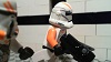
Pulling the camera out a bit might benefit your shot, too. I do not like the minifig's head clipping the top of the frame. You should give him some more headroom! Either pull the camera back or tilt the camera up a bit.
I've pulled the camera back for a reshot. I also had to move it to the left because a lamp would have gotten in the way. Yes, I do have a DSLR (Canon EOS Digital Rebel XTi).
 screenshot 6 by TwoGuysBrickfilms, on Flickr

The second frame looks much better. Not so claustrophobic, you know? ![]() Though, maybe if you raised the depth of field and put the monitor and the minifigure in focus, then you wouldn't have to make a decision of which is better (the minifigure or the screen).
Though, maybe if you raised the depth of field and put the monitor and the minifigure in focus, then you wouldn't have to make a decision of which is better (the minifigure or the screen).

Yea, I think @Tenny that the second one looks better. My eyes draw towards the character more than the first.

I think that you should use another head. That head looks like it's been through a war. I'm sure you'd have another that would be reasonably suitable for a character.
I think I like the original frame better. I like the colours and the emphasis upon the screen. The second shot seems to be too much from the side. Although the first frame is slightly crooked, which is distinctive from a deliberate slant. Of course, leveling the camera is something I find dreadfully difficult. Although if you're shooting at a high enough resolution you can fix that in post easily by slightly cropping the frame and turning it.
But it could be pulled back slightly, perhaps.
I kinda like heads that have been through hell. It shows how much love and play they've had. ![]()
I do not want to change the head of that minifigure. I'm more than half way through filming this Brickfilm, and to change the minifigure's head would mean I'd have to film the whole Brickfilm again. Also Kevin (which is what his name is) is an iconic character in my films and is featured in my logo. He is featured in several other videos of mine and I have plans for him to be in more films.
I'm not sure what you're trying to say? You're saying that Kevin is here to stay? ![]()
Any chewed/scratched/worn/melted/deformed head = personality IMO. ![]() Off topic but ...
Off topic but ...

This is a frame from my next film.
 Watch it on YouTube!
I do not want to change the head of that minifigure. I'm more than half way through filming this Brickfilm, and to change the minifigure's head would mean I'd have to film the whole Brickfilm again. Also Kevin (which is what his name is) is an iconic character in my films and is featured in my logo. He is featured in several other videos of mine and I have plans for him to be in more films.
You could always buy a new one...

I could only suggest adding something to the walls. It kinda looks like you've jammed a desk in the corner of two black walls. ![]()
Light fittings or painting - window perhaps?
I could only suggest adding something to the walls. It kinda looks like you've jammed a desk in the corner of two black walls.

Light fittings or painting - window perhaps?
Yeah, I do need something on the walls don't I? The thing is, I've already taken over 700 frames of this room for my film and I would hate to have to redo all of it.
Watch it on YouTube!
could you make the camera a little lower?
fun fact, hitchcock got his crew to dig a whole hole in the ground so he could get is camera lower. otherwise, it looks really good.
A whole hole or just half a whole.
![]()
Yes - good point. I kinda thought it needed something but couldn't put my finger on it. It's the camera height. That would also remove a little bit of the blackness I was talking about before.
a whole half of a hole. ![]()
yeah, do that, should look great. also, if its been broken in to hence the messyness, give us a dutch angle.
double post!
what do you think of this update?
it has been to long lego. to long. I've missed you.

Posts [ 161 to 180 of 597 ]


