Note: These days, community activity has largely moved to the BiM Discord. Join us!
We are a friendly filmmaking community devoted to the art of stop-motion animation using LEGO® and similar construction toys. Here, you can share your work, join our community of other brickfilmers, and participate in periodic animation contests!
A place to discuss, share, and create stop motion films.
Ad
You are not logged in. Please login or register.


Those minifis look pretty cool, Galactic. IDK what the original comic book characters look like so I can't tell you if they are close to them or not. ![]()
I am designing a minifig, and I'd like so critique on it. It is Princess Storm from the Knight's Kingdom LEGO theme. She is usually a knight, so I made a dress for her to wear (I'm thinking of making a film with her in it). All the textures (even the face) are applied digitally so far, so if they look kind of strange that's why.

This is Princess Storm in her battle outfit. I modified the classic torso very slightly. Again, they are applied digitally.

What do you think?
Last edited by rioforce (February 8, 2015 (07:15pm))

That's funny, I'm actually waiting on a bricklink order containing that very same head (although I'm planning on putting her in a modified Unitron space suit, of course! ![]() ) I think it looks pretty good, although shouldn't her hair piece be red, as that's the color of the printing on her face? (although that might look kinda funny...) I never really understood why they gave a Knight's Kingdom character red hair. Anyway, I hope you do make a film about her. That would be pretty cool.
) I think it looks pretty good, although shouldn't her hair piece be red, as that's the color of the printing on her face? (although that might look kinda funny...) I never really understood why they gave a Knight's Kingdom character red hair. Anyway, I hope you do make a film about her. That would be pretty cool.
Last edited by Brickcrazy (February 7, 2015 (06:42pm))
I think for her dress, a piece like This would look more flowing and natural. And I agree with Brickcrazy that, if possible, her hair needs to be the same color as the hair printed on her head. But that is pretty impressive that you added the prints digitally!!!! I may have never noticed if you hadn't pointed it out in your post. ![]()
Thanks for the comments. I would have used the 2x2x2 slope piece if I had it. unfortunately, I do not own many of those, and the one I know I own is in brown with a decal on it. ![]()
As for the hair, yea, the red hair didn't look good. At least, none of the styles of red worked well. I may or may not change the hair color on the face to match. I'm not sure, I'll have to test and see how it looks.
Here's another minifigure I made. Again, the decals are all digital right now, because these are purely custom, so I'd like to get some feedback on them before I print.
This minifigure is based on the LEGO Universe faction leader Dr. Overbuild.

And what do you think about this headgear instead of the helmet?

All feedback is appreciated! ![]()


The original minifigure didn't have a helmet, so I think it would be better not to include that. Other than that the fig is really cool! I remember back when LU came out, I was hoping so much that they would come out with sets. Alas, that never happened.

I love LU! That doctor overbuild looks awesome. You can look at the actual prints from the game on the Lego Universe Wiki if you want for comparison.

Not really...

I didn't notice the old gray and new gray mixture. I think it adds a bit of color variety. It's barely noticeable. Only the most detailed perfectionists may have a heart attack...
Nathan Wells didn't have one on chat last night, so it should be good. ![]()
Anyone else?
Last edited by Brickcrazy (February 14, 2015 (05:29pm))

I think it depends on the film. In a super clean sci-fi, it would bug me, but within the theme of the stuff you've been posting recently, I think it's fine.

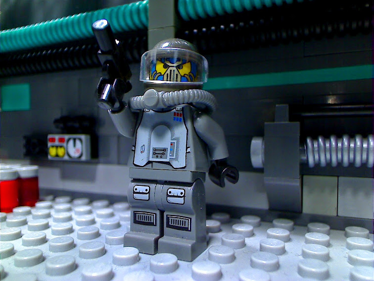
Showed this space pirate to a few people during chat yesterday, but thought I might as well post it here anyway. My main concern is the helmet. Does the fact that the helmet is dark gray while the rest of his body is dark bluish gray bother anyone?
Not at all, I think the blue adds a little extra detail, it could be electronics. The blue adds a little extra touch to the gray robot to not make it all the same color.
This minifigure is supposed to be Duke Exeter from LEGO Universe.
How does he look? Is the shield good enough, or should I try another style?


All comments are appreciated. ![]()

That's some shield! I like that there are transparent elements in it, possibly jewels?

Rioforce, it looks good. I scrolled down the page, saw your picture, and imidiately thought:
That looks like that knight from Lego Universe!
Then I read your comment and saw that that is what you are going for, so good job!
Looks Great Rio! I don't think you should downsize it, because Duke had a pretty big shield.
Posts [ 781 to 800 of 873 ]