Re: BRAWL 2013 Update Thread!
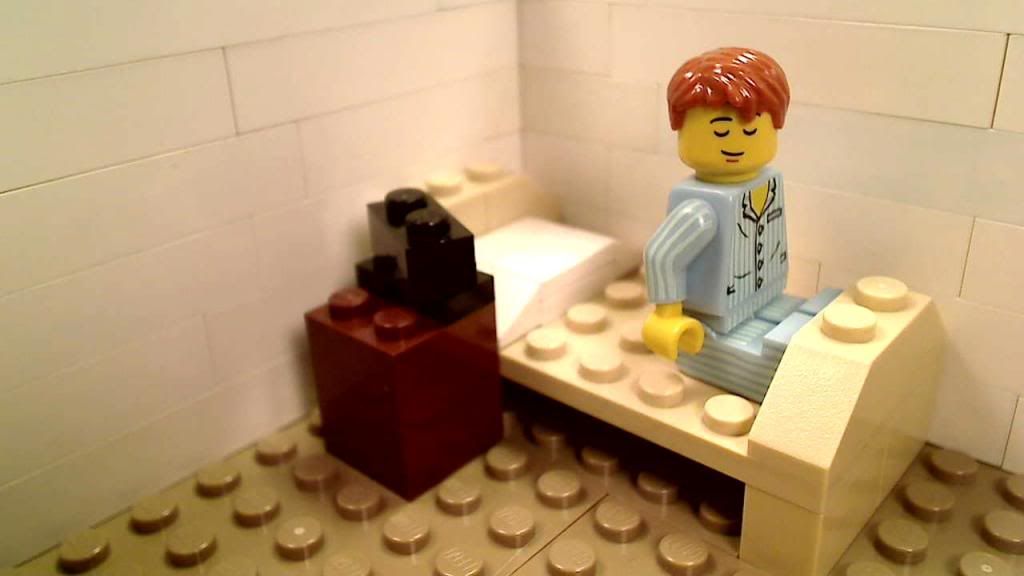
I like the bridge. The huge white walls look a bit odd though, and the bricks don't look like they're pressed together tight enough, which makes the wall look rather "gappy".
I like that bridge. It has a very nice look to it.
That white wall is so huge and kinda old looking. It somehow looks creepy.
Thanks, but strangely enough, I hate the thing. ![]()
The red and gray just don't match IMHO. And there's not much greebling or details.
And the gappy look is from the bricks being old used yard sale stuff, or Tyco brand. I've got them pressed down pretty good, and it doesn't look that bad in the final shots.
The white wall sprang from two things.
#1, I was going to just have a sky background, but didn't want to deal with that and forced perspective again after Contrast.
#2, I have a LOT of white bricks just itching to be used.
I've built the wall even higher now, so I can get some nice farther-out shots. And don't worry, the lighting on the 'river' is a lot better in the clips.
I've got half a page filmed, so I need to really step that up.
May even post a frame later. Just about got the thing cast as well.