
Re: Sets and Props Critique Thread
The TARDIS interior is a bit too much vividly colored. You might make it look like this:
We are a friendly filmmaking community devoted to the art of stop-motion animation using LEGO® and similar construction toys. Here, you can share your work, join our community of other brickfilmers, and participate in periodic animation contests!
A place to discuss, share, and create stop motion films.

You are not logged in. Please login or register.

The TARDIS interior is a bit too much vividly colored. You might make it look like this:

That photo doesn't appear.
And the TARDIS is pretty colorful.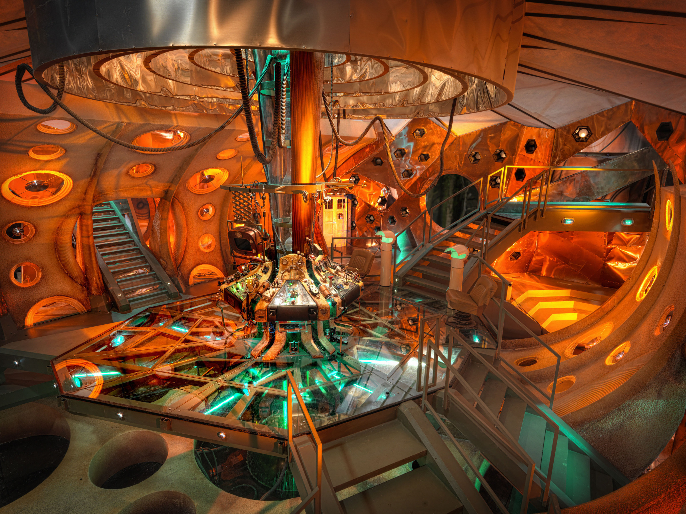

Benthecreator has a fantastic TARDIS interior in this video, perhaps you should base yours off of that.
The walls are too far away from the central platform, the colors don't really go together, (Bright cheery walls and a darker brown and gray platform) and it just doesn't feel very TARDIS-y. Now, I'm not expecting every TARDIS set to look like this, but I think you can get yours looking a bit better.
It also looks like your built a large, plain square room, and stuck a small platform in as an after thought. the two parts look quite different, and they don't flow well together. The "Real" TARDIS may be colorful, but it's mostly orange/metallic with a bit of aqua green. Also note that the colors, while present, are subdued.
They're not bright yellows, reds and whites. The "Real" one also has a lot of curves and angles in the walls.
On the plus side, your central column is pretty good, so keep that. :yes:
Sorry if I sound negative, I'm not trying to be. Getting a good TARDIS set is really tough, and that's one of the reason's why I've kept away from trying it. Keep trying though! I'm sure you can build something great if you keep at it.
Yes I know this new one is basically the same, and it'll probably get critique for being "too colorful" but I like it.


(btw hint: That companion isnt from the middle ages)

I would say make the railing a bit higher and put like a window or something in the wall. It might be difficult but a circular door might be cool, too. Looks pretty cool though
Not "too colorful" to me. More "McDonald's" fast food chain-like. The restaurants here looked very much like the walls of your set through my childhood two decades ago. I think for the sake of breathing life into the creation of your room you should step back and ask yourself where the room has been. What has it seen? Perhaps there is a stain here from a former meltdown. A stack of letters/papers in a corner speaks to the man hours even if the people are not present. An old disused button and wire hanging in disrepair.
The room is very bright / childish and it seems like the machine in the middle is adult-oriented/ PG13 stuff. The two, for me, don't mix. Either age the surroundings and give it some lived in appeal or dumb down the machine. (Which is a nice little build by the way.)
As for the platform- I think it works. The only thing I would change is place 1x6 dark gray tiles underneath where the railings are to give the light gray flooring a defined border.
Kingofbricks made an interesting notation about the door. Sliding, round, bank-vault type doors would make the scene a bit more futuristic and fantastic. That door you used reminds me of a front door to a home and seems like a shortcut in your build.
Have fun,
Jared
I would say make the railing a bit higher and put like a window
The railing is to minifigure scale and I couldn't put a window because this is a ship bigger on the inside and the outside looks like a police box.
Legogod I think I might change it to a burnt orange.
Alright, so imma need some feedback on this set for my EASTER film:
I will upload more images, but right now, this is it.
Also, this film will be a sequel to my BUNNY MATRIX film (which failed horribly in the last EASTER). BUNNY MATRIX: CHOCOLATE EGG RELOADED takes place one year after that guy in BUNNY MATRIX gets defeated by a bunny. Now, the BUNNY Corporation is plotting to take over the world with chocolate eggs. Now, the MATRIX people have to steal the chocolate eggs!
How unoriginal, I know.

Alright, so imma need some feedback on this set for my EASTER film:
img
I will upload more images, but right now, this is it.Also, this film will be a sequel to my BUNNY MATRIX film (which failed horribly in the last EASTER). BUNNY MATRIX: CHOCOLATE EGG RELOADED takes place one year after that guy in BUNNY MATRIX gets defeated by a bunny. Now, the BUNNY Corporation is plotting to take over the world with chocolate eggs. Now, the MATRIX people have to steal the chocolate eggs!
How unoriginal, I know.
Sounds like a lot to fit in 20 seconds. ![]()
Anyway, the set looks nice. I hope there'll be some type of background in the film. Unrelated to the set, the camera looks a little grainy.
I don't exactly know why my camera looks grainy. Here's a frame from my (uncompleted) THAC X film in comparison: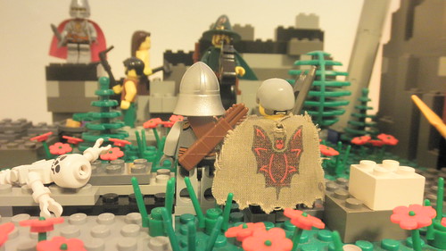
I figure it's because I am using lamps instead of the ceiling lamp. Well, having a camera is better than nothing.
Nearly done with my brickfilm! 4 months in the making!


Looks great!
You've done a great job making a few basic bricks into a very nice set. ![]()
Certainly goes to show that you don't need a lot of pieces to make good sets.
But what's the cage thing for?
Looking primarily at the last picture, it has a nice open outdoors-y feel, without the usual overload of trees.
You'll just have to make sure the edge of the paper doesn't show up in the final shots.
I'm looking forward to the film!
One problem I'm having is that the minifigs have a gross green tint on their plastic. Is there anything that I can to prevent this or is there anything I can do in Post?
That is a nice set, BB! One thing I have a problem with though is that the ground appears flat. Most American houses are built on top a hill.
It doesn't bother me that much though, since I grew up on the Eurasian Steppe (which is flat, except for the occasional "Mine Hill", which is where dirt from Coal Mines is put, making a really large dirt hill).
Now, I'm going to break the rules of the thread need feedback on this little floating island I made for the first scene in "Minecraftia: The Artifacts":


This is supposed to look like The Aether Dimension in Minecraft (the Aether is a really good minecraft mod):
Now, there will be a lot more of the sky islands I will build, but this is what I have right now.

Try making it more square ish.
That is a nice set, BB! One thing I have a problem with though is that the ground appears flat. Most American houses are built on top a hill.
My house isn't built atop a hill.
The last house where I lived wasn't built atop a hill.
The nearest house to mine isn't built atop a hill.
The house across the street isn't perched atop a hill.
I'm not sure that really applies to all of America. Though, it's a big country, I'm guessing it's more common wherever you reside.
Here, the ground is slightly hilly, sometimes really sloped, but most homes seem to be set on the level parts of land as far as I can tell. Though, my grandmother's home was on a hill. That's the only one that comes to mind at the moment.
I (used to) live on the Eurasian Steppe (in the Donetsk Province of Ukraine), and the land was largely flat. Now that I live in america, I see that most houses are build on flat land, but still on a hill.
Also, the Minecraft film I'm making isn't supposed to look block-y. it's based on the video game, but it's not 100% about the video game itself.

Well, if you're not going for the blocky look, try using all gray inverted slopes. Slope bricks make good rock faces.
What you have there is kind of a mismosh of random gray and black pieces.
I think you meant to say most houses in America are built in hilly regions (like where I live). But that's not true everywhere, though; the plains and costal plains tend to be flatter.

I'm making a video sometime in the future with Hoth as the location. I'm not sure at all about any part of the story yet, so I don't have any room that I "have" to have at the moment. So basically, I'd like to know what I need to make this part better. I know the walls are really bare and it needs something scattered around the room...any suggestions on improvements?


Also, is there any part of Hoth you think would be really cool to see in a video (without ridiculous VFX work) and that doesn't include an AT-AT (the only Hoth vehicle which I don't own).
Thanks for the help[!
Nice!
Scattering 1X2 trans-blue and/or trans-clear plates/tiles around the floor would help give the impression of random icy spots, and doing the same in white, but with added cheese slopes would look good for small piles of snow.
Also, these in dark gray are fantastic at filling in bare areas. For the wall, a few tubes going around help a lot, and a few more icicles going both up and down should finish it off.
Posts [ 2,521 to 2,540 of 3,570 ]


