Re: Frame from Your Upcoming Film
@sean
ok, they dont have to be picture perfect, this is a brickfilm... but, yea, I'll look them up.....
We are a friendly filmmaking community devoted to the art of stop-motion animation using LEGO® and similar construction toys. Here, you can share your work, join our community of other brickfilmers, and participate in periodic animation contests!
A place to discuss, share, and create stop motion films.

Ad
You are not logged in. Please login or register.

@sean
ok, they dont have to be picture perfect, this is a brickfilm... but, yea, I'll look them up.....

One should strive to do the best they can, whether it's a brickfilm or a multi-billion dollar feature film.
Your shots so far look promising. I'd hate to see them let down by fake and overdone lighting.
Good luck, I'm expecting great things ![]()
ok, thanks mate, this project may be put on hold for a short time as I just learnt of some other comps... but, I'll continue working on it.... head over to my google plus for more info...
https://plus.google.com/u/0/110305503885231585505/posts

Cooked Cat, I like those lights in the way they look but the color is rather fluorescent looking. That could work, but I would think that street lamps are less blue.
Also, what software are you using to make this lighting?
The main problem with those fluorescent lights is that the lighting effect appears to just be slapped over the top of the image, not integrated with it. The way the scene is lit also does not seem to be affected by the effect, especially with them being that bright.
ok, i think i know what to do to it to make the lights seem to be "working"

@Cooked Cat
If JJ Abrams made a brickfilm it would look similar to your screens ![]() personally I love your frame style with the lights and stuff because I loved Star Trek (2009) and other Abrams's movies.
personally I love your frame style with the lights and stuff because I loved Star Trek (2009) and other Abrams's movies.
@larrystudios
thanks mate, when i started reading ur post i thought it was going to be... "if a real director made a film he would change this"...
I was soo wrong.... and yes, star trek 2009 rocked.
thanks mate.......

Taking a leaf from Smeagol's book.

From my up-and-coming machinima "Tire". The quality isn't brilliant, but it'll do. Also, my screen-capture program may be a bit unflattering.
Er...anyone?
Last edited by Golden (July 17, 2012 (03:11pm))


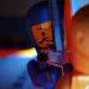
That shot, for some reason, reminds me of the 'sunrise' music. The lighting is great.
(I'd also kind of like critique on my frame...)

Golden, ask and ye shall receive. ![]()
The exposure is WAY too high. The entire wall behind the guy is full blown white, the edge of the right rock wall looks unnatural against that as a background, and the guy's armor (Especially his left shoulder pad) is nearly white.
It appears as if you have just the one lamp, since the shoulder pad is nearly white, but the black parts of the armor aren't lite very well. (Obscuring the details, and blending the surfaces.) It's hard to tell what else is in the shot, you can make out the rock wall (And it's staircase) to the left of the frame, and some sort of door-looking-thingy off to the right, but that's it.
Bottom line: Fix the lighting, then let us look at it again.
EDIT: Saw the film, doesn't look quite as bad there, but still should have been fixed. Sorry my review of the frame came too late. ![]()
Cartoonkid, great job on the window lighting!
The red piece does look a little odd with all the other black/gray/white going on. But something tells me that could be on purpose. I can see a reflection of something on the top-left wall, but can't make out what it is, and can't tell if it's supposed to be there or not.
Last edited by Pritchard Studios (July 18, 2012 (04:01pm))
I can see a reflection of something on the top-left wall, but can't make out what it is, and can't tell if it's supposed to be there or not.
The reflection is of the back end of the rover, It wasn't intentional but I don't mind it being there either.
Golden, ask and ye shall receive.
The exposure is WAY too high. The entire wall behind the guy is full blown white, the edge of the right rock wall looks unnatural against that as a background, and the guy's armor (Especially his left shoulder pad) is nearly white.
It appears as if you have just the one lamp, since the shoulder pad is nearly white, but the black parts of the armor aren't lite very well. (Obscuring the details, and blending the surfaces.) It's hard to tell what else is in the shot, you can make out the rock wall (And it's staircase) to the left of the frame, and some sort of door-looking-thingy off to the right, but that's it.Bottom line: Fix the lighting, then let us look at it again.
EDIT: Saw the film, doesn't look quite as bad there, but still should have been fixed. Sorry my review of the frame came too late.
It's all right. Also, that was made using actual game footage. No lamps were involved. The lighting was all done in Post. But thanks.


I like the use of the green light, but it would be nice if the quality on the photo was better.
Here a picture from BULB, (the new film I'm working on).
OK, so it's a cat jumping onto a stage to ruin an act or something?

Posts [ 2,081 to 2,100 of 3,680 ]