
Re: Frame from Your Upcoming Film
Yeah, they pretty much follow the same princibles as when animating action figures!
We are a friendly filmmaking community devoted to the art of stop-motion animation using LEGO® and similar construction toys. Here, you can share your work, join our community of other brickfilmers, and participate in periodic animation contests!
A place to discuss, share, and create stop motion films.

You are not logged in. Please login or register.

Yeah, they pretty much follow the same princibles as when animating action figures!

Here is a shot from Station Zero.


It's well lit and I like the colours, but I feel like there is too much access space above and below the characters.

I feel like implied ceiling supports would help it out a lot, like any sort of inverted slope

Here is a frame from my upcoming film The Knightly Quest of Knightly Quest-y-ness. This is the throne room.


Is the frame purposely tilted? And is this a happy scene? The bright colors make it look like it is. Also, I feel like it would help to have a back light, to fill in, and get rid of the high contrast shadows (seen on the studs on the floor and on the guards' arms).
@Antonio - I'm curious...are you going to be cropping the frame some or not? I can see studs on the top of the walls, which appear to not be connected to the floor. ![]() As for the hallway, it's well lit, but seems kinda empty.
As for the hallway, it's well lit, but seems kinda empty.
One last clip from Station Zero before editing.


brickelodeon,
Great scene! I love the set and lighting, but the tilt doesn't seem necessary and actually detracts from the frame a bit.
Tilted angles are fine, but sometimes they just aren't the best choice. Not to worry though, as the rest of the frame is still amazing.
Antonio, not bad. There's a bit too much empty space below her feet, but the set looks nice. I really like the computers in the first frame. It has a nice and "clean" look to it, but the spots of color keep it from being dull and monochrome. Some plates aren't quite pressed down, so you need to watch that.
I wouldn't have picked both orange and red on the minifigure, since those two and the yellow make too many bright clashing colors, and having the hand upside down looks odd. And on the first frame the guy needs to change his hair or head. Black hair on the head, and brown hair on top doesn't look right at all.
But don't loose heart! Other than the empty space on the last one, everything else is just nitpicking.


why is luke skywalker in captain USA's clothes?.... ![]()

Nice! I've actually been using the same head and hair for my own Steve Rogers in Avengers Tower.


Nice, but the bright white-out spot on his hair and the guys hand is slightly annoying, but that is supper minor. Great picture, I like it.

I like the framing of the unfocused guy.

Yesterday I did this shot. Invasion in the village by HarryAndBillyBrick, on Flickr
Winter Soldier trailer?
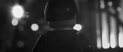
Close. This shot is from a winter soldier t.v. spot.
@HarryAndBillyBrick
Very impressive! I have a new desktop background now ![]()
Tried a few different lenses and ended up with the 18mm lens, I feel like it looks way better then the earlier image I posted:

That really looks great Sloth. I love the little blimp, I hope it's animated, Indiana Jones map style.
Posts [ 3,401 to 3,420 of 3,680 ]


