Re: Frame from Your Upcoming Film
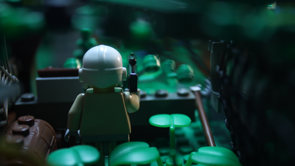
I feel like adding a blurry background makes all the difference when it comes to making stuff look pro. That being said, you did a great job.
However, I am not sure if you did this on purpose, but the colors look a bit weird. It may be what you are going for and I'm just seeing things out of context but it's ever so slightly green. Eh, it's hardly noticeable and may be an optical illusion or my computer screen being mean again.
Nah, that looks great bro. ![]()