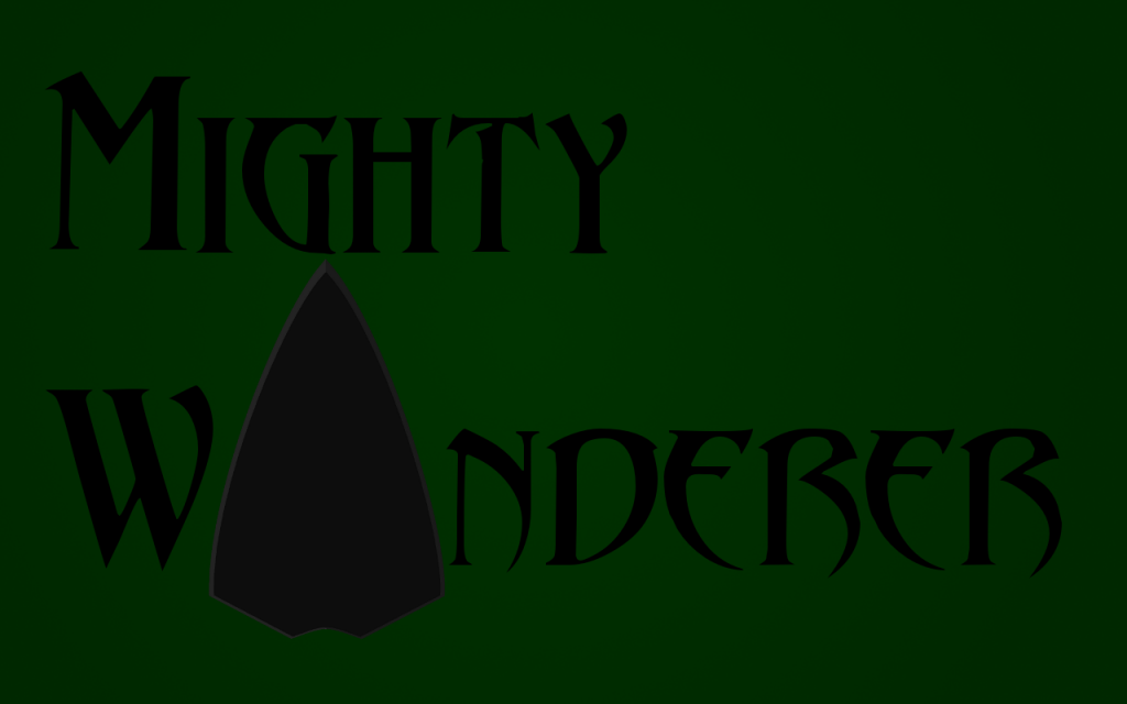
It's all right Mighty Wanderer, but there is definite room for refinement. If you are wanting to keep the current form:
- Change the typography colour from black to something far lighter, so it is actually legible.
- Change the font all together, it's garish. I suggest a sans-serif, low-key font that blends well with the overly large bold 'arrow head'.
- Reduce the arrowhead size.
- Ultimately, the 'Arrowhead', without the background information, could be interpreted as anything. Sort of reminds me of the bow of the titanic about to hit a nice little iceberg.
Otherwise, maybe you could shape the 'Mighty Wanderer' text itself to appear to be the shaft + fletching of the arrow and have your arrowhead horizontally at the front. Good luck anyhow.