
Re: Post your logo here!
Oh, it could be due to the image type i.e. .jpeg, .png, .tiff, .targa, et cetera. Jpeg works well, but tiff not as well and I don't even think they accept .targa images.

We are a friendly filmmaking community devoted to the art of stop-motion animation using LEGO® and similar construction toys. Here, you can share your work, join our community of other brickfilmers, and participate in periodic animation contests!
A place to discuss, share, and create stop motion films.

You are not logged in. Please login or register.

Oh, it could be due to the image type i.e. .jpeg, .png, .tiff, .targa, et cetera. Jpeg works well, but tiff not as well and I don't even think they accept .targa images.

I used .jpeg, I'll see if I can try to flush out the issue.

Well, I've spent a bunch of time looking for a different font, but I couldn't find one I liked more than what I have now, so I think I'm sticking with the one I have, at least for awhile. I've made some changes, though, and I decided to remove the Legos from the name, as suggested by RP. Actually RP suggested pretty much all of the changes. ![]()
And sorry for the weird formatting, it's formatted for the YouTube banner.

In your case, I would choose a darker color for the lettering. Perhaps a darker alpine green for the text on a tan color background?


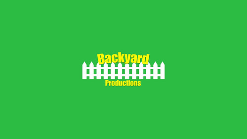
This is my first try at a logo/signature. Feedback/critique would be appreciated. ![]()
(And sorry if it seems slightly grainy)
Threw this together in Photoshop in a couple of minutes.
Not sure if I have the right to say this, but please give feedback before posting something directly after someone else. ![]()
As for the above picture, I'm not sure that that is considered a logo. I've read through quite a bit of this thread, and just adding text to a background like that isn't considered a logo. However, I might be totally off on my interpretation of the forum.

I have to say; that looks great! The colors are very nice as they "pop" from the background well. I think this is a very good logo to use.

I just realized the inside of the gear hole is a minfig head. Clever ![]() .
.

Nice, I like it! That is clever, I love it when people stick a minifig head or a brick or something into an inconspicuous part of their logo. ![]()
Cool, glad you guys liked it. ![]() I wasn't so sure about the gear and head, as it's not super original, but I chose to aim more for something simple.
I wasn't so sure about the gear and head, as it's not super original, but I chose to aim more for something simple.

My company Studio Blimp got itself a new logo recently, thanks to my partner in crime, Ben. We're tweaking the custom script type a bit at the moment.

Wait...I thought a while back you said good-bye to this thread Sean. ![]() Anyway, that looks pretty nice. However, the text seems a little off...like maybe the angle, or else the cursive part. But, as you said, the script is still being worked on. I do rather like the blimp though.
Anyway, that looks pretty nice. However, the text seems a little off...like maybe the angle, or else the cursive part. But, as you said, the script is still being worked on. I do rather like the blimp though.
Guess I'm a glutton for punishment. I'd advise against dark grey on black, by the way.
I'd advise against dark grey on black, by the way.
Okay, here's a version with a lighter background.

And I chose to change the background and not the gear because I like the gear the way it is.
I don't know which I like better...they both look decent. What do you guys think? Also, what about the font; should I change it, or does it look decent? I'm not so sure that I like the "T" in Robotic.
And Sean...were you referring to the previous picture I'd posted, or to my avatar?
I was referring to the one in your signature/avatar. The lighter background works for that, however when designing a logo you should account for presenting it on both light and dark backgrounds - wherever it is you want to make sure there's a good amount of contrast to make it readable. So for the dark background version, try make the dark grey elements a very light grey instead.
With the type, I would suggest separating the gear and the R with a negative space outline, or finding a way to work them together more seamlessly. Change your entire image to black and white. Ie, the logo is completely black and the background white. Even when taken down to two colours everything should be clear and readable. Also try putting a horizontal line through the T and I to match the other characters, and remove the vertical break in the T.
I like it.
Okay, I'll try some of your suggestions out Sean. And thanks for the feedback. It's quite helpful. ![]()
Edit: Here's the third test:

I changed the T design, as well as made the grey parts lighter. Those parts I like...however, I'm not too sure of the outline/shadow of the "R" on the gear. ![]()
Last edited by legoguy501 (October 24, 2013 (02:17am))
I think what Sean was referring to as negative space, and please correct me if I'm wrong, is a transparent gap around the "R" where you can see the background. It's hard to tell if that's what you did, since the outline is so small. If that is what you applied, though, could you possibly make it larger? I think that would look better. And I realize it might get a bit close to the center of the gear, and I'm not really sure if it would look good or not if you moved the text to the right/gear to the left, maybe that could be a possibility you could test out.
What program did you use to make it?
Posts [ 701 to 720 of 793 ]


