Re: Works-in-Progress Post and Critique
That's really nice JD.
_2014
We are a friendly filmmaking community devoted to the art of stop-motion animation using LEGO® and similar construction toys. Here, you can share your work, join our community of other brickfilmers, and participate in periodic animation contests!
A place to discuss, share, and create stop motion films.

You are not logged in. Please login or register.

That's really nice JD.

That is cool, it reminds me somewhat of Nikolas's "Bill Carney's Body," with the setting and shallow DOF.


That is cool, it reminds me somewhat of Nikolas's "Bill Carney's Body," with the setting and shallow DOF.
I agree Sméagol, it has that same kind of "feel" to it... I like it alot. Cool pic JD.

yeah, I immediately thought of bill carney's body when I saw that frame.


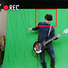
First off, thanks for your comments. I'm glad you like it! I can assure you it will be not like Bill Carney's Body, quite the opposite, though. The shot I showed here was the first picture taken for my new project. Actually, it probably won't be exactly like this in the finished film. In fact, this bar is not the main location for the plot. Once I get my computer to work again, I'll hopefully be able to finish this project.
- JD

Nice photo JD,
Here's a photo from my upcoming film, Garbage Can-Man And the Hobo.
Please tell me how I can improve.

Probably lighting. It's a bit dim. Is it daytime, evening or nighttime?

Daytime

The shot is very basic, maybe try a more interesting angle.
I moved the minifigures forward a bit and changed the angle.
That's a bit better, but it's still rather dim.

well, if you are planning on using the angle in the first picture: you should make the dark grey lower than the light grey to define the line between sidewalk and street...that is if it is meant to be a street and sidewalk, and if the red is meant to be like a red brick wall, you should consider something like this to make it more interesting:
maybe add a plant or two...and make it a bit lighter.
i hope this critique helps more than it ticks you off ![]()
-flip
The white lines always seem too thick to me.
That's the only way to do it mcoov, you can't get thinner lines or you need to costumise lego.
Well you could do it like this:

Or this:
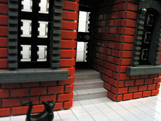

I'm quite fond of the plates on wall method. It's always been pleasing to my eyes.

I wish I had that many special bricks
Or does anyone know of a way to make a wall look interesting with just a bunch of 2x4s

I don't use wood when making sets. ![]()
You could do striped walls, or just one big color wall.

Sméagol, did you actually build that second set?? Because thats amazing!
Posts [ 281 to 300 of 384 ]