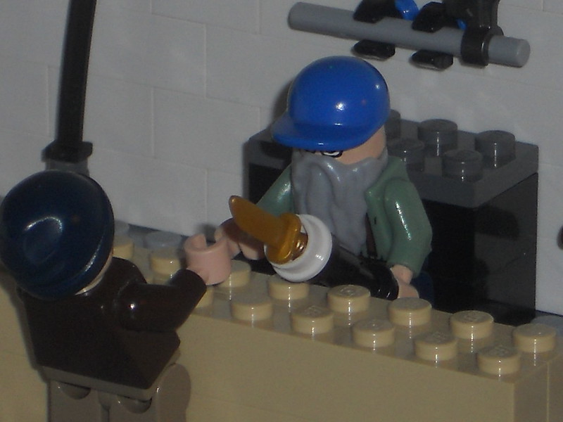
Re: Sets and Props Critique Thread
The bed should be moved just one stud closer to the table.
The bedroom and the kitchen seem really good, but the bathroom seems way off. It way bigger than a typical bathroom should be, and the checked pattern on the way feels wrong because the squares are really more of rectangles, and they're a tad too big to be wall tiles.
The shower looks like a phone box. It should probably be in the corner of the room, as most showers are, and there should also be a sink.
Think small and compact.
-Squid | Twitter | Welcome to Darkmoor