Re: Sets and Props Critique Thread

True, it's the inherent cleanness and geometry of LEGO make it seem very clean.  Old, naturally worn bricks look great,, but when people try to deliberately make them (or usually minifigs) look dirty/damaged using non-LEGO things they just usually end up looking hideous.

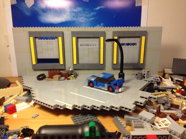
I find quite an effective technique is deliberately mixing the old and new light or dark greys.  It generally gives the walls (or whatever) more texture, since walls themselves are rarely completely one colour and have subtle variations in colour, unless you're going for a super-sterile-high-tech-facility look.  However, I have yet to deliberately implement this technique on a large scale.  Incidentally, I faced a similar challenge in my film Monochrome, which takes place in a world without colour.  Since I was pretty much restricted to light grey or extremely bright rainbow colours, I tried to make the sets varied by focusing on the design and using lots of slopes, pillars, archways, etc.

An interesting point about the stylization.  I remember a philosophy/Theory of Knowledge class I had, which discussed art, and how it filters the scene it portrays (i.e. everyday life/"ugly" things) through its medium to (in theory, at least) create something beautiful.  I think this could be extended to cinema and animation.  It's particularly noticeable with LEGO, as it is needless to say very different stylistically from real life (or even possibly any other art form--assuming LEGO is considered a form of art.  But that's a whole different subject...)  I suppose stylization or exaggeration is more difficult in live-action (unless you're going for a really surreal look) but cinematography and lighting can help.  For instance, the swimming pool/meeting Moriarty scene in Sherlock has a setting that looks amazing, even though it's mundane and probably pretty grungy in real life.  I actually like to think of this effect as the "Sherlock Effect", after my brother pointed out the same thing while watching this scene.  (You'll also no doubt recognize my current profile pic from being from the same scene, if you're not familiar with the show already... mini/XD )

Retribution (3rd place in BRAWL 2015)

&Smeagol      make the most of being surrounded by single, educated women your own age on a regular basis in college
AquaMorph    I dunno women are expensive

Re: Sets and Props Critique Thread

Here are a few photos of St. Hilarius church I retook.  These images are more revealing than the first photo, as they showcase the altar.  Let me know your comments and opinions.

http://holding-our-own.tumblr.com/post/ … rius-altar

https://vimeo.com/channels/holdingourown      http://holding-our-own.tumblr.com

"None practice tolerance less frequently than those who most loudly preach it."

Re: Sets and Props Critique Thread

I also am designing a Jetta for Brent Schneider to drive.  However, I'm not very good with car designing.  I actually tried to make this a 3-seater, using jumper plates to fit two chairs in the front.  But it wouldn't allow me to place the other panels in and I couldn't get the minifigure to sit.  I'm not looking for pure accuracy, but want to try to capture the essence of a Jetta (there are 2 door instead of 4, for instance).  The LDD models can be seen here:

http://holding-our-own.tumblr.com/post/ … 9602/jetta

I'm pretty satisfied with the front.  The back, not so much.  I really wanted to get a trunk in there and put tail lights on the vehicle that extended from the trunk to the rest of the rear.  My idea was to use 1x2x2 panels on a hinge placed sideways, but just couldn't get the room.  LMK if you have any ideas on improving the look without increasing the size significantly.

https://vimeo.com/channels/holdingourown      http://holding-our-own.tumblr.com

"None practice tolerance less frequently than those who most loudly preach it."

Re: Sets and Props Critique Thread

https://pbs.twimg.com/media/BZaNbbjIcAAmXZs.jpg

Here is another set I'm working on for Alex and Derrick: Five Years Later. It's a loading bay behind a mall. I still need to extend the back wall a bit and stick everything down, but I should be able to animate tomorrow.

Re: Sets and Props Critique Thread

mini/jaw

thats all i have to say about that.

Re: Sets and Props Critique Thread

That's the most beautiful loading bay thingy in the back of a dirty store I've ever seen...
The piles of junk and the car are especially great.

Re: Sets and Props Critique Thread

Nice work, but have you considered using tiles for the areas under the glass on the doors? It would make the studs invisible.

https://cdn.discordapp.com/attachments/315234895058173963/400133875549995018/Sig1.png

Re: Sets and Props Critique Thread

So many loose pieces. I don't understand how you are able to animate in the environments that you do, it's really amazing. The realism and on this set and others is incredible. I agree with RealBrick, smooth plates below the clear bricks would be nice, since you've got the sleek look going for the rest of the set, and you don't seem to be against a little instability here and there. mini/smile

Re: Sets and Props Critique Thread

Cool SNOT building to mke the smooth loading bay.

https://vimeo.com/channels/holdingourown      http://holding-our-own.tumblr.com

"None practice tolerance less frequently than those who most loudly preach it."

Re: Sets and Props Critique Thread

I really like the way you made teh diagonal parking lines.  Are you going to animate a walk cycle on that surface?

Anyway, I built a bunch of stuff:

A wheelchair thing with a bunch of medical equipment attached.
http://farm4.staticflickr.com/3671/10968079514_c4dc05de6c.jpg

http://farm4.staticflickr.com/3744/10968163453_64870ac828.jpg

http://farm8.staticflickr.com/7404/10968160833_8afb934100.jpg

The person in it might be a future minor character in a brickfilm of mine, who is basically a guy who got involved a certain "incident" which gave him debilitating injuries, which means he's confined to a wheelchair and needs a mask just to breathe.  I'm not sure if the idea is slightly cheesy, though--thoughts?

Also, I built a Batpod.  I actually made this ages ago, but re-discovered it while sorting my collection.  And since I got a Batman minifig, I decided to post it:

http://farm4.staticflickr.com/3829/10968157753_717e2b1914.jpg

http://farm4.staticflickr.com/3776/10968154313_a6f65abc7c.jpg

http://farm4.staticflickr.com/3818/10968160965_5b1d65afff.jpg

Last edited by Mr Vertigo (November 20, 2013 (02:54pm))

Retribution (3rd place in BRAWL 2015)

&Smeagol      make the most of being surrounded by single, educated women your own age on a regular basis in college
AquaMorph    I dunno women are expensive

Re: Sets and Props Critique Thread

That wheelchair is pretty good, but the Batpod just looks eh.

Re: Sets and Props Critique Thread

The wheelchair looks really, really good, but that head makes him look like a villain.

It could do better with a normal head.
You should use it in something.

Re: Sets and Props Critique Thread

Hey, I finally figured out how to get an img to appear on my post!  So I'm reposting.

Here's that image of a Jetta for Brent Schneider to drive, in LDD format.  However, I'm not very good with car designing.  I actually tried to make this a 3-seater, using jumper plates to fit two chairs in the front.  But it wouldn't allow me to place the other panels in and I couldn't get the minifigure to sit.  I'm not looking for pure accuracy, but want to try to capture the essence of a Jetta (there are 2 door instead of 4, for instance).

http://25.media.tumblr.com/a5bf2b0f1bc923e756a3a1c637b8bbe0/tumblr_mwb6pxCGMv1risd4oo1_1280.png

http://24.media.tumblr.com/21dafe077645fc9fae7b714037195a8a/tumblr_mwb6p6IHQM1risd4oo1_1280.png

I'm pretty satisfied with the front.  The back, not so much.  I really wanted to get a trunk in there and put tail lights on the vehicle that extended from the trunk to the rest of the rear.  My idea was to use 1x2x2 panels on a hinge placed sideways, but just couldn't get the room.  LMK if you have any ideas on improving the look without increasing the size significantly.

--

And here are the new St. Hilarius images:

http://25.media.tumblr.com/e677af66e310e55df030a25561f8997c/tumblr_mw7hrivgs81risd4oo1_1280.jpg

http://24.media.tumblr.com/67dfee2fe880e65498444c2494d5b06d/tumblr_mw7hwsTse51risd4oo1_1280.jpg

Let me know what U think!

Last edited by HoldingOurOwn (November 21, 2013 (07:34am))

https://vimeo.com/channels/holdingourown      http://holding-our-own.tumblr.com

"None practice tolerance less frequently than those who most loudly preach it."

Re: Sets and Props Critique Thread

RealBrick wrote:

Nice work, but have you considered using tiles for the areas under the glass on the doors? It would make the studs invisible.

Good idea. I made the change and animated my two shots with the set a few days ago.


backyardlegos wrote:

So many loose pieces. I don't understand how you are able to animate in the environments that you do, it's really amazing.

Before I build a set, I plan out exactly what I need from the set. Lots of walk cycles? Floor needs to have studs. Lots of figures that need to be animated individually? Big, open set that I can get my fingers into. Not a lot of movement? Smaller and/or more cluttered sets are okay.


FlyingMinifig wrote:

Are you going to animate a walk cycle on that surface?

Nope, the animation for this set was almost laughably simple: a figure leaning against the car, then looking down. I doubt I would have gone with the smooth ground if I needed to animate anything more complex.

Re: Sets and Props Critique Thread

Troodon wrote:

the Batpod just looks eh.

What a fascinating, informative piece of constructive criticism.  Have you got anything more useful to add (such as why it might be "eh"?)

Squid wrote:

The wheelchair looks really, really good, but that head makes him look like a villain.
It could do better with a normal head.
You should use it in something.

Thanks! mini/smile
I used the head because it's supposed to be a breathing mask.  Basically the guy was involved in a massive explosion/accident/incident which paralysed him and gave him a lot of injuries, which is why he needs a special mask to supply him anaesthetic gas and help him breathe.  And I can't really think of many normal head that I have that would work--but I'm open to suggestions, as always.  Also, while he isn't necessarily villainous he's a pretty shady character. 

I certainly intend to use it at some point in the future, though maybe not necessarily with this particular character.

Last edited by Mr Vertigo (November 23, 2013 (09:52am))

Retribution (3rd place in BRAWL 2015)

&Smeagol      make the most of being surrounded by single, educated women your own age on a regular basis in college
AquaMorph    I dunno women are expensive

Re: Sets and Props Critique Thread

I really like the batpod. I understand that it's a bit big, but It's hard to create a good batpod with all of the detail that's still mini figure scale. I made a batpod that I'm quit happy with, but it doesn't have the hand guards or the guns.

"I wear black even when I'm not animating. I'm like a walking funeral parlor."
-PushOverProductions

Re: Sets and Props Critique Thread

I like the batpod too! It looks detailed, yet solid enough for brickfilming.

If it you made it smaller or more accurate to the Nolan films I think it would've been harder to use in a stop motion environment.

https://farm9.staticflickr.com/8625/16037138950_5eeda635ce_o.png

Re: Sets and Props Critique Thread

The blue thingie wingy just sticks out too much.
get a black version of it so that it looks a bit cleaner.
Other than that the batpod looks pretty good.

Re: Sets and Props Critique Thread

@FlyingMinifig I really like the wheelchair you made! I think it looks very effective! Looking forward to seeing how you use it mini/smile Also the Batpod in my opinion looks very similar to the one used in the movies but with your own twist to it mini/smile Also liking the use of Technic pieces mini/smile Never see those used enough...

@HoldingOurOwn The church looks very effective! The only thing that stands out to me is that in all the churches I've been to the piano faces the wall...But that could just be the English wanting to make church as boring as possible for the pianist ;D Very nice set mini/smile The stain glass windows are very detailed mini/smile Loving the symmetry you put on then mini/smile

Re: Sets and Props Critique Thread

Kitchen

Bedroom

Bathroom

I'm going for a bit of a dismal, minimalistic "American Psyho" look.

Last edited by Eddie (November 26, 2013 (03:53pm))

| Website |
So yeah, I'm back from my mind.