Re: Sets and Props Critique Thread

Infinity Prime Studios wrote:

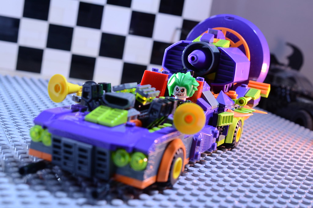
Does anyone have good tips in building an interior of a space station? Like I'm aiming for an Alien/ 2001 A Space Odyssey vibe ( like with detail and all) , but I don't know where to begin in constructing something like that.

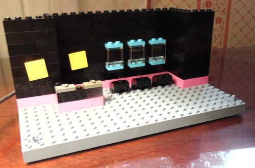
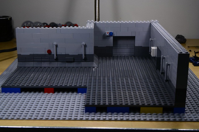
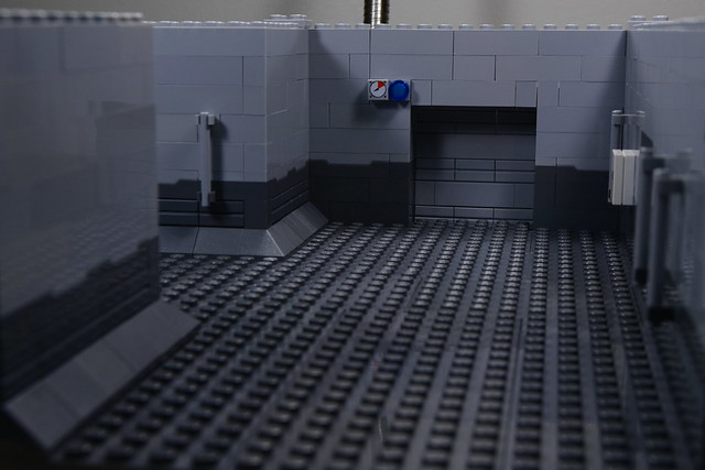
If you want your film to look like Space Odyssey, try to set up your sets to have symmetry in one-point perspective. Both your hallway pictures are actually good examples of this already. mini/lol

Basically you just want to keep the vanishing point in the center of the frame. This is super easy to do with LEGO because everything is already laid out in a grid for you. Just point your camera so the horizon is at the center of the frame (usually the horizon will be imaginary) and straight down a line of studs, and you will have beautiful one-point perspective!

http://img.gawkerassets.com/img/17xslnu1ku57ajpg/original.jpg

(more examples here)

This type of cinematography was characteristic of all of Kubrick's films, but 2001 exemplifies it the best, IMO. Naturally, this is not possible for every shot, but it's good to keep in mind. Your audience would also get bored of one single kind of shot throughout the film, so it's good to mix it up! mini/wink

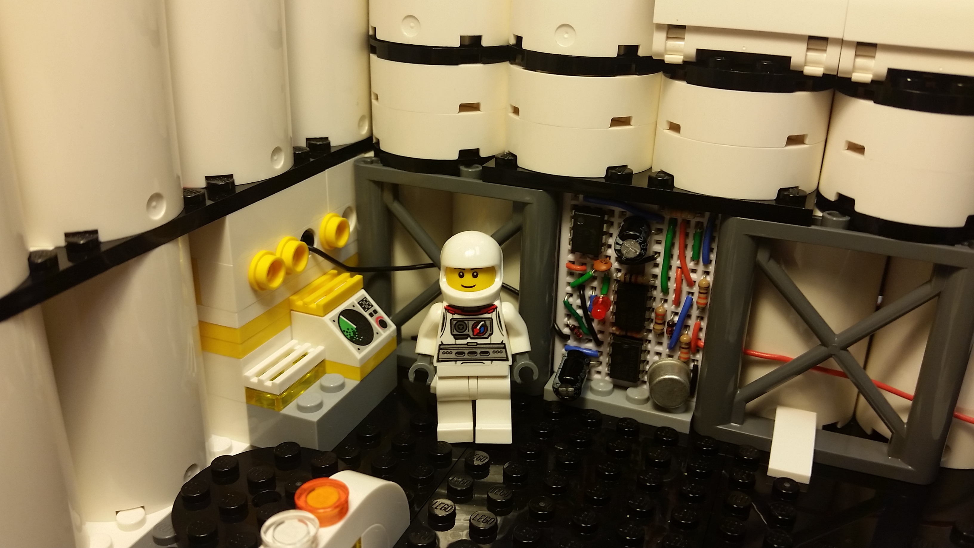
As for your own set you definitely have the right idea with the cramped tunnel aesthetic. There is a bit of unused space on the upper walls that could have some piping or an electrical panel or something the astronauts might use.

I might also recommend adding some kind of element of depth to your frame. You can always shoot down a long hallway, but you could could shoot down intersections of corridors to have a lot of space to work with. This will also make it possible to shoot at odd angles in order to break the one-point perspective pattern.

Hope this helps!

http://www.brickshelf.com/gallery/minifig77/stills/aousbanner.png

Re: Sets and Props Critique Thread

This is the Running Gag, a car I had originally built for the car chase in I am the Night.  I probably made it in either 2011 or 2012 along with the Batmobile.
Because I wanted to keep how it looks a surprise for I am the Night, I hadn't taken a picture of it until recently.  But, since the extended version of the film likely won't be finished, I wanted to show off what I had made.

https://c2.staticflickr.com/2/1544/24980760295_160a8864d7_b.jpg

https://c2.staticflickr.com/2/1603/24704248020_bb15eb4dd3_b.jpg

https://c2.staticflickr.com/2/1546/25040424886_f14c678e55_b.jpg

Overall, it was a particularly difficult build, and I'm surprised that it still seem to stand up to my more recent work despite it's age.  Cars are always really hard for me.

My original plan was to have the car chase start out with Batman chasing the Joker in a tiny little clown car, a sort of minimalist buggy.  But then in the middle of the chase he would Batman would lose sight of him for a few seconds and he'd come back out with this.

I still put an image of this at the very, very end of I am the Night in the ANP title card.

Re: Sets and Props Critique Thread

One word: Intense!

https://vimeo.com/channels/holdingourown      http://holding-our-own.tumblr.com

"None practice tolerance less frequently than those who most loudly preach it."

Re: Sets and Props Critique Thread

Nice car! mini/bigsmile  You are definitely a master builder!

Re: Sets and Props Critique Thread

Thanks guys. mini/smile

An interesting thing I did here is that the back of the car and the front of the car have an even stud width, but I offset the middle portion to have an odd width of studs.  That way I could put the seats in so they wouldn't be too far apart or too close together.

Re: Sets and Props Critique Thread

I also noticed that there is an impressively large tile pattern that truly fits the joker's maniac mind!

This is an unfinished set for a collectible shop.  I like to build the framework first, and add all the details after.

http://40.media.tumblr.com/a454bc24c5f24d25875af1d56416f70c/tumblr_inline_o2sv9s6id21ry2jlq_500.jpg

Here, you can see a second picture and a bit of information about the set and scene:

http://holding-our-own.tumblr.com/post/ … n-progress

https://vimeo.com/channels/holdingourown      http://holding-our-own.tumblr.com

"None practice tolerance less frequently than those who most loudly preach it."

Re: Sets and Props Critique Thread

http://www.brickshelf.com/gallery/minifig77/stills/20160227_003923.jpg

This is for a scene I'm working on with spaceman Bob. Sorry if it's a weird angle, that's about the entirety of the set though. The cylinders extend upwards a few more centimeters but it's supposed to be pretty compact otherwise. It's supposed to be a moon base, particularly a defense system control room. The little red LED on the breadboard lights up when powered, but I still have to make the switch to control it for animation. Luckily it takes AAA batteries!

http://www.brickshelf.com/gallery/minifig77/stills/aousbanner.png

Re: Sets and Props Critique Thread

Right now the set itself look pretty good, but the lighting looks a little weak.  It's a bit too warm, which isn't really befitting a spaceship, and that really stands out with the white all look a little yellowish.

On the right wall, there are a lot of cylinders, and two of the cylinders have a black plate under them, however, the two cylinders on either side have round plates under them.  This feels somewhat inconsistent.  I would suggest putting plates under all of those cylinders.  It would make it move into that section a little more naturally.

I also think that the floor might look better as light grey, dark grey, or white.  I feel like a black floor is just too dark, which makes the lighting a little to contrasted.  A brighter floor would help bounce the light back up onto the walls and such.

Re: Sets and Props Critique Thread

Squid wrote:

Right now the set itself look pretty good, but the lighting looks a little weak.  It's a bit too warm, which isn't really befitting a spaceship, and that really stands out with the white all look a little yellowish.

I suppose I should probably have put more effort into the lighting of this particular shot... This is just a bare tungsten bulb to show the set, I was planning on rigging some white LED strips along the ceiling and behind some support beams and such to give the ship more vertical depth, and also cooling off the color.

Squid wrote:

I would suggest putting plates under all of those cylinders.  It would make it move into that section a little more naturally.

Now that you mention it, I see what you mean. I'll try to fix that and post a new pic, especially since now I've got the red LED working mini/smile

Squid wrote:

...A brighter floor would help bounce the light back up onto the walls and such.

I agree completely. I wish I could have done this in bluish gray, but unfortunately this set pretty much exhausted my entire available collection. I don't have any more plates to make a different floor with... mini/blankexpression

http://www.brickshelf.com/gallery/minifig77/stills/aousbanner.png

Re: Sets and Props Critique Thread

This is supposed to be the main hallway of a small spaceship. I feel like the walls are really bland, but I'm not sure how to go about adding more detail. The poles and the red button are necessary for the plot, but anything else can go or be changed.

https://farm2.staticflickr.com/1672/26118237196_7e488de038_z.jpg

Another angle:

https://farm2.staticflickr.com/1674/26077839481_d93073817e_z.jpg

Any suggestions?

Re: Sets and Props Critique Thread

I really like the patterned one plate offset in dividing line between light and dark. That's a fantastic way to break up the line, and I'm surprised that it hasn't been done too often before.

You say this is a small space ship, right? In that case, you may want to make the room feel smaller and more cramped. So I would suggest adding some inverted slopes near the top to bring things in and down a bit. Also, you may wanna add slopes to the bottom of the walls that are missing them.

Next, periodically add pillars in the walls. To do this, take out one of the slope pieces and replace it with one of these in dark gray, then build up until it's level with the top of the set. For one, it'll break up the smooth, unbroken plane of the wall, as well as add to the 'space-ship-y' feel by bringing things in just a touch.

Finally, do you have some LEDs? Those go a long way in giving a set a nice sci-fi feel.

Re: Sets and Props Critique Thread

What if you added some slopes on the top of the door to make the top arched? Or maybe you could put some on the top and bottom to make it rounded?

This world is a dark place. One day I will see my Savior face to face.
My Youtube

Re: Sets and Props Critique Thread

As Pritchard said, the color break in the walls is really nice, especially with the spring loaded bricks(?) (the ones that shoot projectiles, right?). Along with what Pritchard suggested, try to clutter up the space a bit. Put some random crates and stuff around. If you're going for the dirty space look that can really make a difference.

Re: Sets and Props Critique Thread

I really like how it looks.
I'd suggest making it so that the slopes are on both sides of the wall.  It's a nice detail.

Re: Sets and Props Critique Thread

I agree with Osomstudios that the door would look better round.  Also, the control panel by the top left corner of the door looks odd, maybe if you moved down two bricks it could become the door's control panel?
Overall nice set, I look forward to seeing the movie it stars in.

The Third Arrival is out now!
https://c1.staticflickr.com/4/3749/33174196922_0638c7d7e7_n.jpg
--"The sun's not yellow, it's chicken!"

Re: Sets and Props Critique Thread

Wow, thanks for all the replies everyone! I tried out Pritchard's pillar idea and added the sloped to both sides, and it's looking a lot better now. Thanks! Glad you guys like the wall pattern, too. mini/smile

Re: Sets and Props Critique Thread

I must say that using the spring shooter prices for the pattern on the wall is fantastically brilliant! mini/bigsmile  I never would have thought of that in a million years.

Re: Sets and Props Critique Thread

Back when the animation challenge was mosaic animation, I built a proof of concept for the 2001 A Space Odyssey singularity warp  scene. It came out pretty well but I determined it would be way more work than it was worth. It also needs to be viewed form pretty far away, so I don't think it would translate very well to video.

https://farm2.staticflickr.com/1514/25636224033_cda631a016_n.jpg

Re: Sets and Props Critique Thread

That's really cool! It looks like something you could hang on the wall.

Re: Sets and Props Critique Thread

I didn't know where to put this, but somewhere in BRICKS seemed appropriate, and I didn't think it warranted its own thread.  If it's wrong, please move it.

I made an LDD rendering of the Duck Duck Go Mascot, whose name is Dax.

Here it is, resized about the size he appears on the web site:

http://40.media.tumblr.com/562e1d6bb7307919eb0f85f94fb911bd/tumblr_inline_o5sr4iRuwh1ry2jlq_250.jpg

For comparison, here's the original:

http://blog.hikoweb.net/public/logos/duckduckgo-logo.png

It looks like I should have put Dax a bit lower & to the left.

Hope you like it!  share thoughts & comments.

Last edited by HoldingOurOwn (April 17, 2016 (02:35pm))

https://vimeo.com/channels/holdingourown      http://holding-our-own.tumblr.com

"None practice tolerance less frequently than those who most loudly preach it."