Thanks for the comments guys. 
@Tenny, which size TV fits a minifigure's house better? I think the largest one looks the best, but the medium seems to be the best sized one.
Here's an update on my background test:
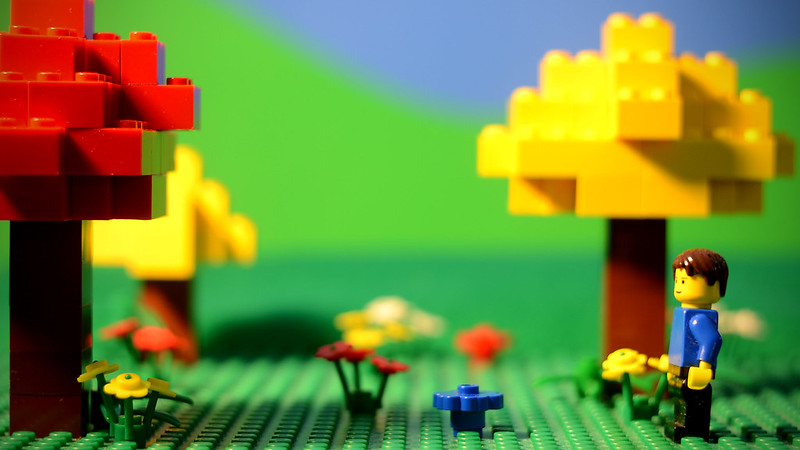
 Backdrop Test 2 by rioforce, on Flickr
In this one, I painted the hills background with watered-down blue paint to decrease the intensity of the green and to give the illusion of depth (you know, like when mountains turn blue in the distance but are not up close?).
I used a piece of cotton for the clouds (real cotton from a cotton plant, because I didn't have any cotton balls accessible at the moment, that's why it looks so dirty and not as white as it ought to  ), and improved my lighting. I also removed the felt for the extending ground, and instead added a couple more baseplates with two trees on them to make the landscape larger.
How do you like it? Any improvements needed?
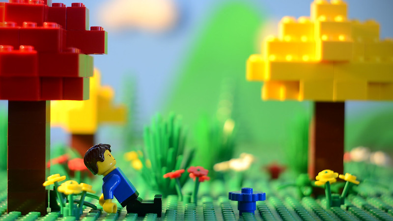
@HOO The idea of the trees came from Legendary Brick Studios' short Spring. I have a distinct lack of those new tree-leaves parts, so I thought I'd use the brick-built trees, which I really like.
@Squid I did notice that you tend to use gray slopes for your backgrounds. I really like that technique, and wish I could try it, but I have a lack of those bricks too. Basically, I have mostly basic bricks and not many of the newer parts. Thus, I am resorting to cheap non-LEGO solutions to add depth to my films. I think it's also helping me develop a distinct style, which I have been wanting for a while.
YouTube • Website "Whatever you do, do all to the glory of God." - 1 Corinthians 10:31b


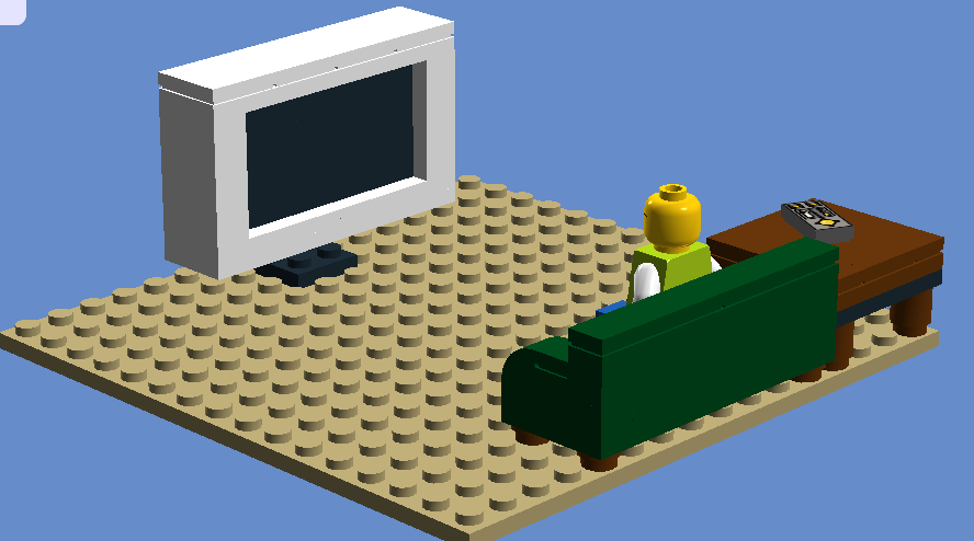 Couch, TV, and Side Table by TwoGuysBrickfilms, on Flickr