Squid wrote:I've updated the cemeteries with Mr. Vertigo's suggestions.
I feel like the goblet wizard chap looks significantly nicer with his new base. I think that was a very good idea to add one.
Any thoughts?
I was thinking more along the lines of some small slopes for the base; it still looks a bit low for me. I think one brick or slightly more is a good height. As for the graves, I was thinking having a 4x6 (or similar dimension) plate stuck in front of the grave to make it appear as though something has been buried there. Of course, it wouldn't be a perfect square, I'd add cheese slopes, small plates, etc. on top to make it look more natural, or create more irregular shapes using smaller plates instead of using a single 4x6 (which was just a general example). Also, maybe add small decorations, railings, or suchlike around the graves, or maybe even a low stone box in front of the gravestone (something like this):


Also, if you want to make it look like a really old cemetery, I'd recommend slanting and off-setting the gravestones themselves to make them crooked and old. For example, if you look at really old real-life cemeteries, such as the old Jewish Cemetery in Prague, the gravestones look really irregular:

(Obviously this is a somewhat extreme example, and it's very crowded seeing as Prague was/is a comparatively big city and not a tiny village, but it should get the point across.)
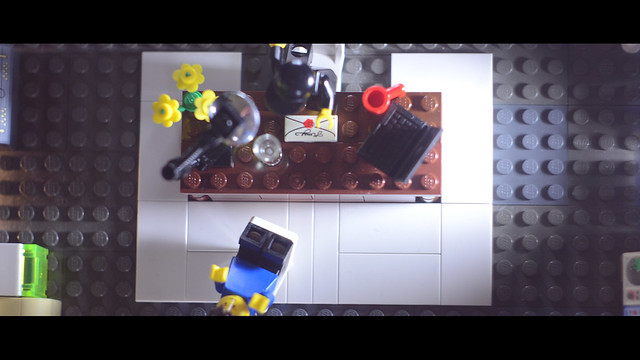
I guess that in a lot of cemeteries the ground where the hole was dug is indistinguishable from the surrounding ground so it should technically look fine, but the way you've rendered it in LEGO somehow makes the cemetery look a bit off to me for some reason. It looks like you've lined up the gravestones and statues on a baseplate, which feels a just bit too neat and tidy, almost clinical, to me.
Whew, that ended up being a lot longer than I thought, hope all this makes sense.
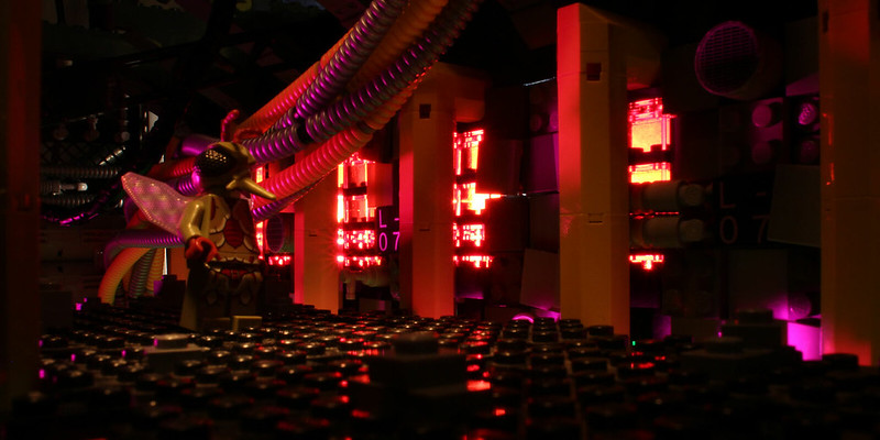
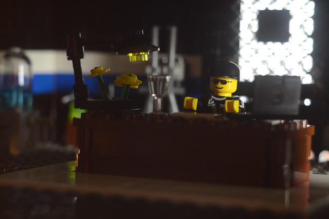
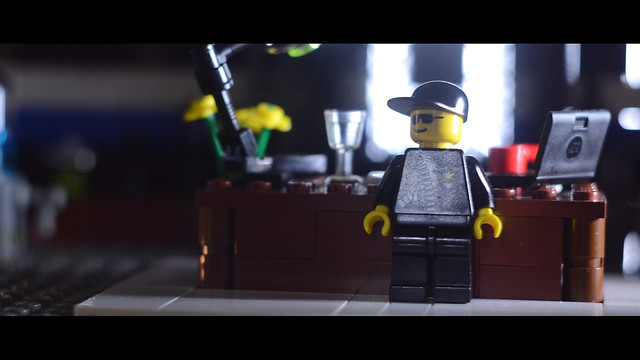
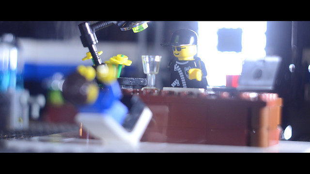
I'm hoping to film tomorrow, animating at the same time as the Thackers to get into the merry old Thac spirit even if I'm not entering.
Me too. I'm not going to enter THAC unfortunately as I don't have time, but I want to still celebrate the spirit by trying to animate as much of my film as possible tomorrow, in between the rest of my daily activities. I'm hoping I can finish my scene--I've animated a good chunk today and yesterday, so I'm feeling optimistic.
Retribution (3rd place in BRAWL 2015)&Smeagol make the most of being surrounded by single, educated women your own age on a regular basis in college
AquaMorph I dunno women are expensive