
Re: Sets and Props Critique Thread
jampot wrote:
the whole thing looks like it's built from rock.
Also, 3000th reply!
signature
We are a friendly filmmaking community devoted to the art of stop-motion animation using LEGO® and similar construction toys. Here, you can share your work, join our community of other brickfilmers, and participate in periodic animation contests!
A place to discuss, share, and create stop motion films.

Ad
You are not logged in. Please login or register.

the whole thing looks like it's built from rock.
Also, 3000th reply!

Wout, did you forget the set-critiquing part of your comment? ![]()
@Galactic,
Basically, Jampot is, like usual, correct.
I feels very much like a jury-rigged assembly-line in some rocky half-forgotten planet.
The look you need is a more grey, much less color/rock work, and more repetitious patterns. I suggest more robot arms/automated equipment, as well as adding another conveyor belt, spacing them 5-6 studs apart, and elevating them both a brick off of the ground. In fact, if you were to only change a few things, if should be elevating the belt and adding a robot arm or two.
See what you can do in keeping things the same uniform in color and build. This is one of those few times when straight, boring, solid-gray walls work really well. Also, see what you can do with the lighting. Do you have any LEDs or flashlights you could use to really dress things up?

Thanks man. I'm in the early stages of CG so if need be I can change the planet to something else. This is a under ground factory and the people are not as funded as the droid factories so I thought I'd make it look a bit more un kept and trashy. I hope the context helps. Also you can see the tiles that are used for the transportation of the box on the end. Now that I think about I don't know why I keep calling it a factory it's really a mine. My bad ![]()

Squid, very nice. I'd love to see this in "color".
Luckily, I also took every single picture in colour as well.

I much would have preferred to have the seats be red, but I couldn't have them in the right shape that way so I just made them purple. However, once again the advantage of shooting in greyscale makes this irrelevant.
If the car appears in the red scene, though, I will probably colour the seats in red, as well as the tail lights and the seal on the woman's letter.

The brick wall looks dandy, and so do the plants. If angled correctly, the would be perfect for the sides of the frame.
I also like that you've given the copper a classic smiley. I've also done this to all three of my coppers.
Is this for the film were I play the snobby beard man?Anyway, I've taken some suggestions from here and elsewhere to fix my model.
The improved version of my Darkmoor Automobile:
The curves on the front have been moved forward so that the engine comes out less comparatively, I've also reworked the rear to make it slightly less tall, and I've worked a curved thing there which puts the wheel at an interesting angle (based off of that last picture from FM). A gauge has been added to the cockpit, and I've added several more black details in various places.
The back is still slightly large, but much less so than before. There are also still some weird lumps near the windshield, but I need to have them there for the glass to stay in place. It was especially difficult to get that bothersome piece to even be there because pf the uneven width. In the end, I couldn't even get it to properly attach, so I made it in such a way that it can fall out, but only if the car is turned upside-down. Luckily, I don't plan to turn the car upside down in the film, so this shouldn't cause a problem.
As an extra detail not pictured, I've put a letter in the passenger seat as though the driver had left it there in the way that many drivers tend to leave random things in their cars when alone.
I still think you could get the back a bit lower. I don't know if you saw this but the back in flying minifigs picks didn't go down in the front. So I think that if you wanted to you could take the slope bricks in the front of the back of and then lower the hole back part down

the red scene
Careful! People might think you're ripping off Schindler's List. Just sayin'.

I haven't seen that film, so I'm currently incapable of ripping it off.
But I know that there have been multiple films which have colorized specific elements for dramatic effect. Paperman, for instance, and I think there are even some films that used it before colour film even became a thing. So I wouldn't worry too much.
I also doubt Schindler's List involved a villain who looks like steampunk version of a cross between Lord Sauron , Hal 9000, an evil cat, and a kraken, who also has a maniacal rhyming top-hatted lunatic of a henchman.

Thank you people for you nice words.
Squid your car looks leaps and bounds better. I quite like it now.
Galactic Films, I think it looks a bit bare. It definitely needs more detailing to fill all the blank space, like railings and machinery, maybe try to cut out some of the studs with flat tiles/cheese bricks also. Just focus on making it a lot more polished and detailed (the devil is in the detail). It has potential.

I also doubt Schindler's List involved a villain who looks like steampunk version of a cross between Lord Sauron , Hal 9000, an evil cat, and a kraken, who also has a maniacal rhyming top-hatted lunatic of a henchman.
No, but I think that exactly describes someone from "Must Love Dogs."
Does anyone have any tips for creating an open city space, like this?
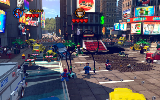
I've just started work on my second episode of Avengers Tower (the first episode is finally done and will be online tomorrow) and I want to build a Times Square set. It doesn't need to be big, but it needs to give the illusion of being big. Please bear in mind that I don't have many bricks for walls and stuff, especially after building my main Avengers Tower set.
Please respond as any help you can give would be much appreciated, and I want to get started on this as soon as I can.
I'm ready for some people to start groaning that I'm doing a licensed theme video, but please try to help if you can. This is only an interim project - once I've got three or four episodes done, it's back to my own, original projects. Well, plus a lightsaber duel, but that's different ![]()

To create the illusion of the set being bigger than it seems, use forced perspective backgrounds. Make miniature skyscrapers and other buildings and line them up on the horizon. Build facades of the other buildings that are on the square, it'll save you a lot of bricks that you can use to make even more facades. If you still want to reduce the ammount of bricks you need, you can try to bring all of the buildings closer together and make the whole set more compact. This will also make the square look busier. The most important thing to remember is to add as much life to the set as possible.
You can make billboards out of colorful bricks, or you can animate them in post-production.
Last edited by BrickStory (March 26, 2014 (03:21am))
Yes, I do. Notice the only place there could be a horizon, a tree is blocking it. Concealing the entire horizon prevents you from making endless buildings and landscape.

what software do you have Jampot?
Thanks for the tips guys!
@Cooked Cat, the complete Adobe cloud (so AE, Premiere, etc). I do have Blender and LEOCad too, but have no idea how to use them.
ok same, I also have hitfilm ultimate 2 and 3ds max.
ok, I would create a lego scene with a gap in the center for your real set. bring the scene into blender, animate it all and your away laughing....
I'm really not that up on Blender. When I say I have no idea how to use it, I really mean it, and I'd want to texture it properly and learn how to do decent lighting before I started trying to do it in a brickfilm. My plan is to begin learning during my free time at uni.
I also have HitFilm 2 Ultimate and had completely forgotten about it ![]() do you have an tips for getting started with it?
do you have an tips for getting started with it?
well, I do have some tuts on my channel:
https://www.youtube.com/user/ACookedCatProduction
and, I am happy to do Tuts on Hitfilm...

So I just finished a bathroom which is going to be featured in our next film. I was originally just going to film from directly above the man in the tub, and a close up of his face. However, I liked the bathroom so much that I think I'll film a couple of more shots there.
Of course, the white balance and everything will be much better in the actual film. These were just some test photos I took to show the set.
Do you guys have any thoughts?


Posts [ 3,001 to 3,020 of 3,570 ]


