Re: Sets and Props Critique Thread

Thanks for the feedback!

If I do go for the brown road, I will put some stuff at the side as so it can ease in, for the time I just wanted to see it next to the grey of the grass.  But with the correct easing in mind I'm starting to lean towards road 2, perhaps making it slightly wobbly at the edges.

Darkmoor is a more isolated country town in Britain BTW.  Cars are still at the time of the story a relatively new invention.

Re: Sets and Props Critique Thread

edit: (ignore this post)

Re: Sets and Props Critique Thread

END films wrote:

edit: (ignore this post)

(Okay)

@Squid you really like the UK...nice to know that it's not just UK brickfilmers who set stuff in good 'ol Albion.

http://www.brickshelf.com/gallery/ZoefDeHaas/stuff/sig1.png
"Nothing goes down 'less I'm involved. No nuggets. No onion rings. No nothin'. A cheeseburger gets sold in the park, I want in! You got fat while we starved on the streets...now it's my turn!" -Harley Morenstein

Re: Sets and Props Critique Thread

jampot wrote:
END films wrote:

edit: (ignore this post)

(Okay)

I was giving my vote on which rode...without seeing the next page with Squid's decision.

Re: Sets and Props Critique Thread

Check out my new ride:

https://scontent-b-iad.xx.fbcdn.net/hphotos-ash3/t31.0-8/q71/s720x720/1522728_822978804382968_1340134901_o.jpg

https://scontent-a-iad.xx.fbcdn.net/hphotos-ash3/t31.0-8/q71/s720x720/1921046_822979034382945_1205035887_o.jpg

This is the protagonist's car from Welcome to Darkmoor.
I built it around the basis of using the round space engine piece for the front of an early 1900's styled car.  Because of this, I had to make the car seven studs wide, which is rather challenging to build since it's an uneven number, though, I find that a seven stud width is best for making a car's seats.

2,986

Re: Sets and Props Critique Thread

Nice car, I love the use of the rounded bricks. I am looking forward to seeing it in action.

Re: Sets and Props Critique Thread

This makes me want to build a bunch of classic style cars, even though I have no particular reason to do so.

I love the way you utilised the round brick, that's a really creative usage of that part.  I feel that the grille part on the front of it juts out too far and looks rather odd, though.  Maybe try pulling the round part back one stud or find a grille piece that sticks out less.

However, the back of the car is much too bulky and built-up.  I'd bring it down by at least a full brick and try to make it more uniformly smooth.  Right now it just looks really thick and awkward compared with the nice smooth front.  If you look at a few pictures of different classic car types you can see that the back is a lot lower--it's usually flush with the front or built to surround the head of the driver.  Here's a few pictures I got from a short Google Imges search:

http://www.velocetoday.com/wp-content/uploads/2009/02/sm-car-late-1930s-london.jpg

http://cdn.cloudfiles.mosso.com/c122611/925435a3-7ba8-440f-8c8d-b841375fb5fc

http://hkcarworld.com/sites/default/files/news/latest/mercedes-benz_at_2013_elephant_race_1.jpg

(I'm not sure what style you're going for exactly, but it reminds me the most of a 1930s racecar.  I often find it very useful to look at some pictures if I'm building a specific type of vehicle for inspiration.)  Hope you don't mind all the pictures here.

As a side note (heh heh) I also think some proper doors for the side would look great too (or even just adding a door handle using a headlight brick).  Right now I feel the sides look a bit too flat and square.

Last edited by Mr Vertigo (March 22, 2014 (12:40pm))

Retribution (3rd place in BRAWL 2015)

&Smeagol      make the most of being surrounded by single, educated women your own age on a regular basis in college
AquaMorph    I dunno women are expensive

Re: Sets and Props Critique Thread

I love it, especially the front half of the car. If you're going for a whimsical aesthetic, I think it's perfect the way it is; if your going for something more realistic, I agree with FlyingMinifig that the back half should be shorter.

Re: Sets and Props Critique Thread

This post rates -1 in the Negativity Scale. Sozzles.

It's okay. The bonnet and pronounced mudguards are decent, but the protruding front/grille just looks really out of place and disjointed. The back (others have covered that) and plain flat sides furthermore really do not fit your desired early 1900s car aesthetic. It looks like the love child of the original Thunderbirds FAB1, the DeLorean and some unattractive 1970s car.

Early to mid 20th century cars generally sported smoothly contoured, curving shells; your car is the antithesis to such. if I were you I'd browse Flickr some more (check out this guy or these 1 2 brilliant specimens) and revise it definitely.

Last edited by Carousel (March 22, 2014 (10:31pm))

Re: Sets and Props Critique Thread

Awesome! Love the classic design. mini/smile

Re: Sets and Props Critique Thread

http://farm4.staticflickr.com/3763/13345517433_4689f33fa5_b.jpg

I spent an afternoon playing with my Lego, here's the result. Microscale buildings are in the works (for the background), once they're done I'm on track to begin filming. Jubilation.

Last edited by Carousel (March 23, 2014 (12:50pm))

Re: Sets and Props Critique Thread

WOW! that looks AWESOME! I love the grass.:)

Re: Sets and Props Critique Thread

Lovely job, Carousel! Can't wait to see more.

Have you seen a big-chinned boy?

Re: Sets and Props Critique Thread

Beautiful! Really great set, and I second what Mickey said.

"I wear black even when I'm not animating. I'm like a walking funeral parlor."
-PushOverProductions

Re: Sets and Props Critique Thread

The brick wall looks dandy, and so do the plants.  If angled correctly, the would be perfect for the sides of the frame.
I also like that you've given the copper a classic smiley.  I've also done this to all three of my coppers.
Is this for the film were I play the snobby beard man?

Anyway, I've taken some suggestions from here and elsewhere to fix my model.
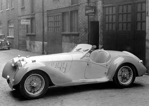
The improved version of my Darkmoor Automobile:

https://fbcdn-sphotos-c-a.akamaihd.net/hphotos-ak-prn2/t1.0-9/p480x480/1958547_709043479118997_175423346_n.jpg

https://scontent-a-iad.xx.fbcdn.net/hphotos-frc3/t1.0-9/p480x480/10152416_709043519118993_1643827841_n.jpg

https://scontent-a-iad.xx.fbcdn.net/hphotos-prn2/t1.0-9/p480x480/1458477_709043539118991_505903479_n.jpg

The curves on the front have been moved forward so that the engine comes out less comparatively, I've also reworked the rear to make it slightly less tall, and I've worked a curved thing there which puts the wheel at an interesting angle (based off of that last picture from FM).  A gauge has been added to the cockpit, and I've added several more black details in various places.

The back is still slightly large, but much less so than before.  There are also still some weird lumps near the windshield, but I need to have them there for the glass to stay in place.  It was especially difficult to get that bothersome piece to even be there because pf the uneven width.  In the end, I couldn't even get it to properly attach, so I made it in such a way that it can fall out, but only if the car is turned upside-down.  Luckily, I don't plan to turn the car upside down in the film, so this shouldn't cause a problem.

As an extra detail not pictured, I've put a letter in the passenger seat as though the driver had left it there in the way that many drivers tend to leave random things in their cars when alone.

Re: Sets and Props Critique Thread

Good, Squid! It looks a lot better.

Re: Sets and Props Critique Thread

It sure looks different than the original. Much better, Squid!

Have you seen a big-chinned boy?

Re: Sets and Props Critique Thread

Squid, very nice.  I'd love to see this in "color".

https://vimeo.com/channels/holdingourown      http://holding-our-own.tumblr.com

"None practice tolerance less frequently than those who most loudly preach it."

Re: Sets and Props Critique Thread

http://farm3.staticflickr.com/2851/13362261515_928e3061ac_c.jpg
Jango Fett Prop by Galactic Bricks, on Flickr

A factory on Corucant.

Re: Sets and Props Critique Thread

That's quite a large set. I don't feel like it's enough like a factory, though. There are no lights, few walkways, and the whole thing looks like it's built from rock. If this was on a planet in the Outer Rim then maybe some of those points wouldn't be an issue, but for Coruscant it needs to be more metallic, and much busier. If you hadn't said this was a factory, I wouldn't have known. I think at the very least, adding some lights/lamps in various places would make a great different.

Hope I haven't put a downer on this. Just trying to be helpful.

http://www.brickshelf.com/gallery/ZoefDeHaas/stuff/sig1.png
"Nothing goes down 'less I'm involved. No nuggets. No onion rings. No nothin'. A cheeseburger gets sold in the park, I want in! You got fat while we starved on the streets...now it's my turn!" -Harley Morenstein