Re: Sets and Props Critique Thread

GEF wrote:

give that "raised platform" feel

one more thing is if its in a city build some mini buildings and place them behind the set here is an example
https://fbcdn-sphotos-g-a.akamaihd.net/hphotos-ak-frc3/p480x480/307424_337906199660634_203417660_n.jpg
its not from any animation just wanted to show what i ment

http://i.snag.gy/E3VvB.jpg
"Right. He deserves for it to not display right" — Sméagol
YouTube | Google+ | Vimeo | Flickr | Twitter

Re: Sets and Props Critique Thread

Thanks guys!

"I wear black even when I'm not animating. I'm like a walking funeral parlor."
-PushOverProductions

Re: Sets and Props Critique Thread

I'm a bit late here but I have to say I simply adore the houses with the yellow roofs. Bravo! mini/bigsmile

Re: Sets and Props Critique Thread

I made this set for the BiM animation challenge: Surfing.

http://farm8.staticflickr.com/7401/9311078558_99292903a7_b.jpg
http://farm4.staticflickr.com/3823/9308309735_e4eb8c94ef_b.jpg

Here is picture from behind the wave.

http://farm6.staticflickr.com/5327/9311085748_b819b23940_b.jpg

Re: Sets and Props Critique Thread

Wow! Very, very nice! mini/smile  My only problem is the surfing board, it looks a bit off.

Re: Sets and Props Critique Thread

SurfSmurf778 wrote:

Wow! Very, very nice! mini/smile  My only problem is the surfing board, it looks a bit off.

ii agree looks like you tries to put too much detail in

http://i.snag.gy/E3VvB.jpg
"Right. He deserves for it to not display right" — Sméagol
YouTube | Google+ | Vimeo | Flickr | Twitter

Re: Sets and Props Critique Thread

masterlego wrote:
SurfSmurf778 wrote:

Wow! Very, very nice! mini/smile  My only problem is the surfing board, it looks a bit off.

ii agree looks like you tries to put too much detail in

I'm not too happy with it either, but I didn't have lego surfing board and this was best I could do in this short amount of time. I have probably just one day to finish this film and I've already filmed one pretty large shot with this board in it.
That too much detail you were talking about  is needed to keep the board together.

Re: Sets and Props Critique Thread

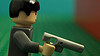
I have created a small little set for a news room that will only be on the video for probably only 20 seconds, but I tried something different for it. I have placed translucent blue pieces on the side of it and I put my ipod with the flash on on the other side of it.

http://i.imgur.com/ZpTG8PBh.jpg
http://i.imgur.com/wMLM4b2h.jpg
http://i.imgur.com/RlX4K76h.jpg


The final result was this...

http://i.imgur.com/GsHjCqVh.jpg


I have also tried to put the iPod flash a little higher because it seemed a bit bright in the first one...

http://i.imgur.com/ZRPF8uMh.jpg


I`m also thinking of putting a screen either superimposed or printed on the glowing part...

So tell my what you think! The reason I`m posting it here is because I had some trouble with deciding the colours and design of the desk, and the background in general with the little bit of bricks I have.
Thanks! mini/bigsmile

Moderator note: please do not use signatures larger than 400x100px.

>okay...

Re: Sets and Props Critique Thread

I think it looks pretty good, since you've stated you don't have a lot of bricks. The colors are fine, but if your going to superimpose a screen, put it to the left of the minifig, not over the glowing part.

Re: Sets and Props Critique Thread

maybe make the floor a different coller. but looks good. Think the tv will ad a lot to it.

This world is a dark place. One day I will see my Savior face to face.
My Youtube

Re: Sets and Props Critique Thread

i would say that the only thing wrong with that set is the green baseplate although green carpet is possible its not common

anyway here is some pictures of my set ive been working on it for a couple weeks now http://www.masterlego.com/MasterLego.com/pictures_files/IMG_0925.jpg
http://www.masterlego.com/MasterLego.com/pictures_files/IMG_0923.jpg
http://www.masterlego.com/MasterLego.com/pictures_files/IMG_0922.jpg
http://www.masterlego.com/MasterLego.com/pictures_files/IMG_0924.jpg

sorry for lots of images but its a big set so big in fact i had to move my computer to another table mini/tongue anyway its a set of a street in france i even went as far to make signs in french tell me what you think. (the cars arnt great because i needed lots of them and couldn't make lots of good ones with the pieces i had).

http://i.snag.gy/E3VvB.jpg
"Right. He deserves for it to not display right" — Sméagol
YouTube | Google+ | Vimeo | Flickr | Twitter

Re: Sets and Props Critique Thread

I made some rocks.

https://pbs.twimg.com/media/BQMxH0fCUAAbgOK.jpg:large

My sets usually look like this before I add detail, so I built this so that I just have to decorate it with some stuff once I have an idea for a film.
It'll save me a little bit of time on BRAWL since rocks take me a while, unless I decide to do something not involving outside.

Re: Sets and Props Critique Thread

http://25.media.tumblr.com/fac646e77ae29a57bb8fa8a53380043e/tumblr_mqltgbnJ5C1rl6rtxo1_500.jpg

Working on a LEGO Serenity (I think this is the right thread). More pics here because I didn't want to spam you guys with images. How does it look?

http://i.imgur.com/Q9NCUnx.png

Re: Sets and Props Critique Thread

Squid, those your rocks look like... rocks.
Which is a good thing. mini/yes

Re: Sets and Props Critique Thread

@Squid: Nice set, one might even say that it... rocks mini/bigsmile
@Golden: You're definitely on the right track! I'm a huge fan of Firefly, so I'd love to see you finish it mini/smile

Re: Sets and Props Critique Thread

@Squid - I liked that rock face so much that I downloaded the picture for future reference, and when I titled the file I called it ANP Rocks. It took me a second to realize what I had done. xD

Seriously though, those are nice rocks.

Re: Sets and Props Critique Thread

masterlego wrote:

i would say that the only thing wrong with that set is the green baseplate although green carpet is possible its not common

I have green carpet in my house... at least I will until tomorrow.

https://vimeo.com/channels/holdingourown      http://holding-our-own.tumblr.com

"None practice tolerance less frequently than those who most loudly preach it."

Re: Sets and Props Critique Thread

I made a couple of props I liked for my BRAWL film.

http://farm4.staticflickr.com/3726/9416611180_1d376d0c27.jpg
This office plant doesn't look like an actual plant to me, but it does look like a plastic office plant, which is what it needed to look like. It's pretty simple so i'm sure someone has done the same thing before.

http://farm3.staticflickr.com/2836/9416621828_89c420377e.jpg
This podium I made for someone giving a speech. I like it, but it's a little annoying that'it's to small to place a 2x2 paper plate style thing on it.

Re: Sets and Props Critique Thread

Those are amazing!

"I wear black even when I'm not animating. I'm like a walking funeral parlor."
-PushOverProductions

Re: Sets and Props Critique Thread

Not too shabby! They are simplistic. Perfectly simplistic.

Moderator note: please do not use signatures larger than 400x100px.

>okay...