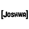
That one with the black/dark colored logo and text on white/light color looked the best (#4), in my opinion.
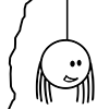
I am not 100% sure what the 1X1 round tile is, but I think it is a film wheel, am I correct?
Yes, you are correct. And thank you, that's seems to be the most popular design, so some form of it will probably become the final logo.
Don't pay attention to his logo, but the thing after it. You might be able to get a more precise, clear, and unique logo if you tried brickfilming it rather than animating it.
The way I see it, (And I may be wrong!) is that he has his logo first, and then an animated title screen for the film second. What I'm trying to get is like his first logo thing, so are you saying that I should physically animate something for a "Brand logo" or what? The title screens for the films may or may not be animated, and aren't really what I'm concerned about right now.
If you stick with computer animation I'm all for the one with a white background and gray text!
Yep, that pretty much confirms my choice.
I'd like to add that the film reel looks a bit square-ish, you might want to round it out.
And I'd also like to ask what program you're using to make the logo and animate it.
Rounding it would be pretty hard because of the programs that I am using.
I'm bringing the bricks into Lego Digital Designer, then using LDD2PovRay to convert the files, and finally using POV-Ray to render a high-res picture of each part. Those pics are then brought into Sony Vegas Platinum 11 and animated.
Yeah, it would be a lot simpler to animate and render it all in Blender, but I haven't put forth the effort to learn all of the tricks to using said software. At this point, it's easier for me to do the longer process.
Making the wheel part spin independently is tough and time consuming, but not impossible.
So I'll see what I can do.