Re: Frame from Your Upcoming Film
That face is hilarious!
EDIT: Oh look, page 123.
Not literally dead, just no longer interested in Lego or animation.
We are a friendly filmmaking community devoted to the art of stop-motion animation using LEGO® and similar construction toys. Here, you can share your work, join our community of other brickfilmers, and participate in periodic animation contests!
A place to discuss, share, and create stop motion films.

Ad
You are not logged in. Please login or register.

That face is hilarious!
EDIT: Oh look, page 123.

This should be good... ![]()

Oh my God JK I love you.
By the way this better be the film that I did that amazingly flamboyant voice acting for. It's taken you a while.


Is it the low camera angle, or just the amount of LEGO that makes that city shot look so complete?
Great set design and lighting! Looks just like a nice sunny day. Can't wait for the trailer.

@Thefourmonkeys I quite agree with KAB. The city is nicely done, as well as the framing. It adequately fits the scene. The brown pillar in the foreground is a really nice 'little' detail, but I think it would look better if it were a bit more blurred. Another thing that I notice isn't right is the green screening. If you look closely at the trees in the left hand side you can see they're almost gone! The same goes for the window of the red car. It has blotches of sky on it. The real life clouds look a bit awkward imo. Maybe the LEGO variant would look better?
Anyway, now for my frames. Here are two shots of the opening scenes of my upcoming film.


Just for the record, I know the book in the first frame is actually a laptop. It's just the only thing I have that resembles a novel.
@Thefourmonkeys I quite agree with KAB. The city is nicely done, as well as the framing. It adequately fits the scene. The brown pillar in the foreground is a really nice 'little' detail, but I think it would look better if it were a bit more blurred. Another thing that I notice isn't right is the green screening. If you look closely at the trees in the left hand side you can see they're almost gone! The same goes for the window of the red car. It has blotches of sky on it. The real life clouds look a bit awkward imo. Maybe the LEGO variant would look better?
The shot was a one second scene done at 30fps It's a tracking shot, so the car is in focus. The trees in the background do have imperfections in the blue screening, but they go by so quickly they look almost blurred. The same is true for the car window. I appreciate your opinion about a LEGO variant for clouds. Perhaps we will experiment with the technique in the future.

4Monkeys - The frame looks nice, with the slight issues that were already pointed out. One question though: How did you blue screen that, when you have a blue car and blue on the buildings? And do you add motion blur to your vids?
(ok, so that was 2 questions ![]() )
)
Kees - Those look nice. The book looks a little unnatural, due to the indentations on the cover and spine, and piece number on the back. Also, the picture of the lady is kinda lopsided. ![]() However, I do really like the dof.
However, I do really like the dof.
-LG501
@Legoguy501 I totally agree with ya. The only problem with the 'book' is that it's basically the only piece I have that resembles a book in the slightest. The picture on the other hand is meant to be kind of lopsided. The reason for this I will not tell because then I'd spoil part of the plot, which naturally I try to avoid.
@Thefourmonkeys 30 frames per second you say?! That's a mighty big number. Also maybe it would look cool if you did something like this:

This would give it more of a sense of speed. Plus, motion blur makes everything look better (and it hides the green screening mistakes).

@The Four Monkeys:
You've got some nice lighting there, along with a nice car, and a good background, but the angle feels really dull to me. It's just really plain and straight on.

^ Keep in mind it's a tracking shot. I bet the angle looks just fine when your eyes are following the car anyways.
Nice shot Monkeys!

An upcoming shot.

Actually it's head is moving up and down, while the background is moving. In this frame his head is the lowest that it gets in the video. So I might have chosen the wrong frame.

Some fram from my Spide-Man video:
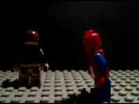
CLICK ON THE PHOTO TO WATCH THE FILM:))
Last edited by GandAanimations (December 1, 2012 (09:43am))


Actually it's head is moving up and down, while the background is moving. In this frame his head is the lowest that it gets in the video. So I might have chosen the wrong frame.
Yes you did because it looks quite weird ![]()

GandAanimations, that was lovely! The fight scenes are very impressive and pretty darn realistic ![]()
The start of the film seems a tad too fast paced but the main part of it was impeccable ![]()
GandAanimations, that was lovely! The fight scenes are very impressive and pretty darn realistic
The start of the film seems a tad too fast paced but the main part of it was impeccable
Thanks ![]()

Nice frame Noobster ![]()
But where is the glass of the window between the store and the consumers? ![]()
Posts [ 2,441 to 2,460 of 3,680 ]