Re: Frame from Your Upcoming Film
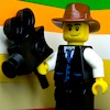
Here is a frame from scene 2 of Batman First Encounter.

We are a friendly filmmaking community devoted to the art of stop-motion animation using LEGO® and similar construction toys. Here, you can share your work, join our community of other brickfilmers, and participate in periodic animation contests!
A place to discuss, share, and create stop motion films.

Ad
You are not logged in. Please login or register.

Here is a frame from scene 2 of Batman First Encounter.
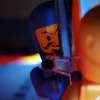
I Like the lighting legocloniac447!!
And the blur in the background adds a nice effect to!:) ![]()

Last edited by BrickCorp45 (October 21, 2012 (08:27pm))

Here is a frame from scene 2 of Batman First Encounter.
Looks alright
I agree with 1011Ev it's a bit grainy, maybe it might need some colour correction:D
3D star map generated in Element 3D inside of After Effects.
I did some more color correction. Does it look right yet?
Last edited by ZachFB Studios (October 22, 2012 (02:11pm))

It came up as a download Zach?
Fixed it.
Last edited by ZachFB Studios (October 22, 2012 (01:10pm))

It looks like a graphic that was overlayed on the original frame. You should play around with the lighting on the set and get it to blend nicely.

Cool frame Antonio. Though it's a tad grainy/blurry and out of focus. I like your angle and I don't think the walls will distract much. Where'd you get the pistol?
You know I am not sure where the gun came from?
Just happened to be in my container where all my Lego guns are.
Thanks for the reply.
It looks like a graphic that was overlayed on the original frame. You should play around with the lighting on the set and get it to blend nicely.
Agree, my first impression was that it was snowing. Also, you should add depth to it, maybe hide half planet or even entirely behind the heads of the characters.

Also, you should add depth to it, maybe hide half planet or even entirely behind the heads of the characters.
That's what I was thinking. I also think the are that it's projecting from is to bright, it's hard to see the actual planets themselves.

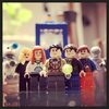
@ LegoCloniac - Looks ok, but I can't tell much from it. The lighting is nice though.
@ Antonio - Like was already said, looks a bit grainy, and it might be able to use some color correction. Also, the change from dark and light grey, to black and white, on the walls looks odd to me. ![]()
@ Zach - Looks decent. I also thought it was snowing, due to the planets looking too blurry (I think). It also looks too 2D, and is too bright (especially at the center). I think it would look better if it was a bit smaller (even if it is supposed to be really large, like in Ep.2.
I think it looks a lot better now. You will not think it's snow once you see it animated. ![]()


@ZachFB it looks... delicious ![]() not that I wanna eat it but I wanna put that frame in my pocket and take a peak once in a while.
not that I wanna eat it but I wanna put that frame in my pocket and take a peak once in a while.
Much better. I like how the planets get more spaced further from the center. It gives it the 3D effect. Also, the light being dimmed down looks nicer. Can't wait for the full video. ![]()
EDIT: I see you got rid of the holoscreen in front of Mace. Any reason?
Last edited by legoguy501 (October 24, 2012 (01:18pm))
I Love it!:D ![]()
It reminds me of the scene From Star Wars Episode 2: Attack Of The Clones
@ZachFB it looks... delicious
not that I wanna eat it but I wanna put that frame in my pocket and take a peak once in a while.
That was one of the most creepiest sentences I've ever read... ![]() lol jk Great job ZachFB!
lol jk Great job ZachFB!
I dunno Zach. I think there are two main problems.
1. There isn't enough depth.
The celestial bodies look like they are all on the same plane which is then overlayed on top of the frame. What would help sell this effect is creating several layers and rotoscoping some of them behind the characters. Also, add some blur as it gets farther back. Everything is pretty clear at this point, which clashes with the depth of field in the actual shot.
2. There is a great big light in the middle, but the characters seem to be lit normally.
It looks like you've added a bright solid in the middle to brighten up that area and fake it, but it looks fake. I'd experiment with some practical effects and illuminate the characters from the center.
Keep working on it, it's got potential.
Yeah, I was going to add some environmental lighting to it. Just like what I do with gunshots.
Posts [ 2,361 to 2,380 of 3,680 ]