Topic: My new logo
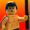
Ok, this is my first ever attempt at a logo for myself. Since I can't get pictures to show up I will link to it
http://www.flickr.com/photos/80285393@N … otostream/
Last edited by TtownStudios (August 15, 2012 (01:27pm))
We are a friendly filmmaking community devoted to the art of stop-motion animation using LEGO® and similar construction toys. Here, you can share your work, join our community of other brickfilmers, and participate in periodic animation contests!
A place to discuss, share, and create stop motion films.

You are not logged in. Please login or register.
Ok, this is my first ever attempt at a logo for myself. Since I can't get pictures to show up I will link to it
http://www.flickr.com/photos/80285393@N … otostream/
Last edited by TtownStudios (August 15, 2012 (01:27pm))
Good, but seems a bit too complicated... But maybe I'm wrong ![]()

It's okay. I'd recommend taking out the shadows behind the title as it makes it difficult to decipher the words. I like the pictures. It may be my computer, but I believe something's wrong with the right-hand minifigure's mouth. Other than that, it looks clean.


It's pretty good. The words are a little hard to see, so I'd go with what Gopher said about the shadows. Either take them out or maybe you could change the color of the words. Also, you should stylize the words or something because they look a little bland. As for the mouth on the right-hand figure, it looks like it's worn out right across the middle. You should probably change the heads or try and fix it in Photoshop or whatever program you're using. It's a nice logo, but it just needs a little touching up.
Thanks for all the advice guys I will post the updated one in a bit.

It looks good, I personally wouldn't get rid of the shadow, I would instead make it a bit lighter so it's still noticeable but is more subtle ![]()
Here is the upgraded version http://www.flickr.com/photos/80285393@N … otostream/
I like the new version! Looks great! Well done ![]()
Here is the upgraded version http://www.flickr.com/photos/80285393@N … otostream/
Much better. May I ask what this will be used for?
TtownStudios wrote:Here is the upgraded version http://www.flickr.com/photos/80285393@N … otostream/
Much better. May I ask what this will be used for?
I would like to use it as my sig and I will put it in front of all my films.
Ah. Looks good! ![]()

Decent enough photo. As it is, not a great logo.
Try doing a stylised illustration of the scene. Ie, the silhouettes of the monster chasing the guy could work quite nicely as a logo.

I'm thinking something along the lines of what Sean said. It's a cool photo, but it's a bit too much. Some of the best and most well known logos are just text, or a very simple design.
Looks good though!
Posts [ 14 ]