Note: These days, community activity has largely moved to the BiM Discord. Join us!
We are a friendly filmmaking community devoted to the art of stop-motion animation using LEGO® and similar construction toys. Here, you can share your work, join our community of other brickfilmers, and participate in periodic animation contests!
A place to discuss, share, and create stop motion films.
You are not logged in. Please login or register.

Also, try spacing the buildings out at different distances from the camera to better aid the illusion. It just looks flat at the moment.

pretty cool.
Though, I think that it could've used more depth so those buildings wouldn't be so obviously miniature.
Nice poster! And I agree with, ANP. Even putting tiles on the tops to remove the studs would make it look nicer. Though Im sure youve already finished animating just about by now. Still looks really nice though!
Also, try spacing the buildings out at different distances from the camera to better aid the illusion. It just looks flat at the moment.
I did try to space out the buildings, but I ran out of room. I may re-film that bit (The poster is a frame from the film), and move the set forward so there's more room to space out the buildings.
Cheers everyone for the feedback ![]()
Last edited by Saminatorger (July 8, 2012 (02:48pm))
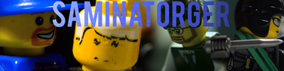
Mine is more like a game poster but it's my first attempt its for the kitchen sink 
@Samingator: the text is annoying, if you're going to add it move it below the main focus of the poster.
@KT: The shield and background are poorly shopped on you should work on that, try and make the characters lighting match up (Purple lighting). What exactly is the point of the shield and random Asian text?
@KT: The shield and background are poorly shopped on you should work on that, try and make the characters lighting match up (Purple lighting). What exactly is the point of the shield and random Asian text?
Don't be ignorant, Cartoonkid98. He can decide to use purple lighting if he wants ![]() .
.
Last edited by Lechnology (July 8, 2012 (08:16pm))


Cartoonkid98 wrote:@KT: The shield and background are poorly shopped on you should work on that, try and make the characters lighting match up (Purple lighting). What exactly is the point of the shield and random Asian text?
Don't be ignorant, Cartoonkid98. He can decide to use purple lighting if he wants
.
But he didn't light the minifig in Purple, which is my point.

A kind of concept image for a film idea I've been thinking up for the last few days:

Not really a proper poster, more like a teaser.
Archie: Time Warrior is the story of a small time war between several versions of a man named Archie from alternate timelines and his nemesis, which gets more complex and confusing as the story goes on.
Note: This film may never be made, but, at the moment, it is my favorite idea, and I think it's the most likely thing for me to make after I Am The Night is done.
We'll see what the future holds.

YES! TIME TRAVEL! HOORAY!
I love time travel.

Hmm, the poster is a little blank, Squid. But, other than that, it looks really good.

I like how clean and simple it is, really cool. I also love the idea for the film.
Really well done and creative poster, ANP. I'd love to see the film get made.
Thanks guys. ![]()
KT, how are you going to utilize the Japanese language in your film? Oh and that's an excellent poster ANP. However, I would make it so the reflection is horizontal (mirror in the middle of the screen) so the contradicotry characters are more conspicuous.
Mine will come

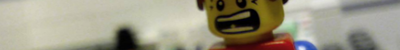
The final poster for part 1, I'm gonna add cast and crew info later.
The text it's hard to read (for me at least). And I don't like the effect.

I REALLY like the filter you've put, it looks like a charcoal sketch.
I do not like the font. It doesn't fit the picture too well. And the color is obnoxious.
Also: Isn't "Night Of The Living Snowmen" what they watch in the Lemony Snicket book?
I REALLY like the filter you've put, it looks like a charcoal sketch.
I do not like the font. It doesn't fit the picture too well. And the color is obnoxious.Also: Isn't "Night Of The Living Snowmen" what they watch in the Lemony Snicket book?
Thanks! It is indeed charcoal sketch, And that's the second time someone said the Lemony Snicket, I've never read it, so i had no ideal, but "Nights of the living snowmen" is better then my original title which was "Attack of the killer snowmen."
Posts [ 861 to 880 of 1,267 ]