Note: These days, community activity has largely moved to the BiM Discord. Join us!
We are a friendly filmmaking community devoted to the art of stop-motion animation using LEGO® and similar construction toys. Here, you can share your work, join our community of other brickfilmers, and participate in periodic animation contests!
A place to discuss, share, and create stop motion films.
You are not logged in. Please login or register.

1011Ev wrote:Looks a lot like Aperture Laboratories.
And Shutterbroke's logo/icon.
Looks a lot like an Aperture. ![]()

Cinexcellence wrote:Looks a lot like an Aperture.
I really don't know what your point is. Are you saying that I shouldn't be basing my logo off of a cinematic piece of equipment because other people have as well? Because that would be silly.
1011Ev is referring to Aperture Laboratories from Portal. The logo looks like this:
Yes, I know what he was referring to. I googled the logo, and clicked on the link that he already posted. I was asking what his point was.
/Users/Kids/Desktop/Silver Crown Productions logo.tiff

If you want to show us your picture(s), you'll need to use a photo-sharing site like Flickr or Brickshelf. The path you posted is the address on your computer, which we can't access. Try reading [guide] for more tips. ![]()

OK, please don't laugh, but here is a (very) rough draft of my logo.
Could someone with a lot more knowledge tell me how to make it look like the film is coming down out of the reel to make the bottom line on the "P"? And I know just about the whole thing looks horrible, so any advice on how to improve it would be very appreciated.
Thanks!


OK, please don't laugh, but here is a (very) rough draft of my logo.
Could someone with a lot more knowledge tell me how to make it look like the film is coming down out of the reel to make the bottom line on the "P"? And I know just about the whole thing looks horrible, so any advice on how to improve it would be very appreciated.
Thanks![img]<Image>[/img]
That's actually a pretty good logo Pritchard. I like the film role being used as a P, very creative.

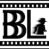
It's supposed to be a sliced eye, but you can imagine it as a aperture as well.

This is a logo I've had for a little, haven't used it yet.
A little something I whipped up:
Sorry for the big picture.
Any feedback?

Here's a random logo; I'll probably end up using it as my sig:

(Then again, I'm used to smaller sigs so I may resize it)

Wow guys, at least leave a little feedback before you post yours. ![]()
@JP, Thanks a lot! Unfortunately my initials can't go into a cool logo like this, so I had to think of something else. I'm glad that you like it, although it's not much more than a Bricklink picture of a Lego piece, some text, and some horrible scribbling.
@T-G Tom, To tell the truth, I don't care for it. The gaps between the pieces are way yonder too big, but even with fixing that, it doesn't tell me anything. A logo doesn't need text, but it must be recognizable, and easily linked to the thingie that it's supposed to be for. That doesn't scream "T-G Tom," it screams....nothing. Maybe Captain America-ish with the round and red/white/blue, but not much else. Part of the problem is that your eyes have to move around to take in the whole picture, and even then it doesn't seem to meld together as one logo.
@Big Bud, Looks nice, the letters appear 3-D, and I'm assuming that the logo screen will have the lights and smoke moving around. (As in the light below the "B" moves to be under the "O") The only things I don't care for are the red spot in the upper-right hand corner, as no other lights are red. And the double blue lights in the upper middle, I would suggest replacing those, and the red light with another blue streak.
@Gopher, Sweet!
That's a great sci-fi logo, but what does the text say? I can read "Gopher" (Who can't) and "Attention," but that's it.
@LASF, Errmmm.....Putting four, successively smaller squares on top of each other ain't that creative.
You should take something like this or this, and make it look like the text is carved into the cube. That would be cool, and a little more professional looking. (Although you should make your own pic of the Cube, as Marvel may not like your using one of their pics.)

@T-G Tom, To tell the truth, I don't care for it. The gaps between the pieces are way yonder too big, but even with fixing that, it doesn't tell me anything. A logo doesn't need text, but it must be recognizable, and easily linked to the thingie that it's supposed to be for. That doesn't scream "T-G Tom," it screams....nothing.
I disagree, I think the fact that it looks like an eye, an aperture and a film reel all in one symbol is pretty clever and does a good job of communicating that this is the logo for someone who makes films.


Hi guys I just joined so here is my logo ![]()


Wow, that's a pretty cool logo! ![]()
Posts [ 561 to 580 of 793 ]