Re: Reworking the site logo

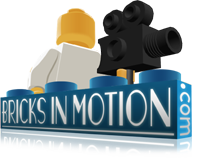
I think that Ladon's logo for the website is very well drawn, I love the style and colors, but to me it seems too busy (a name, a city, and three differently colored minifigs - presumably farmers - is a lot for what should be simple and memorable, IMO) and also it doesn't reflect the filmmaking aspect of this website at all.  I would suggest simplifying it a little, and incorporating a reference to film.  Here's my concept for a revised version of Ladon's logo:

http://www.brickshelf.com/gallery/smeagol/Movies/bimlogo1.png

And here's a shot of it in the context of the website.

I made the studs a little larger (closer to the real-life scale on a brick) and put a LEGO camera in the hand of the minifig.  In retrospect I think it might be good to have some kind of design on the figure's torso to add a little more life and color to the logo, but in the case of a logo, less is often more.  Though this mockup looks OK at this resolution, it doesn't hold up at full resolution so if there's interest in a logo like this, it would need a little more work.

-Sméagol

http://i.imgur.com/wcmcdmf.png

Re: Reworking the site logo

I prefer the current one. The Broadway style font is "filmy" enough for me, and to me the figures represent more of a community, which is what we are. The lone minifig with a camera to me implies that we keep to ourselves and don't interact much.

THAC XIV entry here: (Never) Meant To Be

Re: Reworking the site logo

I've always been in favor of adding the camera to one of the figs in the banner, preferably the one on the right.

Last edited by Sprinkles (December 28, 2008 (12:44am))

Re: Reworking the site logo

Sméagol wrote:

I think that Ladon's logo for the website is very well drawn, I love the style and colors, but to me it seems too busy (a name, a city, and three differently colored minifigs - presumably farmers - is a lot for what should be simple and memorable, IMO) and also it doesn't reflect the filmmaking aspect of this website at all.  I would suggest simplifying it a little, and incorporating a reference to film.  Here's my concept for a revised version of Ladon's logo:

http://www.brickshelf.com/gallery/smeagol/Movies/bimlogo1.png

And here's a shot of it in the context of the website.

I made the studs a little larger (closer to the real-life scale on a brick) and put a LEGO camera in the hand of the minifig.  In retrospect I think it might be good to have some kind of design on the figure's torso to add a little more life and color to the logo, but in the case of a logo, less is often more.  Though this mockup looks OK at this resolution, it doesn't hold up at full resolution so if there's interest in a logo like this, it would need a little more work.

-Sméagol

I like the idea, however the minifig is enormous and way too dominant.

http://www.brickshelf.com/gallery/COTB/FunkyJunk/RUMBLE/mg.jpg

Re: Reworking the site logo

Smeagol, they are the standard Workman Minifigs not farmers and the design/look & feel & graphics were voted on and decided ages ago by majority decision, so it is a little late now for design suggestions. But at least it was a constructive suggestion.

Re: Reworking the site logo

That doesn't mean you can't change the logo. Personally, I always thought the city aspect of the logo looked out of place. Also, I really don't like the connotations of the logo we have at the moment. It says, "We're building a better community." But in doing so, we are leaving behind our roots. I always thought this site was about making films with LEGO.

http://www.brickshelf.com/gallery/COTB/FunkyJunk/RUMBLE/mg.jpg

Topic: Reworking the site logo

I thought that Ladon had said at some point initially that the logo was a concept and he planned to improve it, (though I can't find this in the archive) it was certainly the best logo that was up for voting at the time.

Si665 wrote:

Smeagol, they are the standard Workman Minifigs not farmers and the design/look & feel & graphics were voted on and decided ages ago by majority decision, so it is a little late now for design suggestions.

I am not suggesting an entirely new logo, because this logo matches the look and feel of the rest of the site's graphics, but I don't think that a "Broadway style font" suggests filmmaking, which is, after all, the focus of this community.  When a minority (only 53 people, the community is much larger than this, though it was roughly 66% of the people who voted) of the community voted in the current logo there were no alternatives that were variations on the same idea available for voting, so it doesn't follow that even this minority thought the logo was the best it could be.  I know some people are going to be fine with leaving well enough alone, but I think it'd be cool to make the site the best it can be.  My version might not be an improvement, and if people don't like it that's fine, but hopefully this will at least get some discussion going.  Details are often the difference between good work and great work.

http://i.imgur.com/wcmcdmf.png

Re: Reworking the site logo

I personally like Smeagol's new design. Maybe you should add more minifigs and use the main colors of the site including orange and green.

Why don't we just make a vote on which we want and ask what revisions we want for the symbol?

Re: Reworking the site logo

I support Smeagol's call for a new logo, but I don't like his revised version much.

Re: Reworking the site logo

maggosh wrote:

I can't change my Avatar at all. Whenever I upload a new one, it just reverts back to my old flaming skull, warped to whatever dimensions the new one has. Any way to solve this?

I imagine it's more of an issue with the file you're uploading or the cache on your computer, but if you want, you can hit the "delete" link below the avatar on your profile page and that should reset it.

Sméagol wrote:

I think that Ladon's logo for the website is very well drawn, I love the style and colors, but to me it seems too busy (a name, a city, and three differently colored minifigs - presumably farmers - is a lot for what should be simple and memorable, IMO) and also it doesn't reflect the filmmaking aspect of this website at all.  I would suggest simplifying it a little, and incorporating a reference to film.  Here's my concept for a revised version of Ladon's logo:

http://www.brickshelf.com/gallery/smeagol/Movies/bimlogo1.png

And here's a shot of it in the context of the website.

I made the studs a little larger (closer to the real-life scale on a brick) and put a LEGO camera in the hand of the minifig.  In retrospect I think it might be good to have some kind of design on the figure's torso to add a little more life and color to the logo, but in the case of a logo, less is often more.  Though this mockup looks OK at this resolution, it doesn't hold up at full resolution so if there's interest in a logo like this, it would need a little more work.

-Sméagol


I am actually quite fond of the logo as it is. I know it doesn't scream "film" but I think it accurately represents us a LEGO community and what's more I feel that it's "business" as you call it is a wise design move. It provides a contrast from the simplicity of most of the other parts of the site, simplifying it the way you did would (IMO) make the site feel off balance.

:::: !important is the Jedi mind trick of CSS ::::

Re: Reworking the site logo

Looking at Sméagol's logo again, I think there are some other issues with it that would need fixing before consideration. For one, it doesn't work in the context of the brick and lego figures sitting on the top of the "table". It doesn't feel right with the figure as abnormally large as it is. Also, this site is very heavily themed around a core three colors: blue, green and orange. The current logo incorporates these very nicely without over emphasising them, helping the logo to smoothly blend in with the site. Sméagol's doesn't.

:::: !important is the Jedi mind trick of CSS ::::

Re: Reworking the site logo

I think the basic concept of Smeagol's design is to convey the filmmaking aspect of the site. I think it would look fantastic if the blue figure was holding a camera. It would be subtle, yet still simultaneously show the community and brickfilming. My 2 pesos, anyway. mini/wink

Last edited by Cheshire (December 29, 2008 (08:47pm))

Re: Reworking the site logo

I think that tacking a camera onto the last minifig might look a little out of place.  I agree my logo needs a little work, it was after all a mockup.

My ideal compromise for the logo would be something where there is no city (IMO it's a bit of a distraction, but keep the glow because it helps outline the figures) and the minifigures are a little more evenly spaced behind the brick.  Then swap the colors of the blue and orange figures, because blue represents film (I think?), and put a camera in the screen-right hand of the minifig such that it is on top of his (the center fig's) torso.  Most likely all the figures would need to be scaled down a little bit to accomodate this placement and not obscure too much of them behind the brick.  Also, the studs on the current logo aren't scaled like a real 1x4 brick, to see what I'm talking about compare this to my rendition.  The stud issue should be an easy fix.

-Sméagol

edit: I've done my best to split this discussion into a separate topic.

http://i.imgur.com/wcmcdmf.png

Re: Reworking the site logo

I have to say that I personally like the current one as it is. Not that I wouldn't be interested if something better came along, but the colors, proportions and community feel of the one we have now just works so well.

Pierre Films

Last edited by Pierre Films (December 29, 2008 (04:45am))

Good artists copy. Great artists steal.

Re: Reworking the site logo

I have to agree with Pierre. I rather like the current logo as it is, the city is a nice touch in my opinion and the farmer, well, I didn't see any farmers, I just saw it as three minifigures.

NXTManiac

https://i.imgur.com/IRCtQGu.jpg

Re: Reworking the site logo

I think the camera guy is too big. why not have one of the current minis hold a camera?

http://www.brickshelf.com/gallery/minifig77/banners/logo.png
click me for my YouTube!

Re: Reworking the site logo

The only thing I actually really don't like about the current logo is the fake city in the background. Dump it, and I shall be JOYFUL ONCE MORE.

Re: Reworking the site logo

I think the current one is fine.

Re: Reworking the site logo

Sméagol wrote:

I think that tacking a camera onto the last minifig might look a little out of place.  I agree my logo needs a little work, it was after all a mockup.

My ideal compromise for the logo would be something where there is no city (IMO it's a bit of a distraction, but keep the glow because it helps outline the figures) and the minifigures are a little more evenly spaced behind the brick.  Then swap the colors of the blue and orange figures, because blue represents film (I think?), and put a camera in the screen-right hand of the minifig such that it is on top of his (the center fig's) torso.  Most likely all the figures would need to be scaled down a little bit to accomodate this placement and not obscure too much of them behind the brick.  Also, the studs on the current logo aren't scaled like a real 1x4 brick, to see what I'm talking about compare this to my rendition.  The stud issue should be an easy fix.

-Sméagol

edit: I've done my best to split this discussion into a separate topic.

There are several issues with the changes you suggest. For one, the city background helps very much to keep the logo balanced, loosing it will make it feel lopsided (as the left side will suddenly be very empty) and would require that all the figures move behind the brick for it to have a nice balance, which ruins the perspective or them standing on the "table".

Blue does represent film, but blue is already a very prominent color in the logo other than that minifig (plus that minifig has more color than the other two despite it being behind the orange one). Also, changing the middle minifigs shirt to blue would cause a blending issue with the BiM brick.

Finally, I think the stud issue is different than you might imagine. The studs are actually scaled properly and it's the actual brick that's scaled incorrectly, but that's only to accomodate the name of the site. Making the studs larger will make it look even more bizarrely large compared to the minifigs (especially if you want to scale them down).

:::: !important is the Jedi mind trick of CSS ::::
Re: Reworking the site logo

I really like the logo how it is, aside from the city, which needs some work but I don't think should be gotten rid of.