Note: These days, community activity has largely moved to the BiM Discord. Join us!
We are a friendly filmmaking community devoted to the art of stop-motion animation using LEGO® and similar construction toys. Here, you can share your work, join our community of other brickfilmers, and participate in periodic animation contests!
A place to discuss, share, and create stop motion films.
You are not logged in. Please login or register.


Looking good Briks! When do you think the movie will be out?
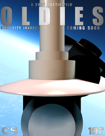
Thanks! ![]() The earliest I can think of is summer 2012, when I can upload videos on YouTube. The movie is in pre-production right now, and I will maybe post a casting call soon. The poster looks a little bit unfinished because I haven't got the voice actors yet.
The earliest I can think of is summer 2012, when I can upload videos on YouTube. The movie is in pre-production right now, and I will maybe post a casting call soon. The poster looks a little bit unfinished because I haven't got the voice actors yet.

Here's a poster to my up-and-coming film/miniseries. If you're wondering what the 'CS' is for, it's simply a temprary logo for 'Chronicle Studios'.
EDIT: Thread's now officially up! For more info, check it out.
P.S. TO THE NUIMOBILE!!
![]()
Last edited by The BIONICLE Hero (August 1, 2011 (12:35pm))

It looks nice, BIONICLE. The greenscreening is very well done. (It's greenscreened, right?)
Can't wait to see how it turns out. ![]()
-JK

Very nifty Bionicle. The colors are great and the background planet is cool.
It looks nice, BIONICLE. The greenscreening is very well done. (It's greenscreened, right?)
Can't wait to see how it turns out.
-JK
Thanks! ![]() But actually, it wasn't greenscreened. The characters are CGI, and the background's an image I found on the internet I thought looked cool. But glad to see I done well enough on my CG models to look like the real thing though, especially since the two characters you see here are completely animated throughout the entire film/miniseries, so they'll go well with my bricks.
But actually, it wasn't greenscreened. The characters are CGI, and the background's an image I found on the internet I thought looked cool. But glad to see I done well enough on my CG models to look like the real thing though, especially since the two characters you see here are completely animated throughout the entire film/miniseries, so they'll go well with my bricks.
I also am planning another one to show off a little more of the serious side of the miniseries/film.
P.S. TO THE NUIMOBILE!!
![]()
Last edited by The BIONICLE Hero (July 31, 2011 (06:51pm))


I love it.

*Throws up over keyboard and proceeds to hide under desk*
I'm scared and disgusted. Finish this brickfilm!
Very terrifying! Is he a priest? I'm really spooked by the bloody heads in the background. ![]()

Frightening, but intriguing.

I like it, but I don't like the caption. I'd try something different.

Looks awesome, but the rhyme is a little awkward. And it doesn't really fit seeing it's set in the 1800s?

I don't know. The font being over the character's head is distracting. Maybe put the font on the bottom and the image above, with a black background and making the image fade to black in its edges.
Looks awesome, but the rhyme is a little awkward. And it doesn't really fit seeing it's set in the 1800s?
It's set in the mid 1700s.
Pillow wrote:Looks awesome, but the rhyme is a little awkward. And it doesn't really fit seeing it's set in the 1800s?
It's set in the mid 1700s.
Yeah, I mean the tagline kind of suggests it's set in today's world. But besides the caption it looks very cool.
Yeah I was trying to come up with a B-Movie tagline like:
Halloween: The Night He Came Home
Black Christmas: If this movie doesn't make your skin crawl - it's on too tight.
Texas Chainsaw: Who will survive? And what will be left of them?

Very impressive poster, KinzCove. It actually gives the horror feel without forcing it in.


I also changed the poster in my update thread too.
That's a lot better than your other one.
Posts [ 701 to 720 of 1,267 ]