
Re: Show off a Frame!
they look really really good.
We are a friendly filmmaking community devoted to the art of stop-motion animation using LEGO® and similar construction toys. Here, you can share your work, join our community of other brickfilmers, and participate in periodic animation contests!
A place to discuss, share, and create stop motion films.

You are not logged in. Please login or register.

they look really really good.

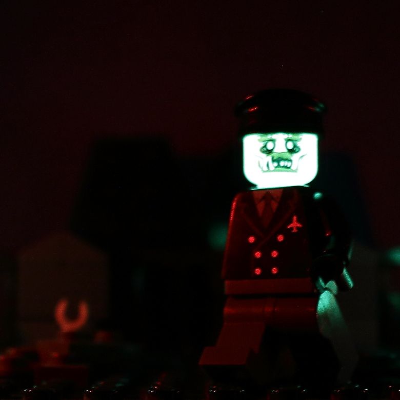
Sorry for the terrible quality, I uploaded these to Facebook rather than Flickr or Brickshelf. These frames are from a flashback in The Defenders. It's only brief, but was really fun to shoot. It's a street war between a Sub-Ultron army and the vampires of St Sebastien. The grey-haired guy in the first image is Xarus, son of Dracula (the spark effects look really good in motion, this frame doesn't do it justice).


It's quite a weird feeling to have animated "archaicly-dressed, Tommy-wielding vampires VS robots" but hey, that's comics. The Defenders itself is still quite a way away, as I have other things I want to do first. It's a nice project to dip to now and then when I need a break from the others.


Nice fiery lighting!
Thanks! These strip LEDs have done wonders for my lighting.
arnt they just awesome. got to love strip LEDS.

Jampot: totally impressed! Great work!

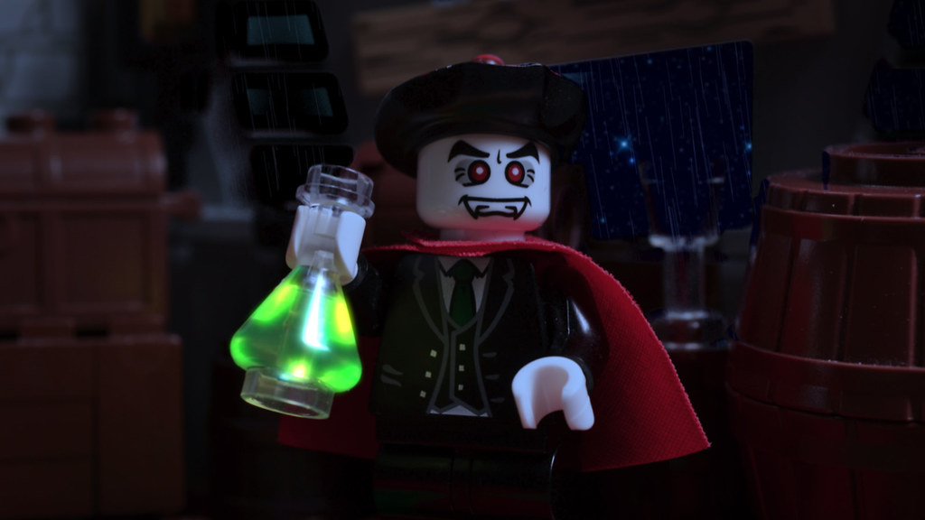
This is a picture I took a month or so back. I got my inspiration from finding out that the heads from my sister's lego set glowed in the dark. ![]() The lighting from this all from three glowing heads (including the one in the frame) and a laser pointer aiming at a white lego wall. This is not from an animation or anything, just for fun.
The lighting from this all from three glowing heads (including the one in the frame) and a laser pointer aiming at a white lego wall. This is not from an animation or anything, just for fun.
The picture was taken with a 30 second shutter speed and an aperture of 3.5. (and a lot of patience. This was the 8th attempt of taking the picture. ![]() )
)
Last edited by Rivvm m (May 22, 2015 (06:41pm))
What a great effect!

@Jampot, I have to agree, the lighting looks great in those frames!
@Rivvm m, Yeah, Lego glowing elements are always awesome!
Brickforge's don't pack the same glow, and it's a LOT harder to get them to look good, especially on a webcam.
I think Squid charged his glowing head with a flashlight, whipped that out of frame, then took a 15 second exposure for "I am the Darkness." So you may be able to speed things up by trying that. At least, when animating with them.
Here's one from my animation challenge entry.
I really like how the main character's minifigure turned out.

@Pritchard, Great stuff! I really like the set design–especially the punching bag. Looking forward to seeing your entry.

Wow that's a great frame Pritchard, imagine what the frame would look like in gritty black and white! I also really like the punch bag and the bricks which help give the set a seedy feeling.
Thanks guys, and that's a great idea Issac!
I was trying to find a way to make this visually distinct, and that may just be it.
Which do ya'll prefer?
Black and White Version
Color Version
I'll have to play around with the contrast and color curves some more, but that's about what it would look like.

I prefer the color version.


To be honest, the grayscale version just looks desaturated, not like a quality grayscale. Quality grayscale keeps the shadows and highlights in-tact, and allows the color to be "shown" without it really being shown. For example, the arms are kind of a weird gray. Since they are originally yellow, the gray that is used does not seem to work. Of course, this is just my opinion on it. I suppose that adjusting levels would help it.
So, to answer your question, I like the Black and White version, especially if you're trying to make it look like an older film, but as the current levels go, I like the color one better. The colors and contrast remind me of a 1970s movie (like Rocky).
@Rivvm m, Yeah, Lego glowing elements are always awesome!
Brickforge's don't pack the same glow, and it's a LOT harder to get them to look good, especially on a webcam.
I think Squid charged his glowing head with a flashlight, whipped that out of frame, then took a 15 second exposure for "I am the Darkness." So you may be able to speed things up by trying that. At least, when animating with them.
Actually, it was probably only about one second. Not THAT long, but there are some other stills where I used ridiculously long exposures, such as We The Pumpkins Three, which involves a shot which uses both really quick exposure as well as a 20 second exposure. A really long exposure is not always good for glow-in-the-dark things, as the glow decays very quickly. If you use a really bright flashlight, you can charge it really nicely, and for about a second or so it will be quite bright. But soon the glow decays to something quite dim. And if you keep the camera open that whole time the other lights in the scene will start to gather a lot more light than the glow did.
I think it's really cool how you used a laser pointer for soft light though. Also using extra heads for fill is a really good idea.
Glowing shots are REALLY hard in animation, though. This is one of the reasons I've decided to release I am the Night as a shorter film rather than releasing the whole thing. I am planning to do some glow shots in Darkmoor, though. An interesting idea I had that I wanted to test was taking first a frame with a really long exposure of only the glowing elements, but then take a short exposure frame of the normal lighting. After that simply combine the two into one frame.
Which do ya'll prefer?
Black and White Version
Color Version
To be honest, the grayscale version just looks desaturated, not like a quality grayscale. Quality grayscale keeps the shadows and highlights in-tact, and allows the color to be "shown" without it really being shown. For example, the arms are kind of a weird gray. Since they are originally yellow, the gray that is used does not seem to work. Of course, this is just my opinion on it. I suppose that adjusting levels would help it.
Well, in your greyscale version, the contrast does not look very good. Particularly on the bits that originally had brighter colours such as the minifigure's flesh. These parts of the frame look more washed out and less defined.
Something I recently discovered from working on Welcome to Darkmoor is that simply draining the colour out of an image can be a mistake, and it tends to produce that effect. What I have found instead, is that one should rather convert the image to a gradient map of black to white. I went ahead and copied your frame to Photoshop and tried it out, and it really looks a lot nicer.
Of course, this sounds like basically the same thing, but I find that the results generally look much better. of course, you would have to have a program that is capable of creating a gradient map effect. And I don't know what you use.
Now, choosing betwixt the black and white gradient map and the original colour, the gradient map looks a lot better. But instead, I would suggest muting the colours. This could be a happy medium 'twixt both options.
If you do mute the colours, I'd suggest making two layers of video. The bottom layer would be the original footage with the black to white gradient map applied, and the top layer would be the original footage, but set to colour the bottom layer, and at only around 50% opacity. (if you have a program capable of doing this, that is)
Ok...Nice to know that the desaturated version is universally loathed.
Solves that question. ![]()
I tried your suggestions Squid, and can do either one in Sony Vegas. People seem to like the color, so I'll probably do either the original, or the half-and-half. But the original seems like the safer choice, so it'll probably be that.
Thanks for all the quick (And very clear!) feedback everyone.

Here's one from my webseries "Transformers: The Stop Motion Series", the episode 1 will be available on my channel LS Animation (https://www.youtube.com/user/LSanimationTV) this Saturday, it's already sitting on my youtube channel ![]()

OPTIMUS PRIME!!!!! THIS FRAME IS AWESOME!!!!!!!!!!!!
OPTIMUS PRIME!!!!! THIS FRAME IS AWESOME!!!!!!!!!!!!
Thank you! ^_^
Having filmed the majority of it months ago, I've finally got around to start editing Vampire Booze, including adding vfx and colour grading. I decided to grade it all to be far darker than in Vampire Owls, which I thought ended up being a bit too colourful compared to my original concept. I'm liking it so far. Some of the footage was a bit rushed when I shot it though, but I think I've managed to counter a lot of my production mistakes.
Hopefully during the summer, I'll have time to shoot the next episode, Vampire Egress, written by my good friend Chicken Bond, and I'll probably start scripting Vampire Karate and Vampire Furniture sometime soon as well, though the latter is dependent on me making a short non-vampire brickfilm first called A Woeful Wizard At Work...I digress.
Posts [ 61 to 80 of 178 ]


