Re: Sets and Props Critique Thread

Overall I think the bed and IV stand look great. However, how does it look with a minifigure in the bed, and another minifigure standing next to the bed? I'm concerned the bed is too tall right now and will dwarf any minifigure standing next to it.

Re: Sets and Props Critique Thread

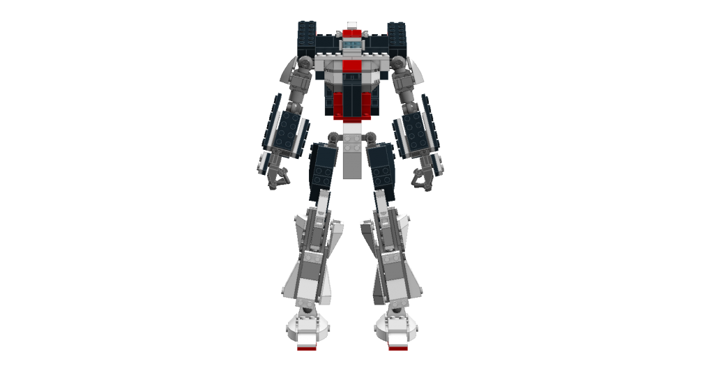
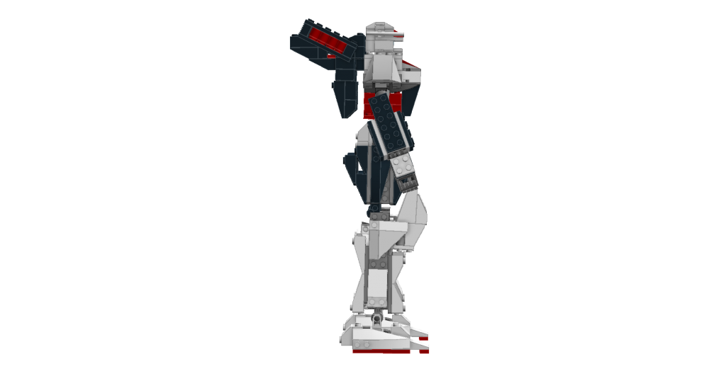
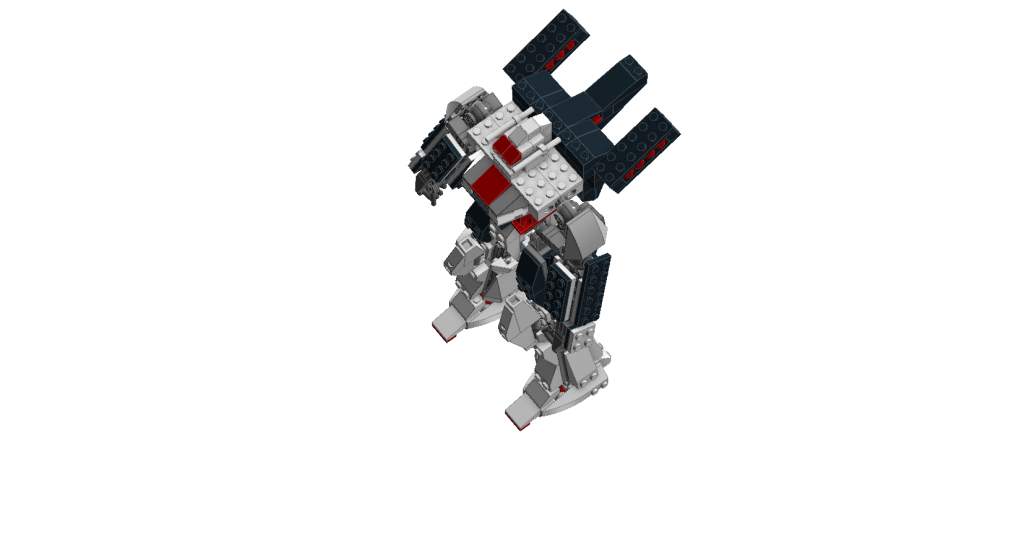
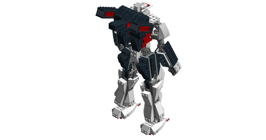
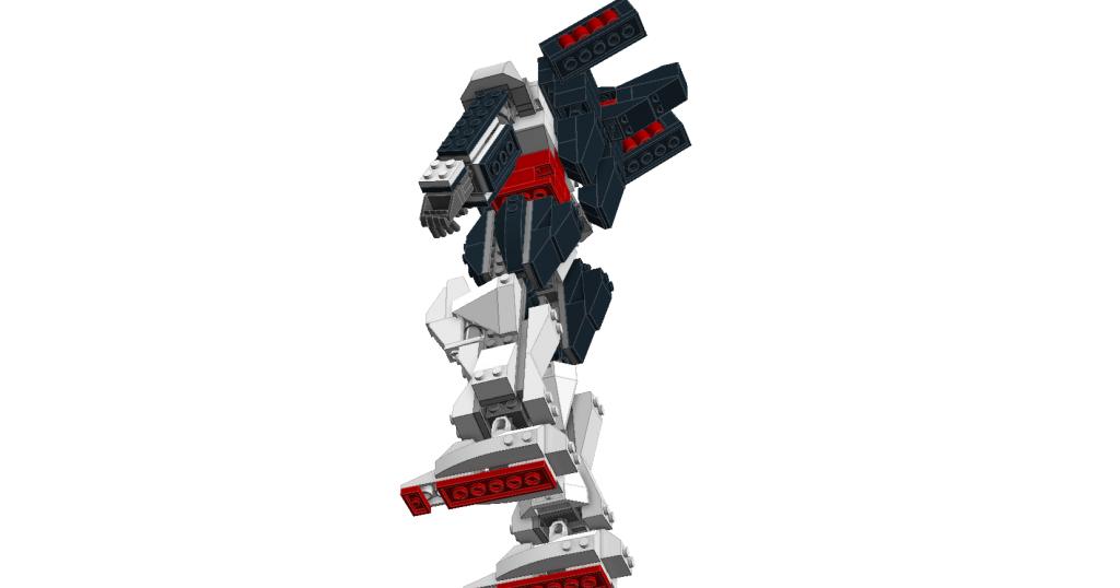
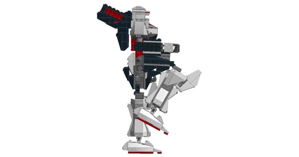
Clonaic, I love the mecha.  I LOVE robots and wish I can design them well in Lego.

https://vimeo.com/channels/holdingourown      http://holding-our-own.tumblr.com

"None practice tolerance less frequently than those who most loudly preach it."

Re: Sets and Props Critique Thread

KTProductions121 actually made the Mecha.

Nathan Wells wrote:

I'm concerned the bed is too tall right now and will dwarf any minifigure standing next to it.

You're right, it does stand way too tall.

Last edited by Legocloniac477 (April 24, 2014 (02:35pm))

"I wear black even when I'm not animating. I'm like a walking funeral parlor."
-PushOverProductions

Re: Sets and Props Critique Thread

Thank Hajime Katoki for the inspiration HoldingOurOwn.

Re: Sets and Props Critique Thread

The Mecha is pretty cool! Is it based on any specific one?

Re: Sets and Props Critique Thread

Slurping Animations wrote:

Is it based on any specific one?

I didn't really use a existing mech design from any artworks but its almost close to the Mon-soonos from Eureka Seven.
http://www.mahq.net/mecha/eureka7/eureka7-tv/type20.jpg
and Hajime Katoki's Leo and Aeries from Gundam Wing
http://www.mahq.net/mecha/gundam/w/oz-06ms.jpg
http://www.mahq.net/mecha/gundam/w/oz-07ams.jpg

Re: Sets and Props Critique Thread

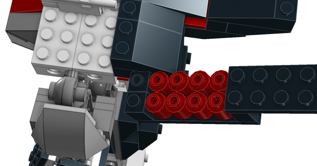
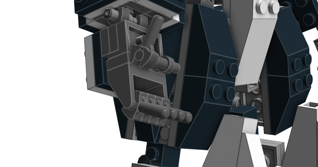
New Model , Ball joints used in the legs peg joints on the arms.
http://i1065.photobucket.com/albums/u385/KTproductions121/IRONGAURD_zps2aeba8e5.png
http://i1065.photobucket.com/albums/u385/KTproductions121/IRONGAURD2_zps0739ea78.png
http://i1065.photobucket.com/albums/u385/KTproductions121/IRONGAURD6_zps05dde84a.png
http://i1065.photobucket.com/albums/u385/KTproductions121/IRONGAURD3_zps397f5cde.png
http://i1065.photobucket.com/albums/u385/KTproductions121/IRONGAURD4_zps1ce85e63.png
http://i1065.photobucket.com/albums/u385/KTproductions121/IRONGAURD5_zps2e7e0d1f.png
http://i1065.photobucket.com/albums/u385/KTproductions121/IRONGAURD7_zpscfc30c30.png
http://i1065.photobucket.com/albums/u385/KTproductions121/PosableFingers_zps4eff4cfd.png

Last edited by Kuwaga (April 25, 2014 (10:14pm))

Re: Sets and Props Critique Thread

very cool

-  Don't trust of the squirrels   -

Re: Sets and Props Critique Thread

https://scontent-b.xx.fbcdn.net/hphotos-ash3/t1.0-9/q71/s720x720/10170834_844217445592437_5960375816784622597_n.jpg

https://scontent-b.xx.fbcdn.net/hphotos-prn1/t1.0-9/q71/s720x720/10176142_844217618925753_2180999612082153949_n.jpg

The town hall from Welcome to Darkmoor.

Re: Sets and Props Critique Thread

I like the way you've done the columns. It feels a little bit too plain, like there should be some dark accent bricks in the walls. I realize there may be a story reason for the lack of windows in the front and more plain design, but I think that that extra layer of detail would make it look even better. mini/smile

Re: Sets and Props Critique Thread

That's so awesome. I agree though that the prostyle is a bit plain. Perhaps you could decorate the capitals a bit, even if just with staggered bands?

http://www.brickshelf.com/gallery/ZoefDeHaas/stuff/sig1.png
"Nothing goes down 'less I'm involved. No nuggets. No onion rings. No nothin'. A cheeseburger gets sold in the park, I want in! You got fat while we starved on the streets...now it's my turn!" -Harley Morenstein

Re: Sets and Props Critique Thread

Yeah, I was thinking it looked a tad plain, though my typical strategies for adding detail don't work as well upon this style of building.  I did specifically want to have columns of that style, though, somehow I thought the blocky shape oddly fitting.  Adding some more detail might be a nice step to take, even though I would like this to stay mostly plain, but I haven't any really good ideas.

jampot wrote:

That's so awesome. I agree though that the prostyle is a bit plain. Perhaps you could decorate the capitals a bit, even if just with staggered bands?

Prostyle? Capitals? Staggard bands?

Re: Sets and Props Critique Thread

http://en.wikipedia.org/wiki/Prostyle

http://en.wikipedia.org/wiki/Capital_(architecture)

Re: Sets and Props Critique Thread

Sorry. I'm a bit of a classical architecture nerd. By staggered bands, I mean that instead of having a plain capital, you could have it split into three bands, getting thinner as they go down, the bottom one being only fractionally thicker than the diameter. You normally see it on the architrave - the beam above the columns - in temples off mainland Greece. I can't think of any specific examples atm but I can try and find one later.

http://www.brickshelf.com/gallery/ZoefDeHaas/stuff/sig1.png
"Nothing goes down 'less I'm involved. No nuggets. No onion rings. No nothin'. A cheeseburger gets sold in the park, I want in! You got fat while we starved on the streets...now it's my turn!" -Harley Morenstein

Re: Sets and Props Critique Thread

I'm not sure exactly what you are trying to describe with that last bit, but if you can find some examples, that would be quite nice.  I do really need to improve this somehow.

For the area above the columns, I'm thinking of taking away the four arches and replacing them with one large arch, also, I'm thinking of putting a line of snot dark grey plates just like I did for the church and the shop directly above the columns and right under the new arch.  I'm also going to elevate the windows a smidgen and try to gather up some bricks for detailing the walls a bit and perhaps trying something at the top of the columns.

Also, I made some improvements to the tree for the centere of town by use of a technique I learned here: https://flic.kr/p/7pUHbL

https://fbcdn-sphotos-a-a.akamaihd.net/hphotos-ak-prn1/t1.0-9/q71/s720x720/10277047_844712068876308_8503136961703746002_n.jpg

I like how the stone ring looks and how the tree is off the grid.

3,096

Re: Sets and Props Critique Thread

I really like the tree, It has a beautiful aspect, but that sinister feel. The base looks great, hopefully you have a way to make it look attached to the ground, putting it on tiles surrounded by normal plates might work.

Re: Sets and Props Critique Thread

I think I know what he means on the columns.
For example, if the column was 1x1, then for the top part, you could have a 1x1 round, then a 2x2 round, then a 4x4 round connected to the bottom plate of the roof. (All plates of course.) Basically, he wants the capital to get wider and wider until it connects to the building. That way it looks more fancy than just being straight and the same thickness form top to bottom. Not that wide probably, but that's a simple example.
Am I right Jammy-Boy? mini/eh

The tree and stone ring look great, as does everything else. The off-the-grid look helps it look odd and crooked, and not quite right, which is perfect for this film. You're just overachieving to a nigh-lethal degree, you know that right?

Re: Sets and Props Critique Thread

Pritchard Studios wrote:

I think I know what he means on the columns.
For example, if the column was 1x1, then for the top part, you could have a 1x1 round, then a 2x2 round, then a 4x4 round connected to the bottom plate of the roof. (All plates of course.) Basically, he wants the capital to get wider and wider until it connects to the building. That way it looks more fancy than just being straight and the same thickness form top to bottom. Not that wide probably, but that's a simple example.
Am I right Jammy-Boy? mini/eh

Yes, although Squid would need to find a way of doing it that doesn't end up being 4x4 at its widest. That'd be too wide.

http://www.brickshelf.com/gallery/ZoefDeHaas/stuff/sig1.png
"Nothing goes down 'less I'm involved. No nuggets. No onion rings. No nothin'. A cheeseburger gets sold in the park, I want in! You got fat while we starved on the streets...now it's my turn!" -Harley Morenstein

Re: Sets and Props Critique Thread

Cool.  Somehow the tree looks like it's "twisting".

https://vimeo.com/channels/holdingourown      http://holding-our-own.tumblr.com

"None practice tolerance less frequently than those who most loudly preach it."

Re: Sets and Props Critique Thread

Squid wrote:

https://scontent-b.xx.fbcdn.net/hphotos-ash3/t1.0-9/q71/s720x720/10170834_844217445592437_5960375816784622597_n.jpg

https://scontent-b.xx.fbcdn.net/hphotos-prn1/t1.0-9/q71/s720x720/10176142_844217618925753_2180999612082153949_n.jpg

The town hall from Welcome to Darkmoor.

Nice really like it. If I were you though I might change some things. I probably would take out the front walls by the columns and maybe move the columns back a stud as they look a bit funny sticking out. But  that's just my opinion.

Osomstudios

This world is a dark place. One day I will see my Savior face to face.
My Youtube