Re: Works-in-Progress Post and Critique
I certainly am. It makes things a lot easier.
We are a friendly filmmaking community devoted to the art of stop-motion animation using LEGO® and similar construction toys. Here, you can share your work, join our community of other brickfilmers, and participate in periodic animation contests!
A place to discuss, share, and create stop motion films.

You are not logged in. Please login or register.

I certainly am. It makes things a lot easier.

If you care about the visuals in your sound experiment Lech, I think part of what kills the illusion of speed is the lack of ground textures - asphalt has a lot of sparkle and variation in color which, when rushing past the camera with motion blur, adds a lot of life to the motion. I would guess studs could probably have a similar effect.


That's awesome, 0ldScratch. Now, I hope you don't mind, but I really need some comments on this. I've decided that eternal walls in brickfilms are getting on my nerves, so I'm going to try a ceiling for my next film.

I only just realized that I only use one lamp while doing this test, so I'll probably do another test later. BTW, this film is supposed to look like a Vlog video.

If you want it to look like a Vlog video, then you should center the frame to put the minifig in the middle, then if you have a small light (maybe blueish) directly on him it'll make it look like he's looking at a computer screen, not too much light though. The lighting isn't too good in that shot, and also I can see the camera in the reflection of his torso.
And that's my two cents. ![]()
Nice set, btw!
Well, I need him on the side of the shot for reasons I will not explain at the moment, and vlogs usually aren't well lit, so while I'm going to try as hard as I can to make it look good, it probably might not end up being important. And now that I look at it again, I realize that the quality is too good for a vlog video, so I might shoot the shot without using frame averaging, and if that doesn't do it, I'll degrade the quality after filming.
I'm doomed, though. This short is going to be about 45 seconds long, and the set is a really cramped place to work in. I think it will be worth it, though.
EDIT: After talking with VN on Skype, it sounds like there is an easier way to do the ceiling. I'll try it, and post some tests later.
EDIT 2: I scrapped the ceiling. After re-angling the camera, it didn't show up, so I just took it off. It looks so much better now.

Last edited by Littlebrick (March 26, 2009 (07:40pm))
I think the camera needs to be a little lower and angled up more. It's rare to see that much floor in a vlog. Filmyguy is right about the blue light too.
Well, I don't really have a blue light that is small enough, or that will hold power for as long as I need it. Putting a blue brick somewhere above or below the camera kind of works, as it reflects a bit of blue light back on the character. And I'm pretty happy with the way the camera is angled, slightly down from about the hight of a computer monitor, but I'll play around a bit more. It just save me the trouble of needing the edge of the desk at the bottom of the shot, which is one thing that really bothers me about this setup. I think I'll also change the shirt of the character as well; it just reflects too much.
EDIT: Okay, I don't have much time, because I'm leaving in a moment, so here's the updated version.

Last edited by Littlebrick (March 27, 2009 (02:15pm))

Can't give too many suggestions cause I can't see the background

I like it. Take away some of the light on the keyboard. It's rather distacting
I'd say center the minifig more. The lighting does look better without the ceiling, depending on what time of day it is, really. The first one with the ceiling looks like it's in the evening with no lights on and the windows open. The others look like it's too dark for the windows to be open, so they turn on the lights. Make sense?
I agree with the blue light idea. ![]()

-^mmproductions' movie poster^- (now deleted)
http://www.bricksinmotion.com/forums/to … ge-images/
Looks good.
Last edited by Hazzat (April 6, 2009 (06:03am))


Woah! I didn't even know that existed. Editing it now.
Here's a WIP clip of one of the opening shots in my STAR entry.
Brickshelf
Is there anyway in God's name I can make this look better?

Adding a shooting star or some planets in the background.

You can clearly see it was blue-screened. I'd advise you to try and get rid of that blue mark. You need the blue screen to be further back so the studs of the base plate don't cover it, and then that line won't appear. Hope that helps. Other than that, it's brilliant, I just found that line distracting.
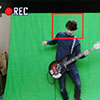
Is there anyway in God's name I can make this look better?
Ask you're friend from Holland who helped you out with effects before maybe?
Keylight can make that thing look a lot better (it's a plug-in for AE).
filmyguy wrote:Is there anyway in God's name I can make this look better?
Ask you're friend from Holland who helped you out with effects before maybe?
Keylight can make that thing look a lot better (it's a plug-in for AE).
Oh man, you're great. Please help me out with that shot. ![]()
It's just I can't bare to film it again, and do what Splash Studios said, I filmed it at least five times last night. D:

I would make the opening camera tilt a bit slower, and clean up the blue screen edge.
Then I would have a planet in the distance or something.
It looks like it's in space, like on an asteriod.
Posts [ 181 to 200 of 384 ]