Note: These days, community activity has largely moved to the BiM Discord. Join us!
We are a friendly filmmaking community devoted to the art of stop-motion animation using LEGO® and similar construction toys. Here, you can share your work, join our community of other brickfilmers, and participate in periodic animation contests!
A place to discuss, share, and create stop motion films.
Ad
You are not logged in. Please login or register.


What show are you guys talking about?

What show are you guys talking about?
Over the Garden Wall, it was a miniseries. And it's quite good. I'd recommend sitting down and watching it all at some point. It's pretty short.
Oh okay. I saw it and thought David the gnome ![]()

Thanks, guys! Glad you liked the show, rio. ![]()

A comic I wrote and drew for applications to university. Very loosely based on the Oedipus Rex story, regrading him and the sphinx.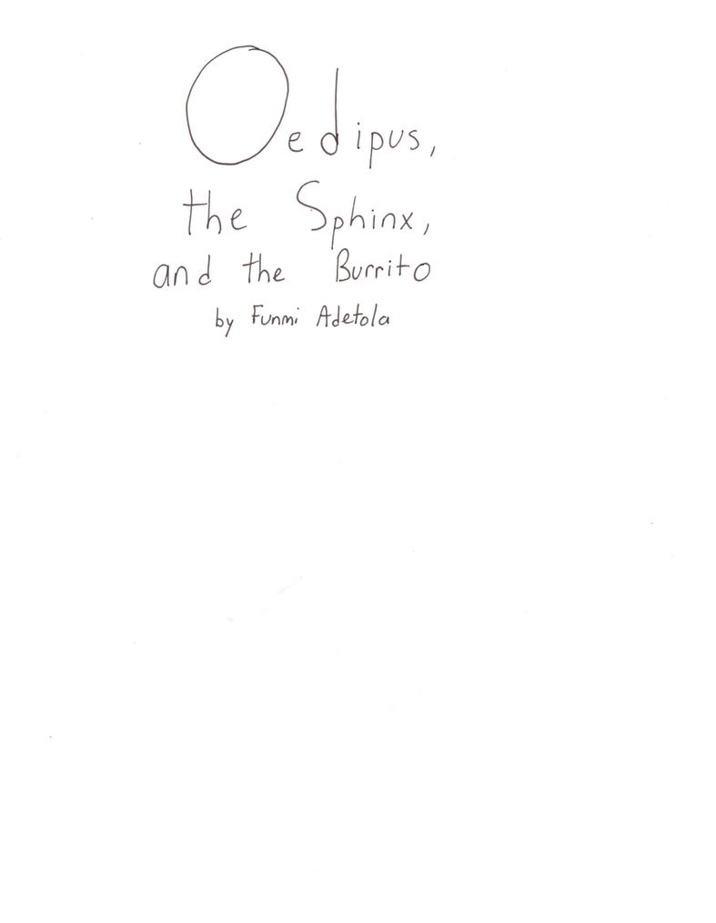
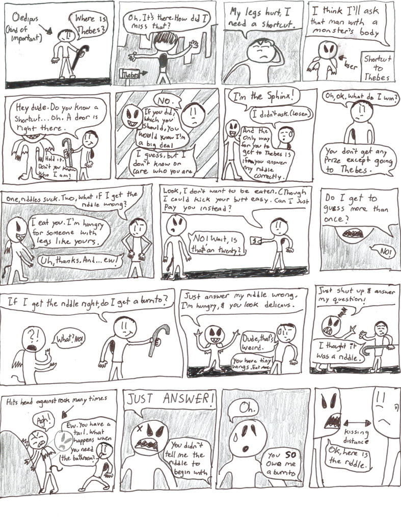
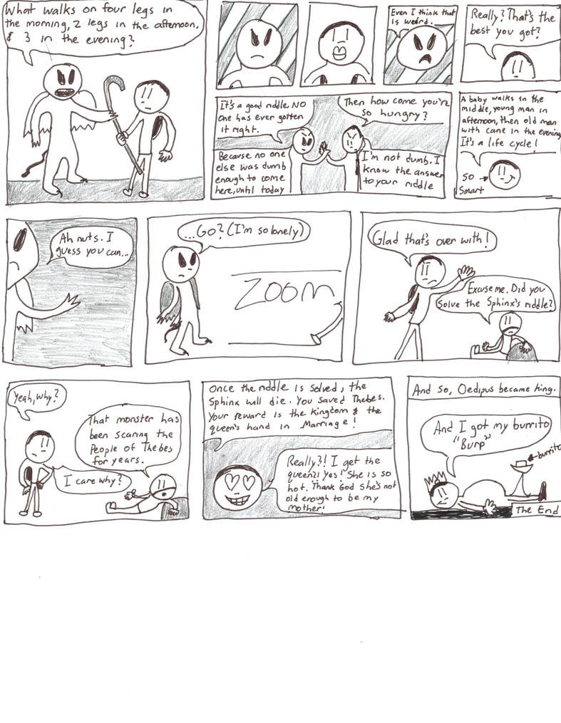

I like some of the little jokes and asides. It's certainly a lively comic.
A few points of critique: in some places it's pretty apparent that you were trying to fit the text into an already drawn panel (though it looks like you're thinking about the bubbles beforehand, so that's good)- in general, it's a better idea to plan the panel with the text in mind before committing to a final drawing. Maybe write it in light pencil while you're laying things out so you know you have enough space to say what you want. In the same vein, it's frequently useful to draw light guidelines that you can erase later so the lettering is consistently spaced vertically.
If you're submitting this as part of a portfolio, you might want to consider cleaning it up some. Unless you're intentionally going for the uneven panel borders as part of the aesthetic, you could fix those pretty easily with a ruler. It's not always obvious but there's usually a significant amount of planning and draftsmanship that goes into designing a high quality comic page- it may seem boring but working artists often use tools like rulers, squares, compasses, etc... to make their work look professional. It's definitely good to keep your own style, but make sure you're also taking whatever steps you can to make it look publishable.
If I could make a suggestion (stolen from someone who has more experience than I have with portfolios), it might be a good idea to just cut back and make something shorter where you can spend more time on each panel. I suspect an admissions worker would be more impressed by a four panel comic with cleaner art and color than something long that looks a little bit like a first draft. I don't want to dampen your enthusiasm because I think it's great that you're interested in drawing and are making things on your own (and this may be late advice since I believe most college applications have already gone out) but in general, the more you can make a portfolio application look like you put a lot of time and focus into what's there, the more likely it is that it'll get noticed.
What sort of program are you applying to?
Interactive Multimedia and design
Media studies
Animation


Cara Delevingne in ten hours with XAN on iPad using Wacom stylus
Late to the game, but those are pretty interesting Robukka
Thank you ![]()
Last edited by Robukka (February 20, 2016 (05:36am))

Interesting Technique Robukka.
Brickcrazy: you may like those Christopher Hart books on Japanese animaiton drawing. They're found at craft shops like Michaels, AC Moore, Hobby Lobby, and whatever's regional for you.


Hmmm, I wonder which movie that could be. Perhaps the one in which love transcends both space and time?
No, but I love op art and do a lot of things that people who draw this would like.
You may like those Christopher Hart books on Japanese animation drawing. They're found at craft shops like Michaels, AC Moore, Hobby Lobby, and whatever's regional for you.
Thanks for the suggestion HOO. I really should look into some books on the subject sometime, as basically all I know when it comes to drawing so far has come from personal experience and the internet.
Woah, that is epic Brickcrazy. The facial expression is awesome, as well as the shading. I look forward to seeing more manga-style drawings from you!
Thanks rio, glad you liked it! ![]()
Speaking of seeing more manga-style artwork, here's a piece of digital Star Wars Rebels fan art I just finished:
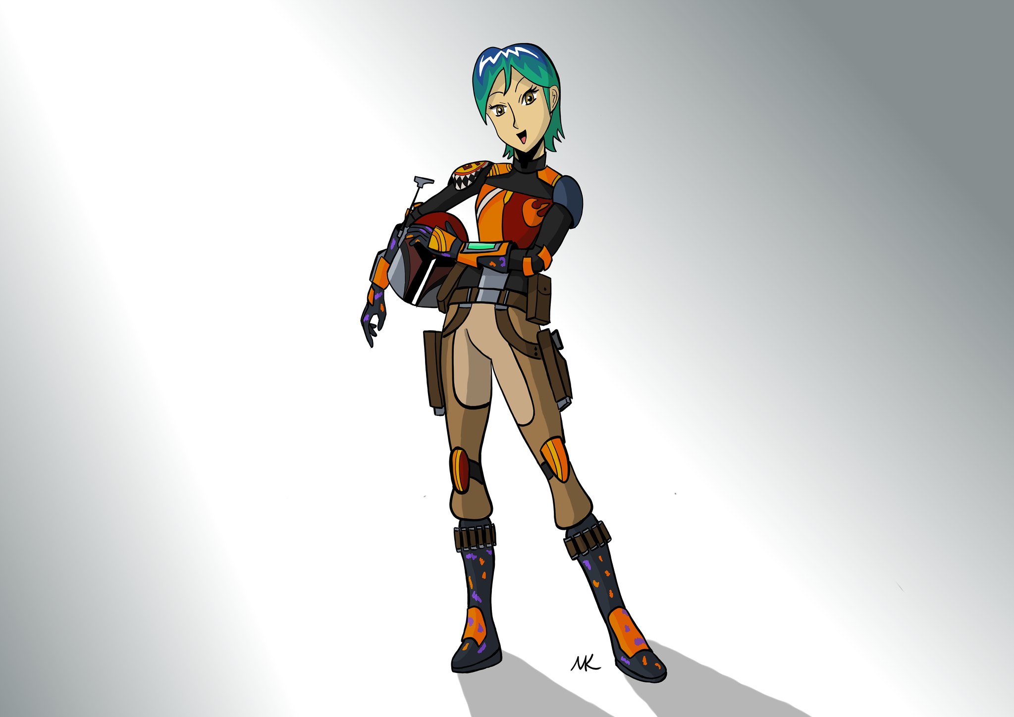 Sabine Wren - Digital Drawing by Brickcrazy, on Flickr
EDIT: went back and changed the backdrop a bit. The old one was distracting.
Last edited by Brickcrazy (January 26, 2016 (02:46pm))
Yes! this is your best sketch yet!

Late to the game, but those are pretty interesting Robukka.

Here's another so-so line art computer drawing, this one of Skylor from LEGO Ninjago, drawn as a human rather than a minifig. Drawn in an afternoon for a little contest I had with rioforce.

Also, just in case people might find it interesting, here's the base sketch layers before I did the final inking, coloring, and shading. For some reason I like the look of sketchy WIP stuff ![]()

Last edited by Brickcrazy (March 8, 2016 (09:11pm))
That's great. Good job ![]()
Posts [ 1,761 to 1,780 of 1,853 ]