Re: Sets and Props Critique Thread

I really liked how this set turned out everything right down to the colors I decided to use and the lighting seemed to work perfectly. The door is probably my favorite part.

https://pbs.twimg.com/media/CXN4M5PWAAAEyJK.jpg:large

Now comes the tricky part. Does anyone have good tips in building an interior of a space station? Like I'm aiming for an Alien/ 2001 A Space Odyssey vibe ( like with detail and all) , but I don't know where to begin in constructing something like that.

Re: Sets and Props Critique Thread

The design of the walls looks really good, however, the lighting feels a bit bland at the moment.

I feel like it needs some more contrast as well as some interesting colours.

Re: Sets and Props Critique Thread

That is a great hallway.
And as for your question, you can start right there.

If I could offer one suggestion, it would be to replace the top layer of slopes with their inverted counterpart.
That way, it appears to be more of a tunnel, and thus, more of a small, enclosed space station corridor.
That being said, those parts aren't too common, and it'd be hard to have enough to pull off the effect without a Bricklink order.

Now, from what I can tell from Youtube clips, 2001 and Alien have somewhat different spaceship designs, so I'll give some tips on both. Although you'll also want to think about want rooms you'll need, since that'll determine the major features in them.

2001:
What you'll want is very little in the way of color, and more in the form of repetitious structural details. This gives it a detailed, yet clean and minimalistic look. A few spots of color, but always in a regulated, ordered, fashion. You can have tubes and computer banks, but make sure they are meant to be there. Everything has its place, and nothing is out of place. So set dressing should be deliberate. A lot of white and light gray, and tiles.

A few 1x2 computer tiles along a wall, for example, could work. Continue with the slopes coming out of the wall idea. Have bright, full lighting. You can pull in some more black, but keep it balanced.

Alien:
Depending on the deck, it can look far dirtier, some a mix of grays and browns. Regardless, things appear more worn and haphazard, so some random hoses and computer banks lying around would be good. Industrial, again, on lower decks, so you'll want vents and ladders, and random crates. It also looks a lot busier, so make heavy use of textured bricks all throughout.


Re: Sets and Props Critique Thread

Squid:
I feel like it needs some more contrast

In terms of that what did you have in mind?


Pritchard Studios
That is a great hallway.
And as for your question, you can start right there.

Thank you so much. Yeah I'm looking at the images of the two movies and I see what you mean. Thank you for suggesting what bricks to use also.

Re: Sets and Props Critique Thread

Perhaps some sharper light sources, like that shot of the moon had rather than soft light, or perhaps some colour contrast due to multiple light sources.

I made a series of test animations before one THAC with some lighting tests centered around a similar astronaut.

Link: https://youtu.be/cXCIcMm-qNo?t=1m53s

At the time index the links stats at, there is some light coming from beneath the astronaut.  I feel like something similar might look nice for yours, but perhaps just significantly brighter.  You could get some interesting light colours by shining some light through coloured transparent LEGO elements.

Slightly later in the video, there is also another shot of the same set but with brighter softer lighting.  It also has some blue elements in the walls with some aluminium behind them to angle light through the blue bits, and the light is a cool white to make things a little bit more interesting.

Another cool thing you might do is have that door or whatever behind the subject be opened to another part of the ship, and have the room with the subject be lit in a way that is more cool or warm with the room behind him or her being somewhat warm or cool (opposite of whichever you chose for the room of the subject).  Thus the figure will stand out slightly against the background of the open door.
(I'm not sure of that made any sense)

But mainly, I just think that it needs something here in the lighting to make it more interesting.  Perhaps just experiment.  Try shining lights in from weird angles and change around the colours and such until you find something really cool.
(I hope I've been at least slightly helpful)

Re: Sets and Props Critique Thread

Squid:
Try shining lights in from weird angles and change around the colours and such until you find something really cool.

That was really helpful thank you so much for your help. Do you mean something like this?

https://pbs.twimg.com/media/CXQRPdhWEAAd6ml.jpg:large

Oh one more thing (sorry I keep bothering you), but did you have any tips on constructing interior ships. I've seen your film Planet of the Sneeuwpop, and thought the sets where fantastic, really great job overall and was thought you might have any tips?

Re: Sets and Props Critique Thread

Oh man that is so much better. It's fantastic!

"I wear black even when I'm not animating. I'm like a walking funeral parlor."
-PushOverProductions

Re: Sets and Props Critique Thread

Legocloniac477:

Oh man that is so much better. It's fantastic!

Thank you, I agree!

Re: Sets and Props Critique Thread

Ooo... that's nice.

Re: Sets and Props Critique Thread

That is very good Infinity! mini/bigsmile

Re: Sets and Props Critique Thread

Golly Infinity, that is just beautiful... mini/love

YouTube  |  Flickr  |  Twitter

Re: Sets and Props Critique Thread

Thank you so much!

Re: Sets and Props Critique Thread

That looks really cool Infinity! Love that lighting.

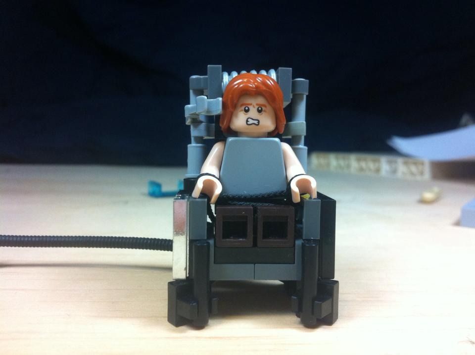
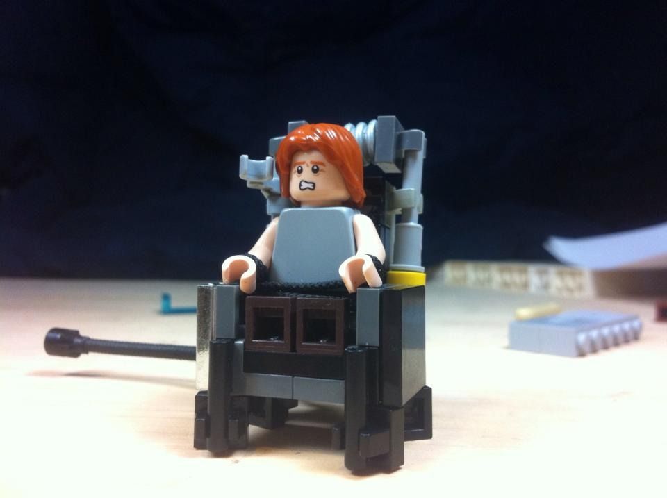
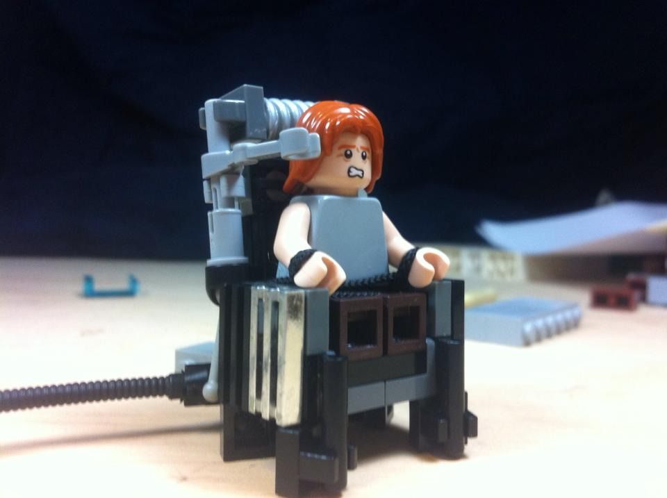
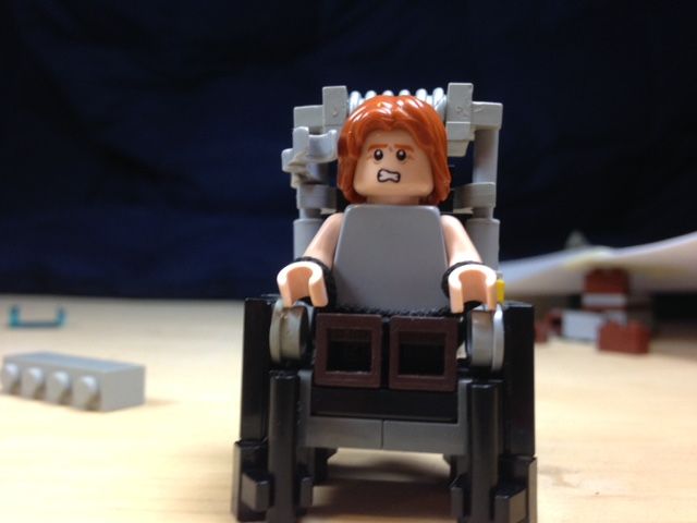
Heres try two on the shocking electric chair. What do you guys think?

http://i841.photobucket.com/albums/zz336/Kaleb_Barkman/1005511_461360264047932_7515651865519981303_n_zps5neyvm0x.jpg

http://i841.photobucket.com/albums/zz336/Kaleb_Barkman/12509308_461360250714600_8874419596045330648_n_zpsyv3nqefw.jpg

http://i841.photobucket.com/albums/zz336/Kaleb_Barkman/1649_461360194047939_7922609492980985493_n_zpssnvtnnrp.jpg

This world is a dark place. One day I will see my Savior face to face.
My Youtube

Re: Sets and Props Critique Thread

Looks great! Knew what it was as soon as I saw it! mini/smile  Also, are those flick missiles and droid arm in the sand blue color? If so, what sets do you find them in?

Re: Sets and Props Critique Thread

Galactic Films wrote:

Looks great! Knew what it was as soon as I saw it! mini/smile  Also, are those flick missiles and droid arm in the sand blue color? If so, what sets do you find them in?

Thanks! No there in light gray but I just took the picture on my phone so the light balance is probably of. !hose would be cool though!

This world is a dark place. One day I will see my Savior face to face.
My Youtube

Re: Sets and Props Critique Thread

I think you managed to capture the look of an electric chair reasonably well Osom, I like it. One thing I'd suggest though is that you narrow down the color scheme a bit. As it stands, the colors kinda make it look somewhat hodgepodged and cobbled together (of course, if it's supposed to be a makeshift electric chair someone built in their basement, it could work). I think it would look better is you used one or two basic colors for the majority of the prop. I guess it just depends if you're going for a more clean or a more makeshift look.

Still, I like the general design. Definitely an improvement IMO over the last one. mini/wink

YouTube  |  Flickr  |  Twitter

Re: Sets and Props Critique Thread

Thanks Brickcrazy it's crazy because I'm building something I don't really want to look at the real thing. I tried narrowing the colours down a bit much to my surprise though to me (it might just be me) it looks like it might be doing the opposite of making it look less hodgepodge? (Im still not sure which one I like better). Maybe if I kept it the same but changed the silver piece? Also I should probably say the room Im thinking of placing it in will probably be a plainer gray looking building with a low white roof. So I'm thinking I'l probably want some contrast from the chair, two so it and the guy stand out more.

http://i841.photobucket.com/albums/zz336/Kaleb_Barkman/IMG_2345_zps7tm3kobu.jpg

Thanks a ton! mini/smile
OsomStudios

Last edited by osomstudios (January 12, 2016 (09:37pm))

This world is a dark place. One day I will see my Savior face to face.
My Youtube

Re: Sets and Props Critique Thread

Yeah, looking at both, I kinda liked the original better. Maybe if you keep that and just change out the chrome grille like you said? Sorry my suggestion didn't work out that well. Good luck with it, I'm sure it will turn out great. mini/wink

Last edited by Brickcrazy (January 12, 2016 (10:40pm))

YouTube  |  Flickr  |  Twitter

Re: Sets and Props Critique Thread

I'd say that the arm piece you have next to the guy's head should be mirrored on the other side, it feels a little odd with just the one.

Re: Sets and Props Critique Thread

Brickcrazy wrote:

Yeah, looking at both, I kinda liked the original better. Maybe if you keep that and just change out the chrome grille like you said? Sorry my suggestion didn't work out that well. Good luck with it, I'm sure it will turn out great. mini/wink

Thanks! I think I'll try that then. Oh its totally fine, when you said that I thought oh yea thats true I'll try that, but sometimes you just have to try it before you can really see.


backyardlegos wrote:

I'd say that the arm piece you have next to the guy's head should be mirrored on the other side, it feels a little odd with just the one.

Thanks! I might try that then, I guess that would probably help the electricity pass through......  mini/twitch 

Thanks a ton Guys!
OsomStudios

This world is a dark place. One day I will see my Savior face to face.
My Youtube